Composition for Three Cubes
A projection mapped composition for three cubes.
produced by: Sam Ludford
Introduction
My aim in with this project was to create a composition that constrasted slow geometric movement at the macro level with faster organic movement at the micro level. Our group chose a shape based on four cubes to be projected on directly from the front, so that only three would be visible with their points facing towards the projector. This gave nine projection surfaces. The shape was chosen on account of both its rich variety of symmetries and relative simplicity, giving us plenty of freedom to play with the overall geometry without taking the viewer's attention away from detailed animations on individual surfaces.
The composition is split into three movements, each with three inner scenes. Each movement explores a radial or bilateral symmetry of the shape, moving through its permutations. Each movement highlights a smaller, organic animation which is expressed differently through each permutation, alluding to the morphogenetic variety of natural processes and the repetition of forms at different scales.
Concept and background research
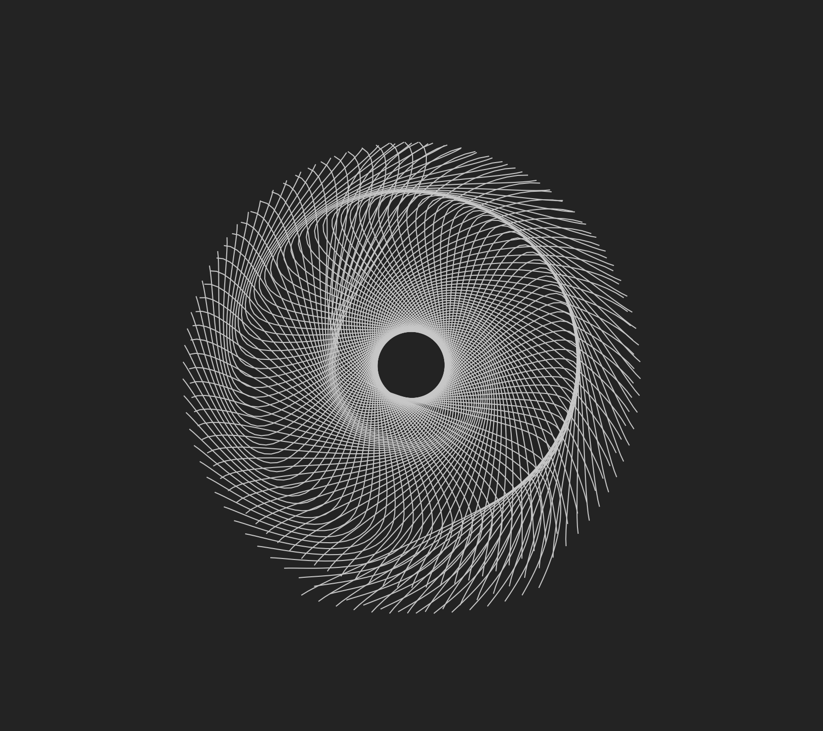
My starting point for the project was an openFrameworks sketch I wrote in October which uses noise to animate the control points of curves, yielding an animation with an organic feel evocative of marine life [1]. The algorithm itself was a happy accident, discovered as a byproduct of a learning exercise. This way of working and the kind of output it generates has always interested me, and it was something I wanted to incorporate into my project. However, given the intrinsic unpredictability of this process I was faced with the problem of how to use it in relation to the specific shape I was working with. This gave rise to the idea of a timed combination of simple animations to create geometric shifts at the macro scale which would 'frame' more detailed and organic animations projected on particular surfaces.
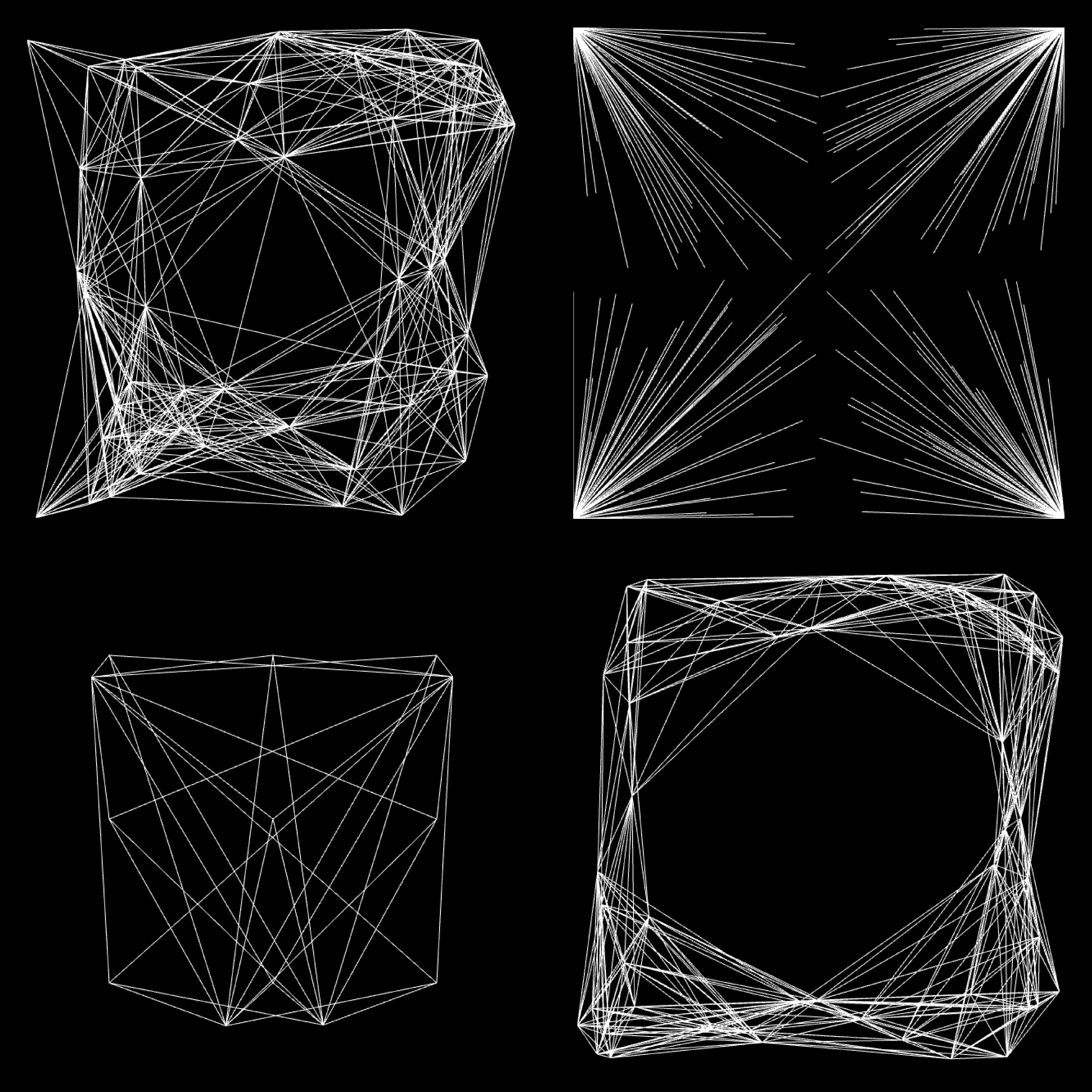
To achieve this I set about creating some simple sketches which would be used as the framing animations. These consisted of a white square which would flash on after a specified time, a series of moving vertical lines of changing thickness, and a white line which scans across the surface, both highlighting the geometry of the shape and giving a sense of time. Then I created a sketch for each movement which would serve as the 'detail' animation. The first uses nested rectangles in motion to create an illusion of depth inspired by Marcel Duchamp's Rotoreliefs [2]. The second was a particle system which is drawn in different ways. The third is the squidlike animation responsible for inspiring the project in the first place.
Putting these together I composed the three movements. Custom fading to/from both black and white was used to smooth the transitions. I chose not to use any colour in order to keep the focus on form.
Technical
Creating the framing sources themselves was straightforward; the more difficult task was allowing the parameters defining their timing to be controlled from client code so I could use them as compositional elements in piMapper. This involved basing the timing (e.g. of the flash, or the length of time it took the line to scan across its surface) and the angle of orientation on an externally supplied parameter. In addition to this, to save having the code handling the fading in and out replicated in every source (and increasing the fragility of the codebase) I put it in a superclass which all sources inherent from.
The 'rotorelief' rectangles based their motion on noise to create an organic feel. The particle system was a standard implementation with wall collisions, with drawing based on various ways of connecting particles with lines. Particles were initialised at the edges so they would appear to spring out into the center of the surface, and then at the end of the cycle they would collapse toward the edges again, giving the impression of a spider's web tearing apart. The squidlike source created a constant number of curves rotated around the center at regular angles while the noisy motion of two shared control point made them pulse and wiggle.
Future development
If I was to develop this further I'd put more attention into interspersing quick scenes amongst the longer ones, moments of rapid change in between slow evolutions to add an extra sense of dynamism. I'd also like to spend more time experimenting with accidental animations.
Self evaluation
I was happy with the way the macro-scale geometrical highlighting turn out, particularly the line scans and fading. But a lot of the resolution in the detailed sources was lost in the projection, leading in turn to a loss of the contrast the piece aimed to communicate. In addition, time pressures during setup didn't allow the surface mapping to be quite as precise as the composition required, and some jumps can be noticed.
Overall I was pleased with the project, but in the future I would like to develop these compositions with the shape and projector present. This would help to gain a sense of these difficulties and allow them to feed back into the piece during its creation.
References
- Marcel Duchamp - Anemic Cinema
- Source code for the 'aquaforms' animation: https://github.com/samludford/aquaforms


