void void
void void is an attempt to create a hypnotic experience using shape and light
produced by: Christopher Merrington
Introduction
void void is inspired by psychological experiments of the 50s and 60s. I wanted to use visual language from found footage of experiments from this period to create something that made the viewer feel like they were slipping into a hypnotic state whilst undergoing such an experiment. I chose to work entirely in black and white as this fits with the aesthetic of my starting sources.
Concept and background research
The creation of the cube was influenced by a piece entitled Data Gate by the creative agency Ouchhh. After Hannah found Data Gate we all decided as a group that we wanted to make something big and something using cubes. I decided to wait until the shape had been confirmed to start researching the type of projection I wanted to make. We spent a week or so developing the shape and, after several rounds of elimination, we settled on a shape with a convex surface. I was inspired to look into ideas of sinking/disappearing, and I originally started working with Enter The Void as an inspiration. I wanted to use the DMT scene (see below) as a starting point.
While researching DMT I came across LSD trials from the 50s and 60s and decided to use this as a starting point instead. I liked the slightly sinister nature of the video and loved the repeated shots of the clock.
This led me on to look at this amazing video of a hypnosis experiment. This video became the main inspiration for my project and further inspired the aesthetic direction I wanted to proceed in. The use of repetitive spiral shapes and lights was a key thing that I took away.
Technical
The Shape
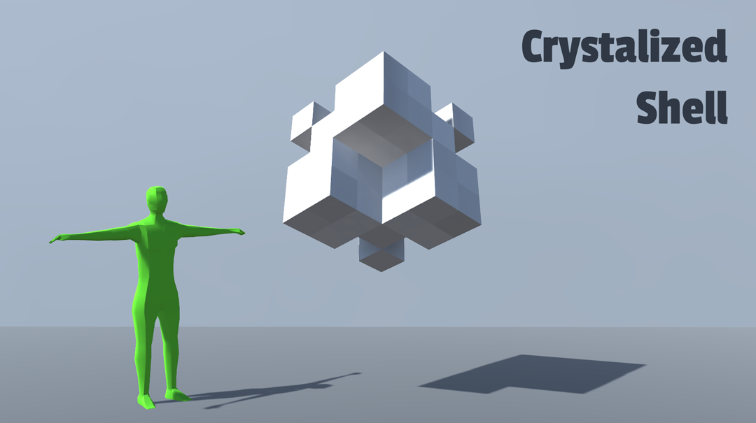
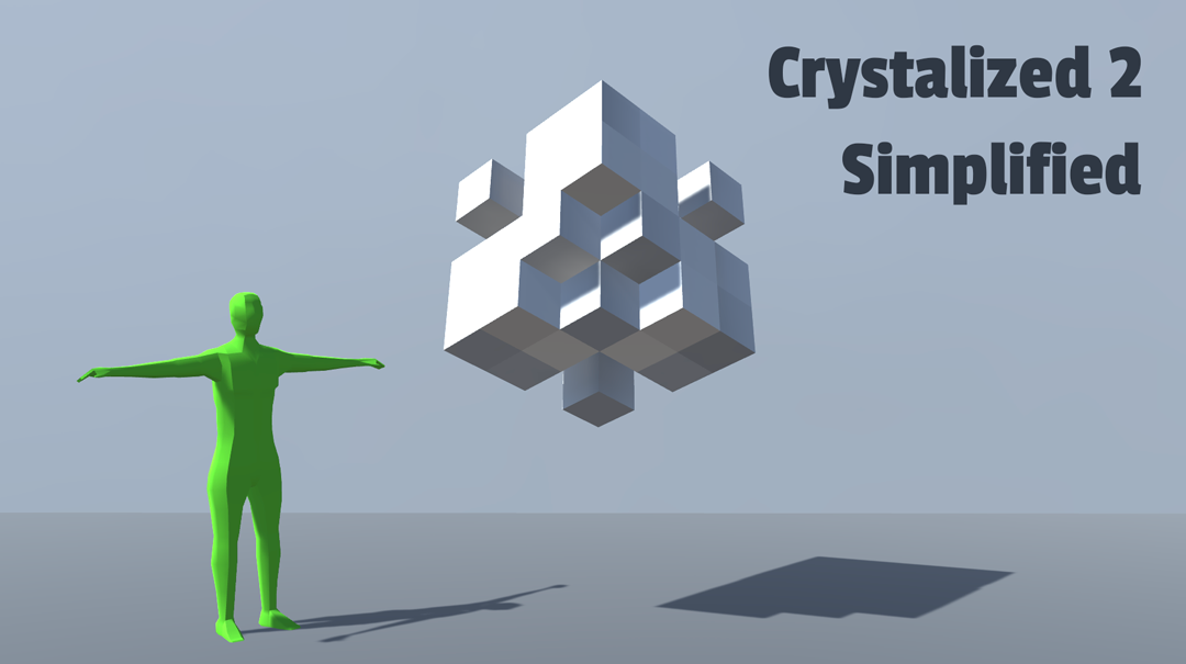
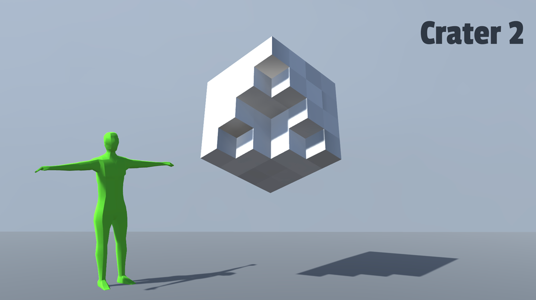
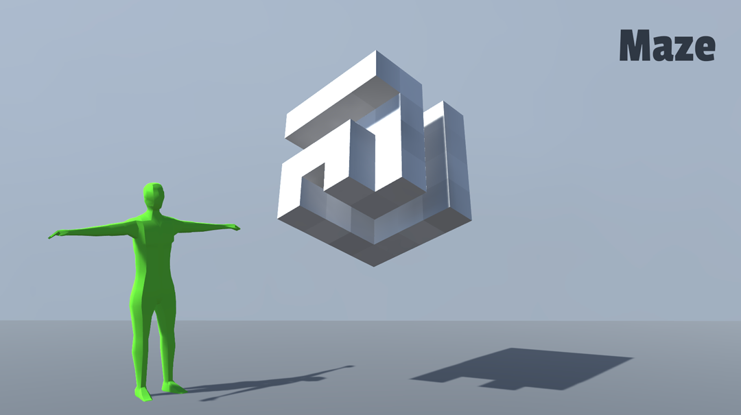
Using the 3D computer graphics application Autodesk Maya, my group tested out several variations of the shape. We then decided as a group which one would be the final shape. We named the final design Nested Shell, but after a few days of stress and headaches (with various failed attempts) we decided to rename it Too Big to Fail.


Projection
void void was created using C++/OpenFrameworks using piMapper addon.
I used Processing as a starting point mainly because I felt more comfortable using this than OpenFrameworks. I knew that if I worked quickly with processing then I could test out a lot of different ideas in a short space of time and hone in on what I wanted my final project to look like. After creating about 12 different sketches in Processing I moved onto OpenFrameworks. I translated the java code to C++ and ran separate sketches on OF, but I didn’t test out these sketches on the dummy object straight away and a few of them just didn’t look great on the shape, meaning they had to be scrapped.
Various other sketches were too simple or just didn’t work with the direction I wanted my project to go. The 12 sketches in Processing turned into 4 FBO sources in OpenFrameworks. I would have liked to have more but thankfully I was able to improve my FBO sources considerably using ofGetElapsedTimeMillis. By using millis I was able to create the effect I was aiming for from the start, which was something both fast and intense but, in a way, soothing.
Future development
If I were to continue with this project I would like to add a few more FBO sources and perhaps develop a sketch that looks good on the whole surface of the shape. I only looked at projecting onto each individual box and I would be interested in developing my existing FBO sources and see how they look on a larger scale. I would also have liked to have spent more time on the mapping process. Whilst projecting there were a couple of edges that weren’t quite right and given the opportunity again I would sort those out.
I was originally put off by using colour because I wasn’t very confident with OpenFrameworks. If I carried out the project from scratch I would be more comfortable with many aspects of OF and would be more likely to try using colour.
Self evaluation
I was happy with how void void turned out. I was able to become more comfortable with using OpenFrameworks. I didn’t particularly enjoy using OF before starting the project but being able to experiment by myself and take my time increased my confidence using C++. I also think the outcome is close enough to what I envisioned at the start of the process. I had quite low expectations for myself before starting and although it isn’t the most exciting piece I am still happy with how much I have learnt and how the piece looks.
I would have liked to have seen my project working during the pop-up but I wasn’t able to get my full code to work on the shape. This meant that I had to go back to the church the next morning and film. The construction of the shape took up too much of everyone’s time, and we were all in a scramble at the end to finish. As much as I loved the shape it was a pain and mean that (as stated above) some parts of the projection weren’t mapped perfectly.
I am extremely happy with how the shape turned out. My group worked incredibly well together and really rallied round to help each other. Without the people in the group the shape just wouldn’t have happened. We were all determined to make it work and our efforts paid off.


