Structured Chaos
Creating forms from lines, obscuring an image input from the camera feed, exploring the an interplay between order and chaos.
produced by: Alyson Marshall
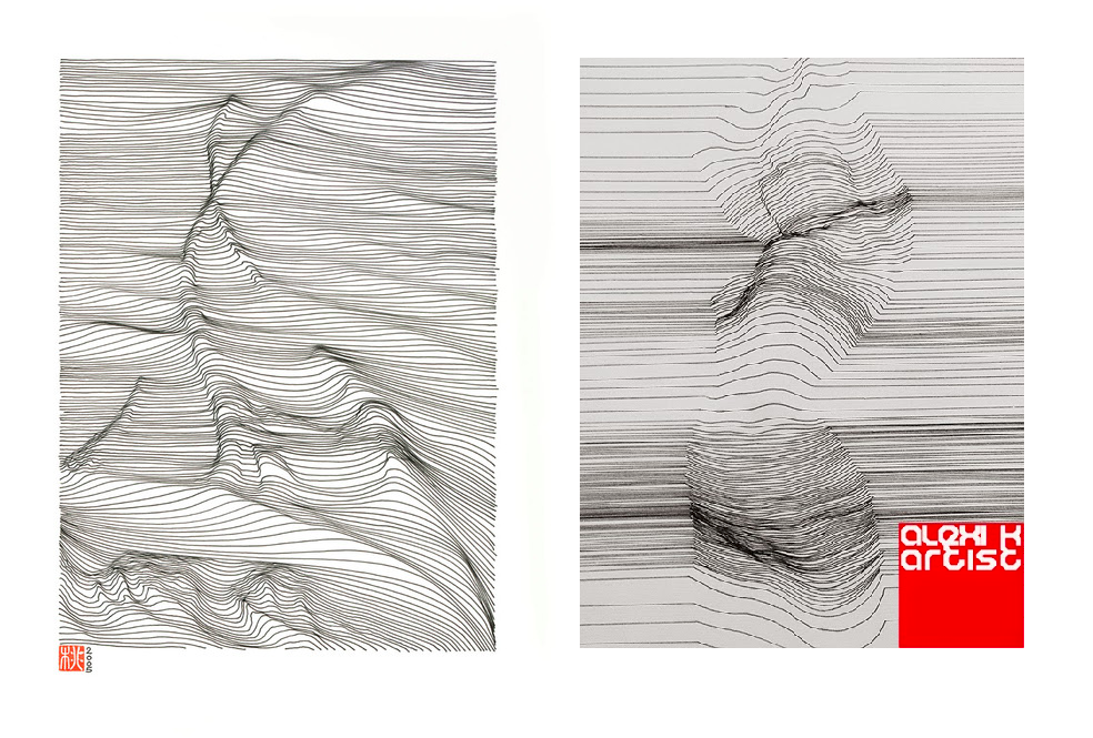
I took inspiration for the basic structure of the animation from artists such as Momoko Sudo and his Linescaping works, and Alexi K.’s illustrations of a similar nature. There is an illustration in Form + Code which inspired the procedure I would use to create the piece, and I adapted the structural aspects from the shapes from pixels assignment from class.
To begin the process I roughly sketched the image I wanted to create and made notes of how I wanted to introduce each element in relation to one another.
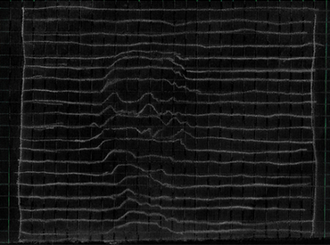
I wanted to create the effects of these pieces by drawing lines both horizontally and vertically within the frame and offsetting the x or y co-ordinates to create the illusion of form. The aim was to stick to minimal lines and monotone colours in order to emphasise the forms that were generated from the camera feed. To begin the process I roughly sketched the image I wanted to create and made notes of how I wanted to introduce each element in relation to one another. Initially, I wanted to create something as clean and as truly minimalistic as the pieces I took inspiration from, but ultimately I found that it was more interesting to me to add aspects of noise and randomness to further distort the images, and layering the images to add more of a feeling of chaos on top of what is still a very structured piece.
The original aim to emphasise the forms created with simple lines is still apparent, but the ways the lines are manipulated to distort the form becomes more of a focal point. I was very interested in using noise as a function to disrupt the order and it has effectively produced the ‘messy’ but sort of not messy visuals which I wanted to create. I stuck to using black and white, with some grey at one point in the video, because I wanted to place emphasis on the forms being created, and believe the pace of the animation as well as the overall effects are able to hold a viewer’s attention more effectively than the introduction of colour.
Narratively, the piece moves from clean structures to more confusing ones. We start with an order in the first scene, only for it to be disrupted and to appear broken. Continuously there is a desire towards remaining ordered, but inevitably it is never fully seen, only grasped at. The piece ends with dispersion – seeming to breaking down the structure, although underneath it still exists. The piece itself is interactive to the person viewing it, as the forms change according to the camera feed and the movement of the viewer – the video here only shows one iteration of the results but I attempted to demonstrate some semblance of how the image and forms are affected by movement.
References
Shapes from Pixels class assignment, Template for transitions
Reas, McWilliams & Lust (2010) Form + Code: In Design, Art and Architecture. Illustration on pp.10-11


