Stages Of Learning
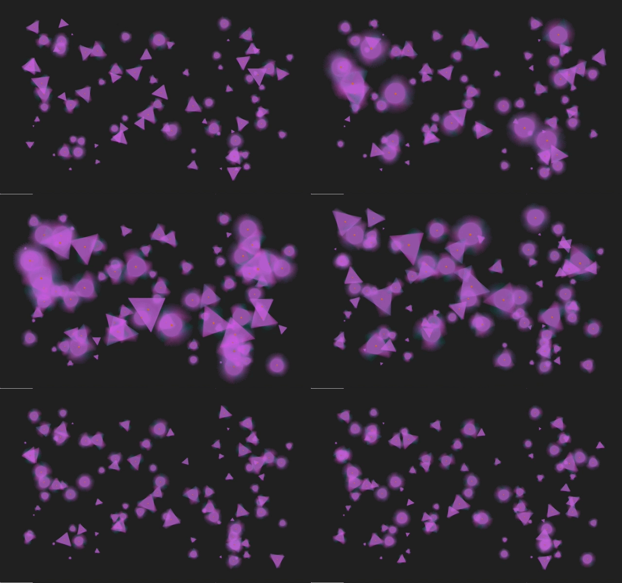
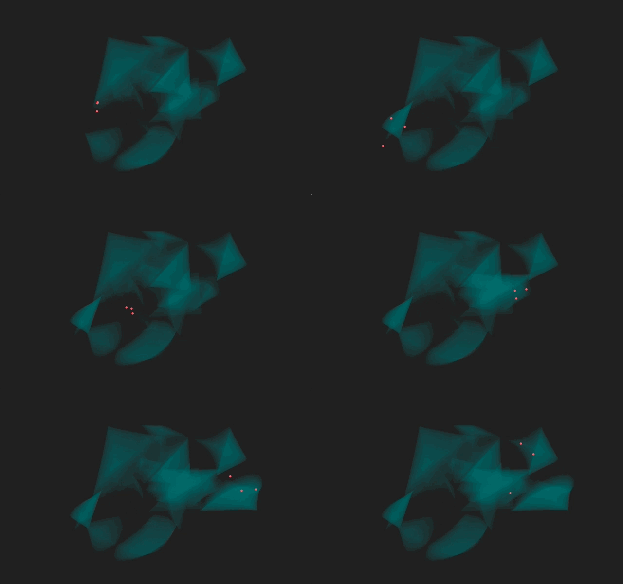
An abstract interplay of basic shapes and color that follows the narrative of the four stages of learning, juxtaposing fluid red dots (the learner) with triangular shapes in motion (the knowledge).
produced by: Tin Geber
Introduction
"Stages of Learning" is a push-pull story of basic shapes representing the dynamic between the learner and knowledge in the learning process.
Unconscious and Conscious Incompetence
The advancement of multi-layered triangles from the edges of the screen (or the borders of the projection object) is methodical, regular, but uncontrolled by the learner: it represents gaining awareness of knowledge, before gaining the ability to use it.
Conscious Competence
In this learning phase, the learner takes conscious control of knowledge and starts creating their own shapes with their own colors — each object on the screen is an overlay of 100 triangles, constrained in a rotation sequence that forces them into a circular shape. At the center of each shape the learner, represented by a red dot, sits and weaves the shapes.
Unconscious Competence
The learner effortlessly creates, having absorbed knowledge to the point in which it is no longer a conscious exercise, but a seamless, intuitive act. The three red dots fly around the surface, leaving a trail of transparent triangles in their wake that evoke three-dimensional spirals and an illusion of depth.
Background and technical details
I was influenced by the potential of Perlin noise to describe a "humanly random" motion. All the shapes have been animated with attention towards a humanly recognizable fluidity; sometimes by accumulating more than one layer of movement to produce unexpected results.
Overlays and multiplications play a big role in defining shapes, usually by slightly reducing opacity and starting positions of shapes to create an elastic feel to rotations and movements.
Self evaluation
While I am satisfied with the ideas and their execution, I didn't take into account real-life difficulties of projecting onto less-than-ideal surfaces. Hundreds of transparent overlays lose their effect when projected onto brown cardboard through a dim projector. Additionally, I believed that choosing a dark background will make the objects stand out more; instead, smaller objects fgot lost in the emptiness and reduced the effect.
in the future, I will pay much closer attention to the final medium when designing a project.


