Saturation
Saturation is projection mapping piece which transitions through three distinct scenes which explore different image and video manipulation techniques to visualise colour distortion, form abstraction and motion.
produced by: Karen Okpoti
Introduction
The focal point of this piece was to create abstractions and distortions of original images and videos. This was to re-imagine the different ways colour and movement can be generated to alter the viewers perception. The original images and videos themselves were selected deliberately because of their distinct and varying colours and shapes. I gain much inspiration from nature aswell as natural colours and forms. Therefore, I purposefully wanted to avoid using much additional colour in my code to cherish the richness of the natural saturation as a base for further manipulation.
Concept and background research
Artist Quayola’s piece Jardin d’ete was the main source of inspiration for my first scene which pays homage to the impressionist art movement. Therefore, the sketch ‘Jardins’ itself encapsulates the abstraction of nature and challenges how it can be observed. The idea was to use ordinary subject matter to visualise and accentuate generative motion while encapsulating different visual angles. This is a response to the visualisation of the passage of time when using a still image. Thus, manipulating the perceived image through incremental distortion by the inclusion of additional shapes and lines and creating a flow field effect using perlin noise.
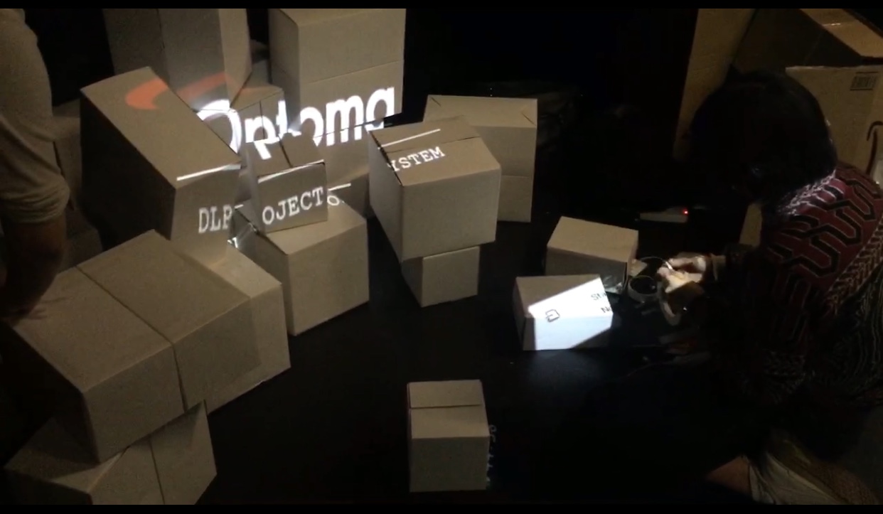
I also wanted to pay tribute to the structure of random boxes themselves which mimicked old 90s television screens and broadcast style. This idea conceptually inspired my second sketch ‘Through the circle lens’, which includes an image of a street in Bordeaux and a video of a butterfly sanctuary. Here, I recreated an effect using the ofDist function to determine the pixel distance to a mover object to create a circular screen interface. The third iteration of this concept was ‘Get out’ which is the idea of a trapped figure in a box, inspired by Edward Munch’s painting ‘The Scream’. This piece represented the anxieties faced by the modern man. I reimagined this artwork as a moving piece which creates a 3D illusionary effect.
Technical
As this project was developed in OpenFrameworks this was bound to be an iterative creative process of continuous incremental modification. All three scenes relied heavily on grabbing data from ofPixels which had a high risk of affecting the speed, which it did. Therefore, finding more efficient ways to display this data by only selecting and manipulating certain pixels at a time was the best solution. Furthermore, using lower resolution pixel data was necessary. Therefore, I had to reduce the number of shapes generated in the grid or on the screen. In the second sketch ‘Through the circle lens’ I slowly transitioned the scene from colour to monochrome using the sine and getlerped function whilst only allowing viewers to see a particular section of the image at a certain time interval.
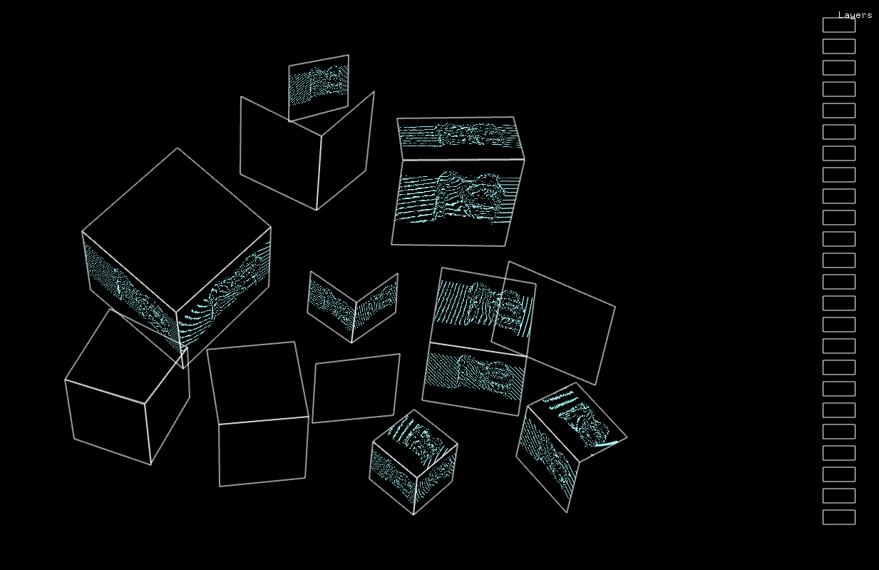
The boxes themselves were spaced intentionally to create asymmetry. However, the largest squares or rectangular faces were steered forwards towards the viewer to create a clearer and less complex structure. Collectively as a group, we discussed how many faces we wanted showing and at which angle, therefore some boxes were tilted slightly and some were straight. The final structure was efficient and worked well.
Future development
In the future I would actually consider using a lot more boxes as I feel like the space the boxes occupied was very minimal and did not quite achieve the affect I was hoping for. This may allow for more detailed visualisations at a lower resolution. I would also perhaps use sketches which were more suitable for the projection mapping surfaces. Some of my sketches were not very clear when actually projected it was often hard to decipher any specific detail. Therefore, I would use simpler shapes and patterns which truly accentuate the structure of boxes.
Self evaluation
On the days leading up to the exhibition I faced many issues regarding colour changes when importing sketches into ofPiMapper aswell as issues with lower detail and resolution when projecting. I went back and forth and had to move around a lot of code to get my projections working. In hindsight I see that this was due to perhaps a lack of efficiency and modularity in my code. Hence why I faced many issues with lagging also. However, this was a very big learning curve and I feel that moving forward I am more equipped to structurally develop more complex code.
References
Code
Noisy Lines - Code reference from https://www.openprocessing.org/sketch/426206
Benedikt Gross, Julia Laub, Claudius Lazzeroni, Hartmut Bohnacker (2012), Generative Design: Visualize, Program, and Create with JavaScript in P5.js, Chapter P_4_3_1_01.
Conceptual
Quayola, V2 Publication (2017). https://v2.nl/events/jardins-d2019ete-museumnacht-010
Quayola, landscape paintings (2017). https://quayola.com/work/series/landscape-paintings.php
Edvard Munch 'The Scream' (1893). https://www.edvardmunch.org/the-scream.jsp
Music
Ice_Mocha - https://freemusicarchive.org/genre/Hip-Hop


