Merriweather Post Pavilion
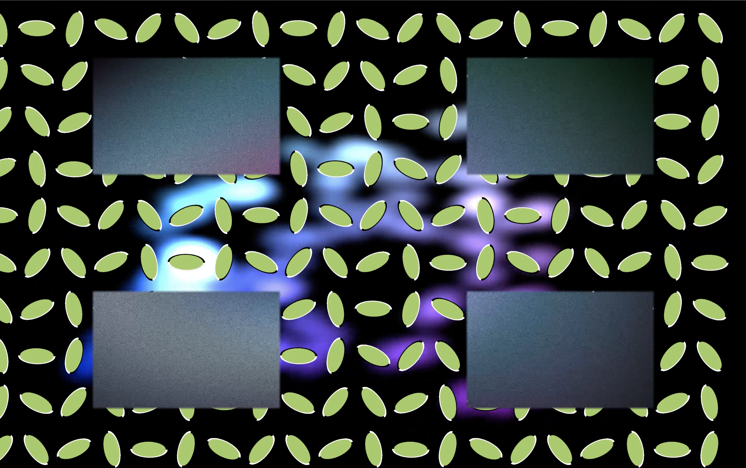
Merriweather Post Pavilion is an audio-visual installation that reimagines the aesthetic of Animal Collective’s experimental pop album of the same name.
produced by: Armando González Sosto
Introduction
Drawing inspiration from colorful visuals and psychedelia, Merriweather Post Pavilion aims to explore the possibilities of installation art in home spaces under lockdown. Instead of creating a prototype for a piece to be displayed in a different space in some possible future, I wanted to create a piece that was meant for a space I currently have access to.
Merriweather Post Pavilion looks to repurpose devices commonly found in households, specifically televisions and smartphones. The piece attempts to create an interaction between these devices and hopefully invites the audience to question the usage these machines have on a day to day basis. Can the combination of these devices have a beneficial effect on individuals that goes beyond their traditionally dictated usages?
Sound is an important part of this piece. However, instead of manipulating the source material through DSP, I decided to leave the music as found on the original recordings. I’m not looking to modify the original source material, but rather, I’m looking to build on top of it. This comes through the addition of visuals that interact and re-contextualize the sounds and experiences from the original recordings.
Concept and background research
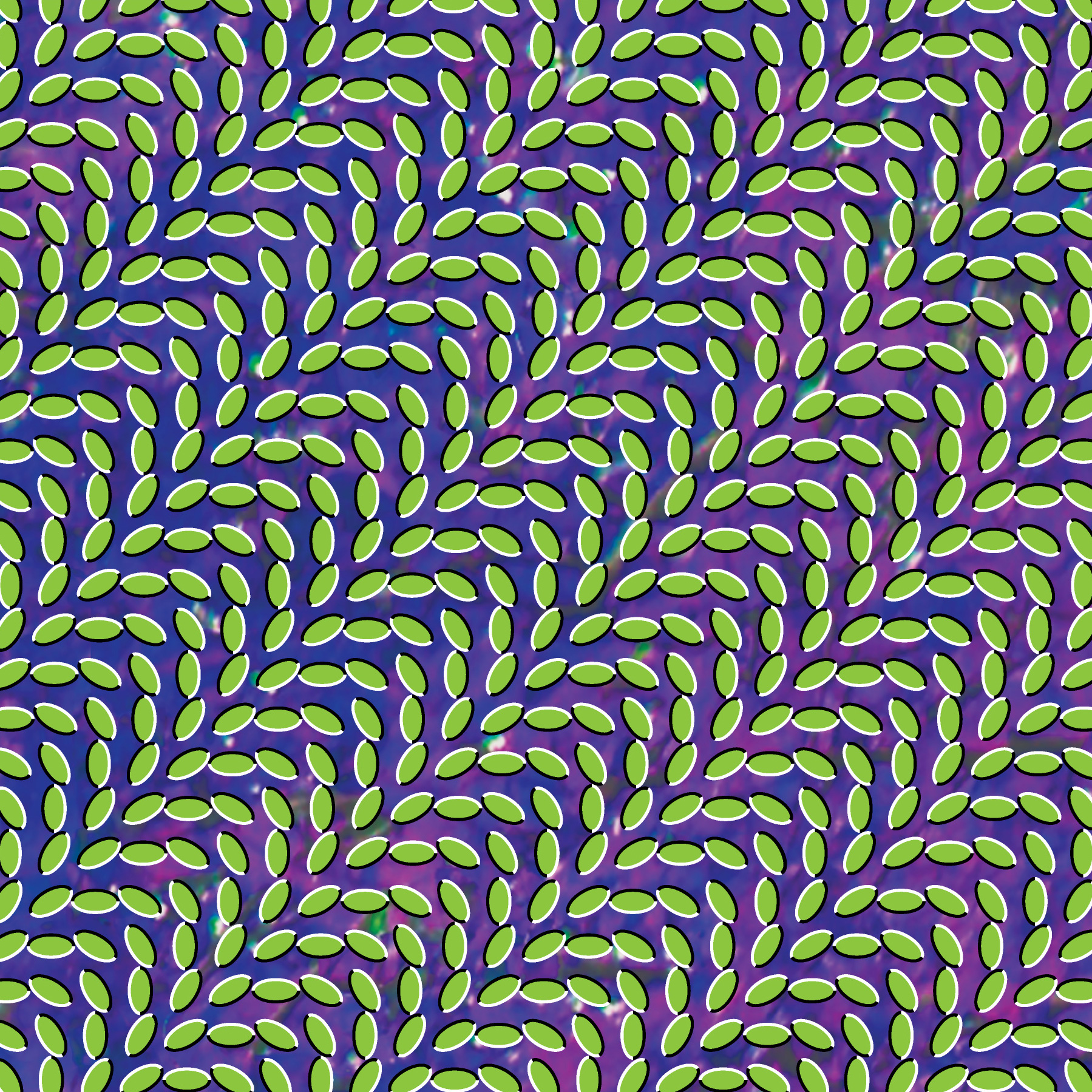
An important source of inspiration comes from the visual material released by the band themselves. Out of the material released, the album cover is of particular importance. The cover art, created by Robert Carmichael of SEEN studio, uses an optical illusion called illusory motion, which creates the perception of movement from static images. This field of work is highly influenced by the work of Akiyoshi Kitaoka, a psychologist working in the field of perception.
Merriweather Post Pavilion album cover
Some other important references include the music videos released by the band, especially the videos for the songs My Girls and Brother Sport. The video for My Girls, animated by Jon Vermilyea, was particularly inspiring due to its colorful imagery and celular motion. The video for Brother Sport also clearly demonstrates the playful, joyful and psychedelic nature of this band’s music, which served as a spiritual inspiration for the interactional parts of the piece.
Brother Sport music video
Setup
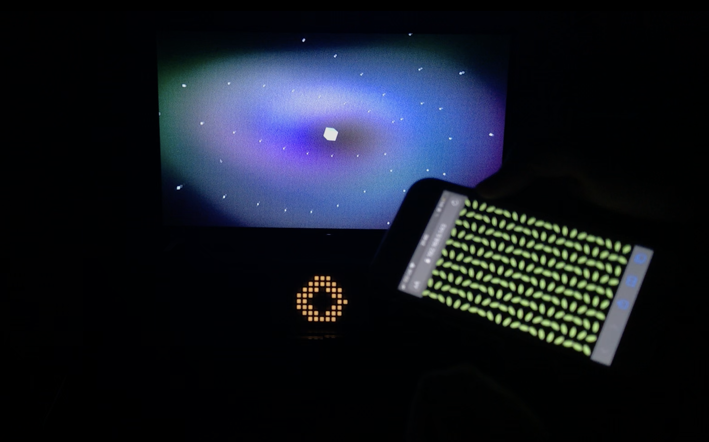
The setup consists of three main points of interaction: a television, a mobile phone, and a monome grid controller.
setup - television, monome, and phone
Television
The television serves as a central focal point of the performance. Its usage is rather conventional, and it can be thought of as the main pillar of the visual component of the piece. The television is connected to the computer via HDMI.
Mobile Phone
The desire to incorporate mobile phones into the piece comes from their ubiquity. If a friend comes to my flat, it’s likely that they will have a smartphone. I believe this is a convenient way to create interaction between a piece and an audience member, as they can simply rely on hardware they already have.
Many artists working with mobile phones and computers use applications like GyroOSC or TouchOSC, which stream data from a phone using the Open Sound Control protocol. However, having to install paid proprietary apps significantly limits my idea of convenience, so that makes these apps unviable for my project.
I wanted my audience to use their own mobile phones, but I didn’t want them to install anything. These specific requirements resulted in the development of a custom Node.js server which serves as an intermediary between the phone and the computer.
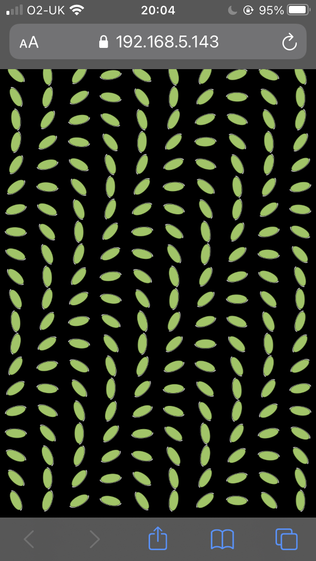
a screenshot of a phone running the site
monome grid
The monome grid is a grid controller with buttons and variable brightness LEDs. This controller is often used in music performances, but it has a very open and programmable interface which allows developers to develop software to communicate with it in specific ways. I think of the monome as a lo-res touchscreen display, which is how I incorporated it into this piece. The monome is used as a monochromatic 16x8 display that contrasts with the high fidelity found in the other displays used in the piece.
monome grid running a sketch
Technical
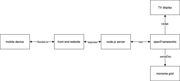
a simplified architectural schematic shown for illustrative purposes
The project is divided into two main technical components. The openFrameworks component of the project handles all of the visual and audio playback, and essentially serves as the “core” of the piece. The Node.js server handles the communication between mobile devices and openFrameworks.
Node.js
I developed my own solution for phones and openFrameworks to communicate in the specific way I wanted. I built a Node.js server which serves (using Express) an interactive site to mobile phones that visit its URL. In order for a participant to take part in the piece, they need to visit a specific site on their phone’s browser, which handles all interactivity. To ease the process of accessing the site, a QR code including the web address is presented on the screen while the piece awaits an audience member to engage with it. Additionally, to limit latency issues, the node server always runs locally on the same computer as openFrameworks.
The Node server consists of two main parts - a website that is delivered to the mobile phone, and an application that communicates data from the website to openFrameworks.
The website itself consists of two main parts. Firstly, it takes motion data from the phone’s browser using the DeviceMotionEvent WebAPI. This API reads values from the phone's built-in accelerometers and gyroscopes. Secondly, it uses p5.js to create an interactive visualization on the screen of the phone. This means that the piece also uses the phone as a third display.
The website communicates with the Node application using SocketIO, a library that uses different communications protocols (including WebSockets) to establish a full-duplex connection between two nodes in a network. This means that every time that a new DeviceMotionEvent action is detected, data is sent from the phone to the server using SocketIO. The Node application then takes this data and passes it onto openFrameworks through OSC by using the ts-osc library.
This system enables users to control sketches using their own phones, but it also enables artists to extend beyond the central screen and display custom visuals on the audiences devices.
openFrameworks
OpenFrameworks handles all of the visuals displayed on the television screen and on the monome grid controller.
The monome communicates with a computer through a serial port, which means that the data can technically be accessed in openFrameworks using ofSerial. However, the monome community has developed a program called serialosc, a server/daemon which serves as an interface for the monome and makes its usage more convenient. Serialosc basically converts serial events into osc messages (and vice versa), which makes messaging easier to handle and understand. Instead of working with ofSerial to read and write data directly into serial ports, the piece uses ofxOsc to communicate with serialosc, which then communicates directly with the monome.
All messages sent to the monome are handled as pixel information within openFrameworks. Pixel values from 16x8 images are converted to brightness values that the monome can display. Low-resolution FBOs are used to enable basic openFrameworks drawing functions which are then decimated into 16x8 images which are then read and passed into the monome. This allowed me to explore the low-resolution, often aliased graphics I wanted to display on the monome, while still using simple drawing instructions openFrameworks provides.
FBOs are also a central part of the TV graphics developed for this piece. Around 7 sketches were developed, all of them drawn onto FBOs, which are then contained within a custom class called CoreChannel. In the context of this project, a channel is a class in which drawing is performed. Textures can be then extracted for drawing onto the main class. The CoreChannel class is inherited by different specific implementations of channels.
In the main class for the project, textures are taken from the channels which are then mixed by using a custom fragment shader used to mix between different textures. This allows to cut and mix between different channels of visuals, an approach not unlike how audio mixers work.
blending between 3 sketches - a possibility afforded by working with FBOs and GLSL fragment shaders
All of the sketches are orchestrated using a score, written within a JSON file and read using ofxJSON - an approach similar to the one taken in my previous piece Unload, developed last term. However, in this case, I developed my own custom class to read from the score. The score is only used as a timing mechanism, as parameter control is done directly within the code of the program.
Fragment shaders also constitute an important part of the development of the piece. They are used mostly as video source generators, but are also briefly used as video processors as well.
Future Development
One of the main ideas I’d like to develop with this piece is in integrating multiple phones at once, representing the presence of multiple participants in a meaningful and interesting way. I also want to further develop the “full-duplex” communication part of working with SocketIO. This means I want to have a larger degree of coordination between what is displayed on the phone and what is displayed on the screen by using OSC to communicate score messages from openFrameworks back into the phone, and not just sending information from the phone to openFrameworks.
Additionally, I believe that the approach used of working with FBOs as channels is incredibly flexible and appealing to me, so I believe I can use this as a basic approach for more complex systems that could potentially be used as live performance systems. In the past, I’ve worked with Max/MSP for live graphics using OpenGL with a similar approach, but this project leaves me thinking that the approach implemented for this project would be more convenient for the types of things I want to do, which is exciting.
A decision I took during the development of the piece was to remove some computer vision algorithms I was planning on including in the piece. I decided this due to the fact that I wanted most of the interaction to be centered around the smartphone and the television. I felt computer vision didn’t fit organically into the concept so I removed it, but I am still curious to further integrate some of these ideas, possibly in a version of the project that doesn’t rely so much on the idea of a “living room” as this one does.
I found my favorite visual pairings to consist of interactions between monochromatic color schemes and very colorful palettes, which was somewhat limited in this piece. I would like to see some more of this in future works, as I feel this juxtaposition creates an interesting combination of colors.
Self Evaluation
I believe this piece is satisfying to watch, but I also believe it requires more score development in order for it to work with any piece of the album. It works the best with the song In The Flowers (used in the video demo), but it needs more time for each track to have a satisfying interaction. So in this sense, I think I accomplished the biggest goal, which was to augment the experience of the music, but I’d still need to polish it more for this to be true in the case of every song of the album.
I think the phone integration is quite usable and satisfying as it is, but I believe this integration could be better. I also think that there could be a higher degree of interaction with the sort of feedback that the phone receives - I think that despite being interesting and engaging, the current implementation doesn’t go as far as it could potentially go in terms of taking advantage of this new layer of communication. Additionally, in some brief instances there were strange cases of jittery and choppy lags, which I need to look into. Interestingly, I believe this has mostly to do with the phone itself, as when it was fully charged it performed considerably better.
I also think it could’ve been good to have a higher degree of interaction with the monome by allowing the audience to press buttons. Technically one of the monome sketches does respond to button presses, but I placed the device in a position where it’s not convenient to press buttons - I prioritized the placement aesthetics over the interaction, which I feel comfortable committing to, but I also think it could be interesting to consider other solutions that enable both options.
In conclusion, I’m generally very satisfied with the piece, as I believe it manifests the ideas I set out to accomplish. I enjoy the innovation that this project led me towards, and I’m happy with the discoveries made by wanting to integrate the phone in an unconventional way which led into many new ideas. Despite limitations, I believe the phone and monome integrations open exciting new areas of opportunity for future developments, and in general, I find it really enjoyable to watch the piece.
References
Documentation
https://socket.io/docs/v4
https://developer.mozilla.org/en-US/docs/Web/API/DeviceMotionEvent
https://riksolo.pages.riksolo.com/ts-osc/
https://www.npmjs.com/package/https-localhost
https://monome.org/docs/serialosc/serial.txt
https://monome.org/docs/serialosc/osc/
Tutorials
https://medium.com/factory-mind/websocket-node-js-express-step-by-step-using-typescript-725114ad5fe4
https://kongmunist.medium.com/accessing-the-iphone-accelerometer-with-javascript-in-ios-14-and-13-e146d18bb175
Referenced Code
https://gist.github.com/patriciogonzalezvivo/670c22f3966e662d2f83
All sound in this piece is written by Animal Collective


