Memphis in Motion
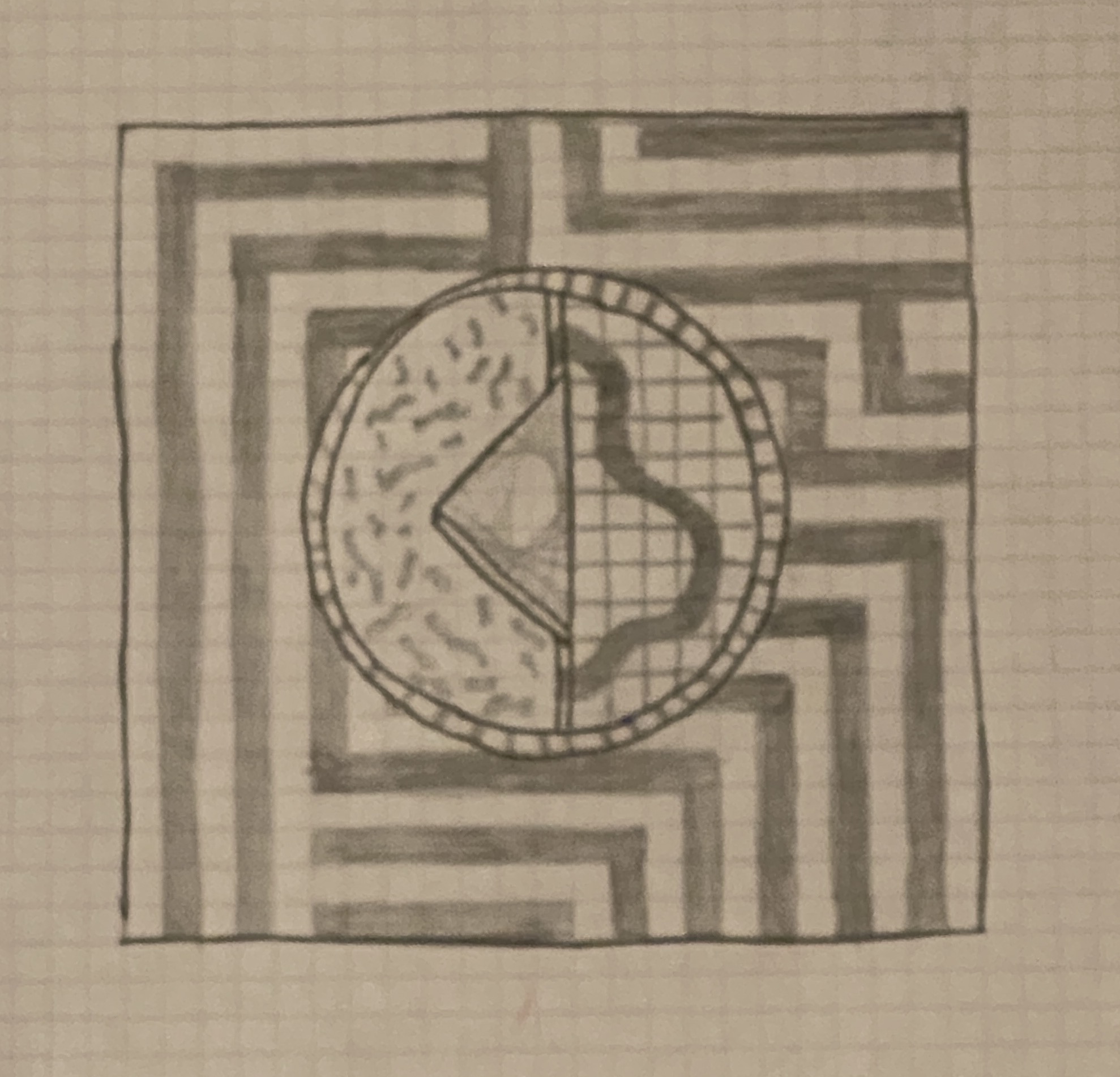
Inspired by the Memphis Design moment this projection mapping adds movement to the bold, colourful and eccentric style.
produced by: Eleanor Edwards
Introduction
The visual aesthetic of the Memphis movement focuses on structure, strong lines and divisions, contrasting and complimentary geometric forms, repetition and clever uses of bold, block colouring. This style has long been a favourite of mine. The reason I wanted to use this as a jumping off point is two-fold, the patterns and composition within Memphis works, which are often static graphic prints, interior design forms or murals, allude to kinetic forms, I wanted to add to these almost illusionary pieces of work by extenuating the kinetic feel with actual motion. My own visual style has similar traits to Memphis Design through the use of colour, in perhaps unusual ways as well as frequent use of geometric shape and pattern. Therefore I aimed to combine and collaborate these visuals for a bright, visual exciting and eye-catching journey.
Concept and background research
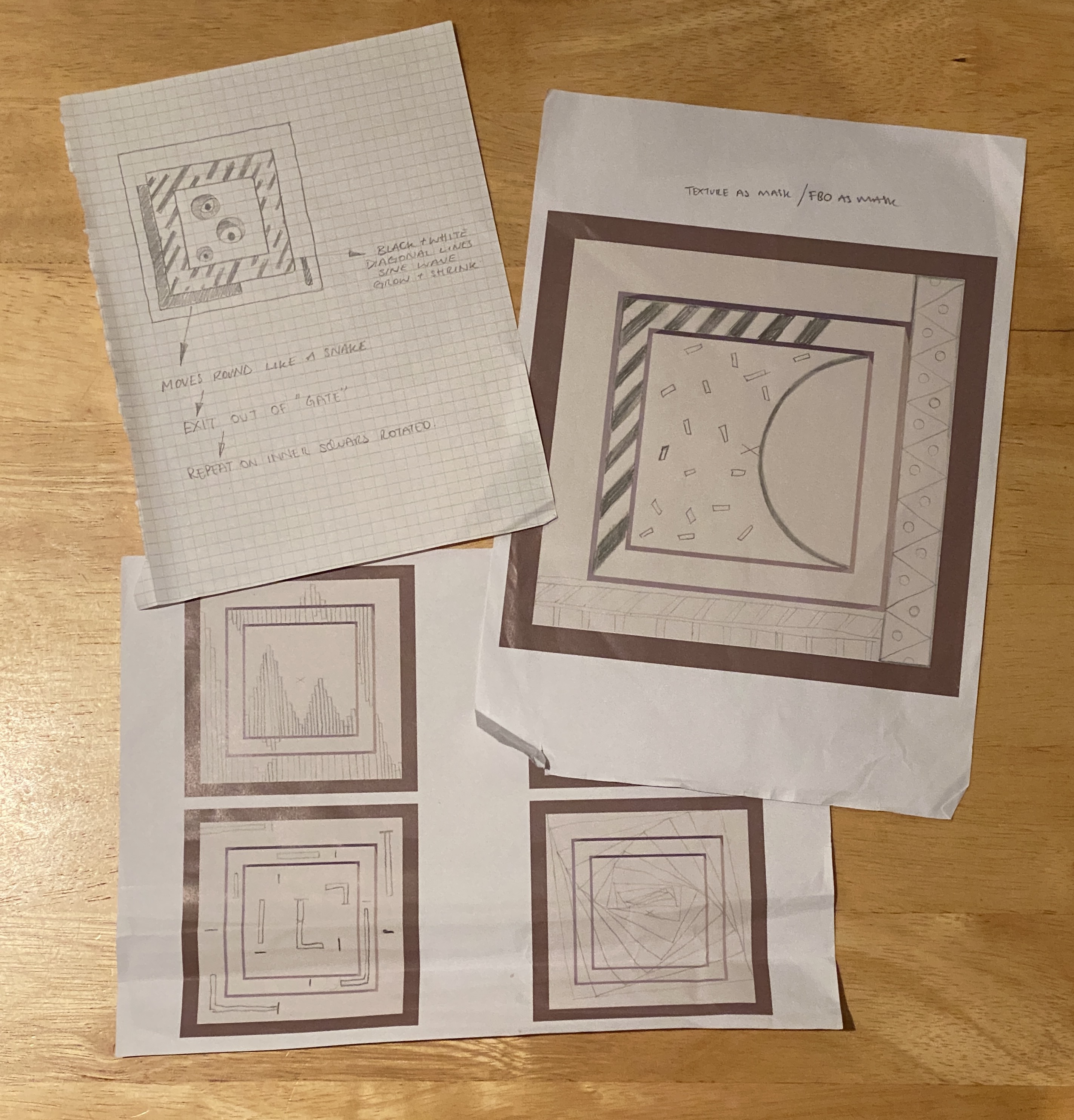
As stated above the two concepts were; to use Memphis style as inspiration and blend this with my existing visual style. Therefore my research was highly visual. Collecting and examining images of artistic work within the Memphis Movement. Defining key visual themes which then provided the starting points to create animated graphics.
The concept initially based around the physical shapes to be a variety of geometric forms: squares, circles and triangles. However the majority of the group wanted to focus on a repeated singular shape, a drop structure of squares set intruding and extruding each other. This required adaption of my initial vision and implemented a structural and visual restriction I would rather have avoided as one of the beauty's of Memphis is its ability to inspire complimentary forms with what would otherwise be consider disparate shapes. To over come this I designed my animations to include the varied geometrics I had hoped to have as physical frameworks.
Technical
The basic and repetitive forms within my designs could be considered simple therefore the animation used to allow the visual strength of this style to show needed to be smooth and uninstructive whilst setting the core elements in contrasting and visual powerful arrangements.
To set up the many repetitive forms I used loops and vector arrays to allow easy population. The use of the sine function enabled flowing, smooth animation to set up striking white sine wave columns and powerful black and white stripes. These stripes, due to the monochrome contrasting with the bold coloured central Memphis style animated image proved a good transition. I outlined a limited colour palette which I used across the animations, yellow, pink, blue, orange, purple and then black and white. This helped carry the visuals through the geometric Memphis sections to the more abstract rotating squares section more characteristic of my own visual style.
One of the biggest technical struggles I overcame was the alternating coloured triangles, I was easy to get them to be alternating pink and orange, but required implementation of multiple Booleans and if statements to check the current state then change to the next colour state in a visually pleasing way.
Self Evaluation & Future development
This project was a good opportunity to consolidate all the learning from term 1. As well as providing space for experimentation and longer development of pieces than the weekly assignments, overall I had a lot of fun. I really wanted to challenge myself to write all my code myself, as this is the best thing for my learning style. Therefore other than visual inspiration I did not look for other inspiration in the form of code. This was a double edge sword. Although this process has allowed me to cement some key fundamentals into my learning now and conquer topics I had been struggling with in class, vectors for example. Restricting myself to using only class work, online tutorials and then C++ documentation, openFrameworks documentation and the class examples to work through any problems meant my work doesn't push too far past the realms of my technical capability. However the understanding I now have is more important to me at this stage and in the future I will be able to use this to push the boundaries of the work further.
If I were to do the project again I would use a variety of physical shapes as this is more inline with the initial concept and would encourage more expression within the style of animation used.
References
Week 5: Number Generators
Week 7: Algorithmic Thinking
Lewis Lepton https://www.youtube.com/channel/UC8Wzk_R1GoPkPqLo-obU_kQ
openFrameworks https://openframeworks.cc/documentation/
C++ http://www.cplusplus.com/


