Hit-Strike-Play
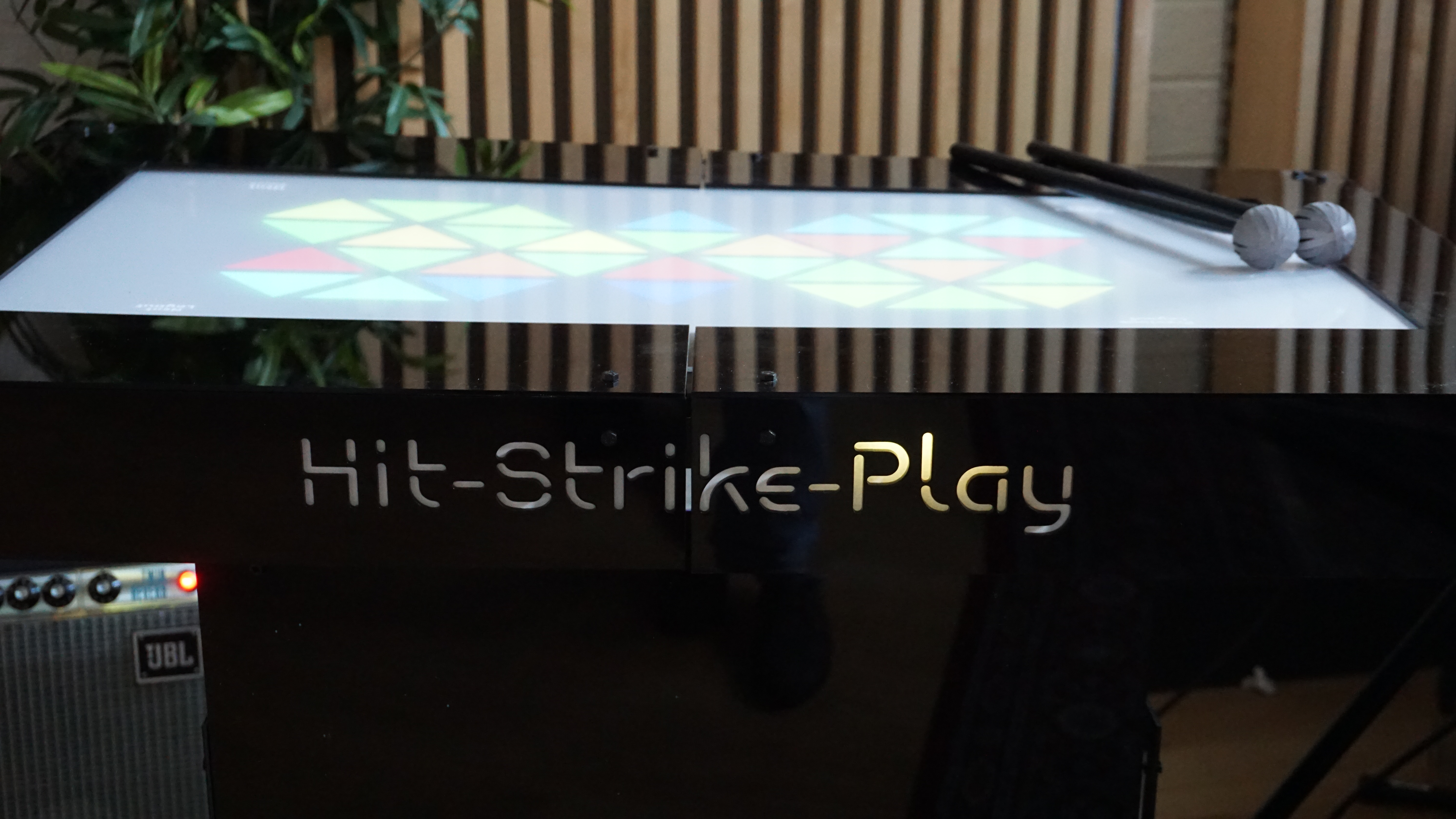
Hit-Strike-Play is an installation exploring layout design and interaction with digital musical instruments using computer vision. The different layouts challenge traditional instrument design idioms by allowing total creative freedom while making music in the digital age.
produced by: Amit Segall
Introduction
The installation balances the cognitive and visual feedback of a digital interface with a physical musical instrument. While providing users with a familiar tactile design of a percussion instrument, any user is able to play music. The installation can be used as a solo act, a collaboration tool, a studio instrument and for a performative purposes. Hit-Strike-Play highlights the interface as the key factor in the user-interface-musical output relationship, by allowing users to experiment with different design aesthetics and musical concepts using an intuitive approach and modern technology.
Concept and background research
The inspiration for this project came from reading the book Push Turn Move by Kim Bjørn about interface design in electronic music [1]. While the book offers a framework to analyse different aspects of an electronic musical instrument, I wanted to focus around layout design for digital instruments. I wanted to design a tool that will allow easy exploration of layouts and offer a way to examine new musical relationships. These ideas will allow me to highlight visual feedback, familiarity, color and consistency.
The role of layout design in a musical controller is rarely discussed in the computer music field [2,3]. While there are works that explore different musical layouts [4] I could not find one that highlighted the importance of the design and it’s possibilities. Therefore, my goal was highlighting different layout designs and explore ways to interact with them. My approach for interacting was inspired by Aerodrums [5], a computer vision application that allowed playing drums in the air using a camera and reflective markers. I thought it could be a great approach for interacting with the layouts since it offered familiarity of a musical instrument.
The exploration of layouts could have been presented in many ways, however knowing my work is going to be publicly displayed in an exhibition settings, I decided to design an interactive table. Having a table meant it is familiar and fun to explore, more than one person could interact with it and it is self-explanatory. A table offers a tactile feedback by hitting a surface as opposed to playing in the air and also able to display the layouts and visual feedback on its surface.
Design
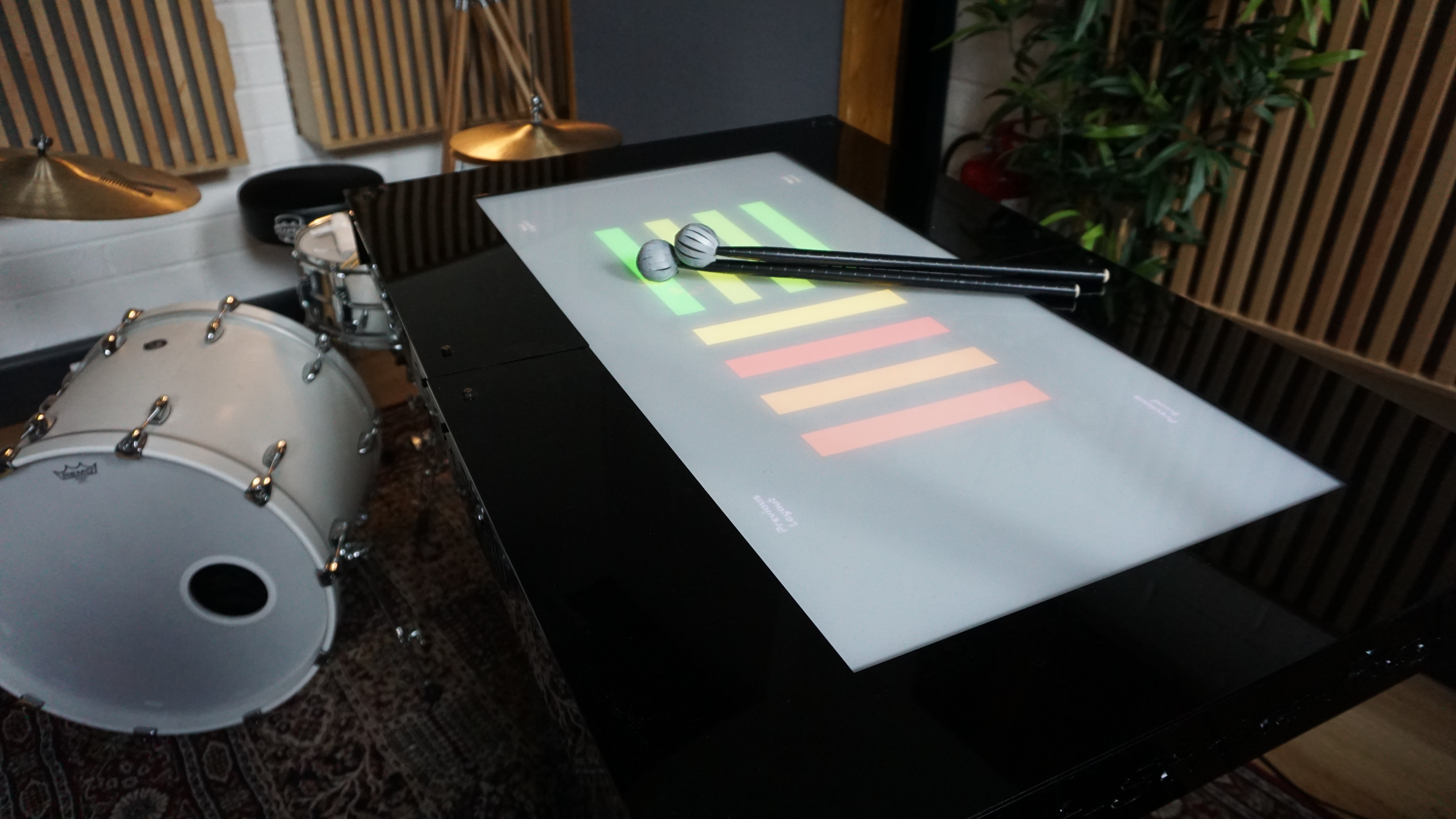
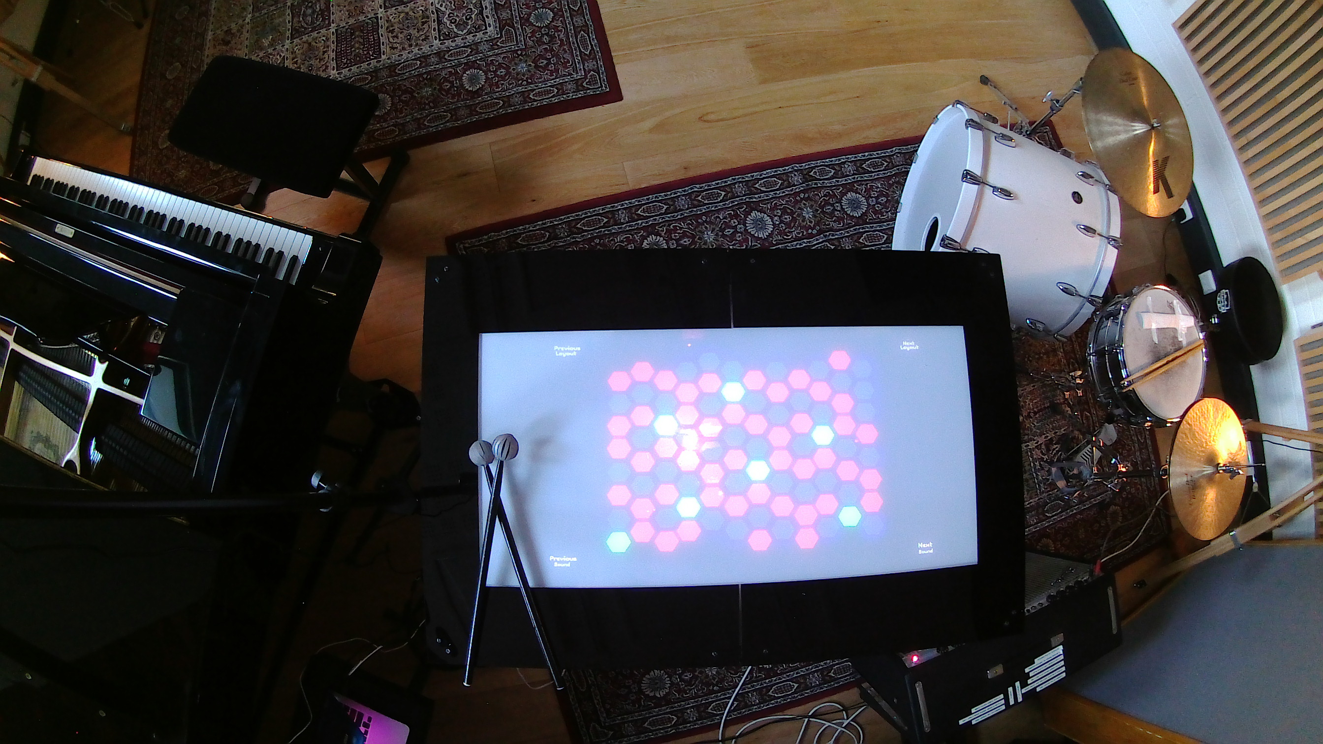
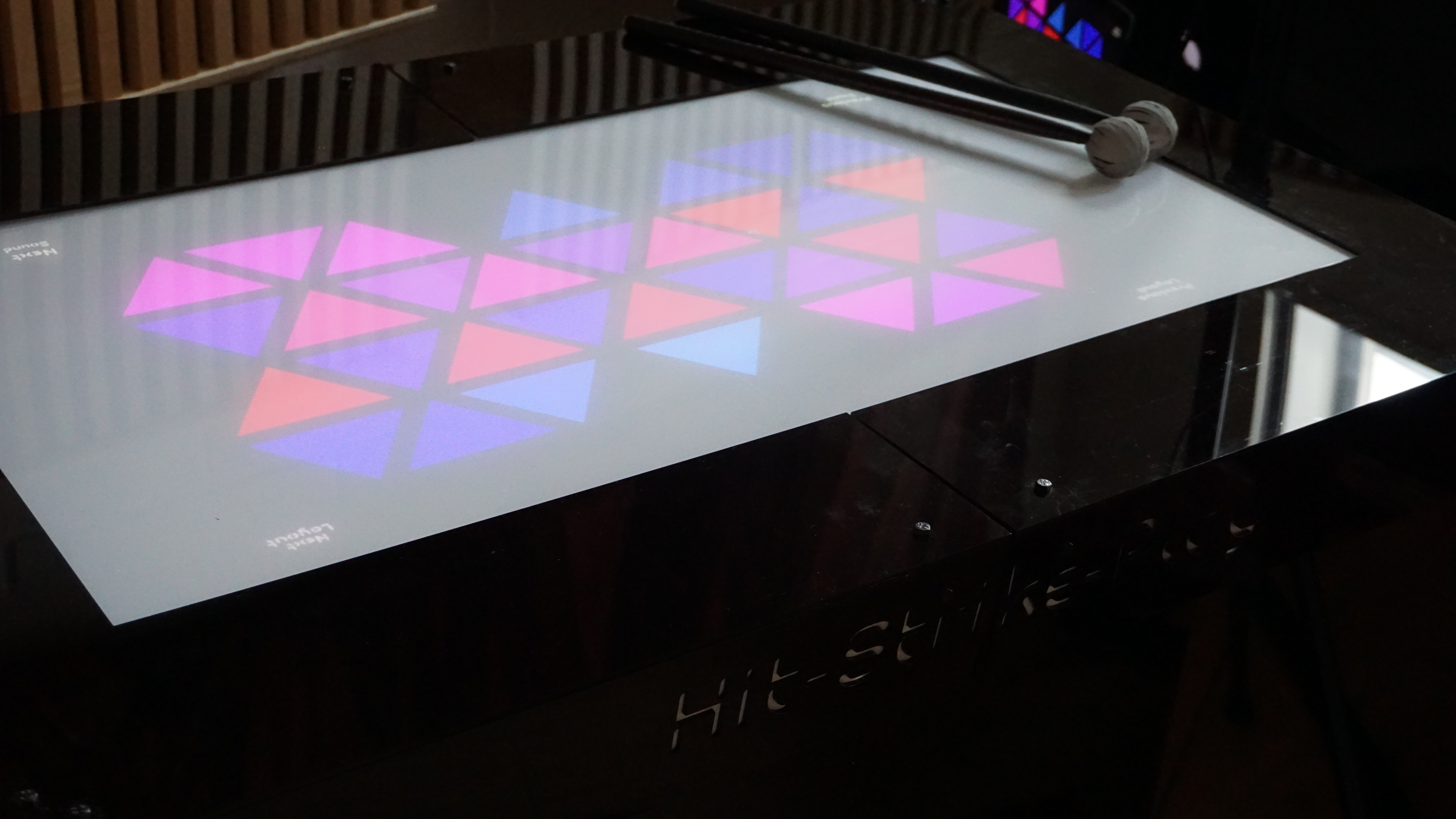
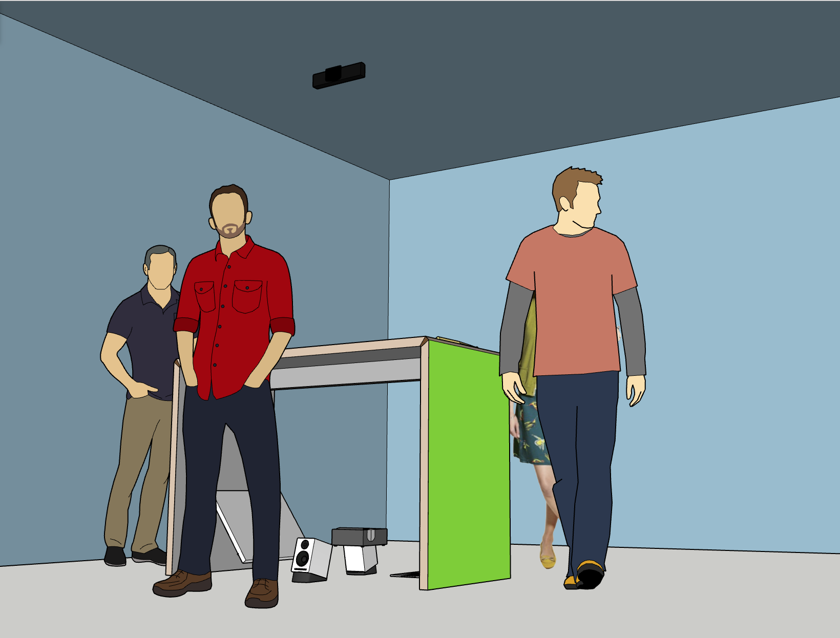
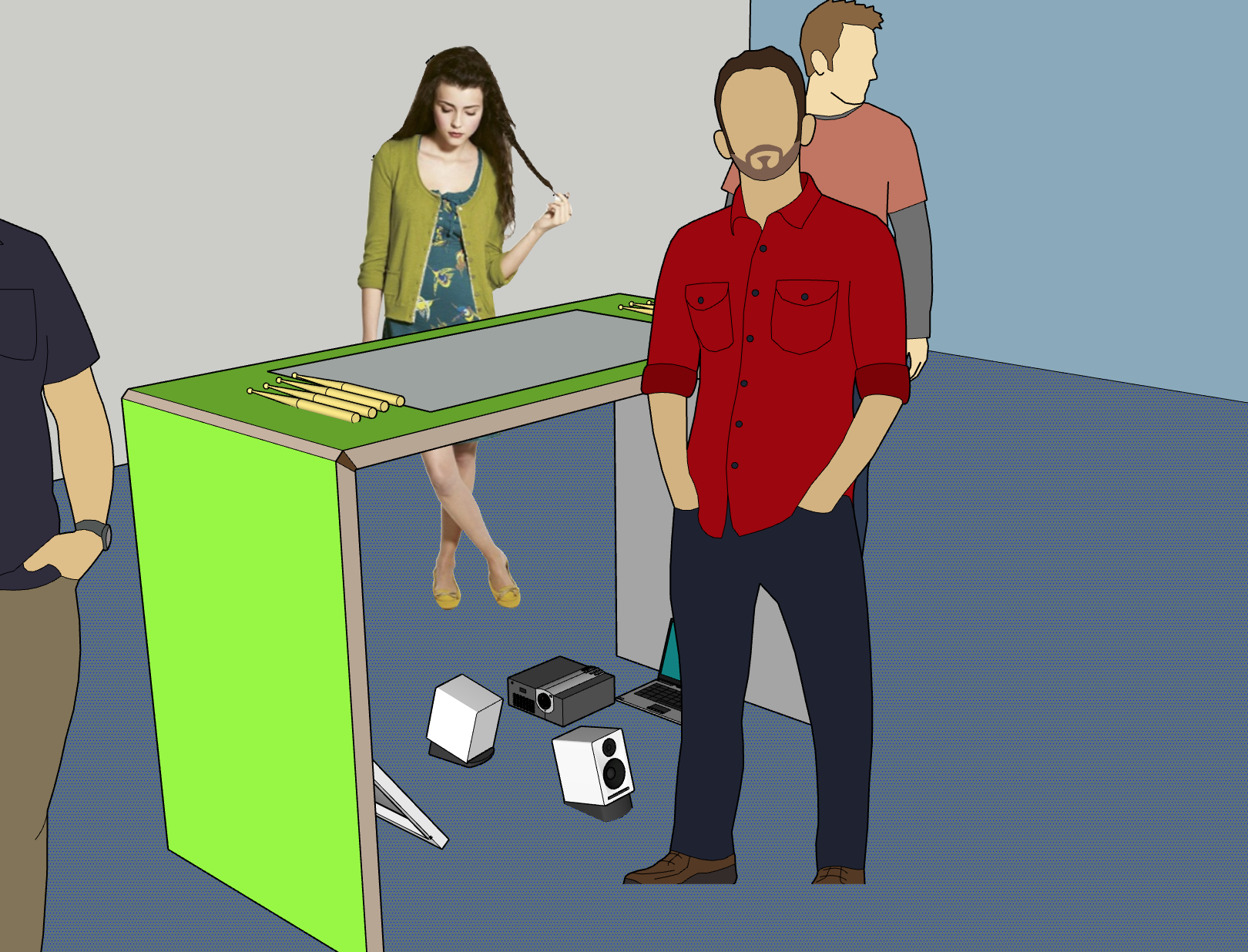
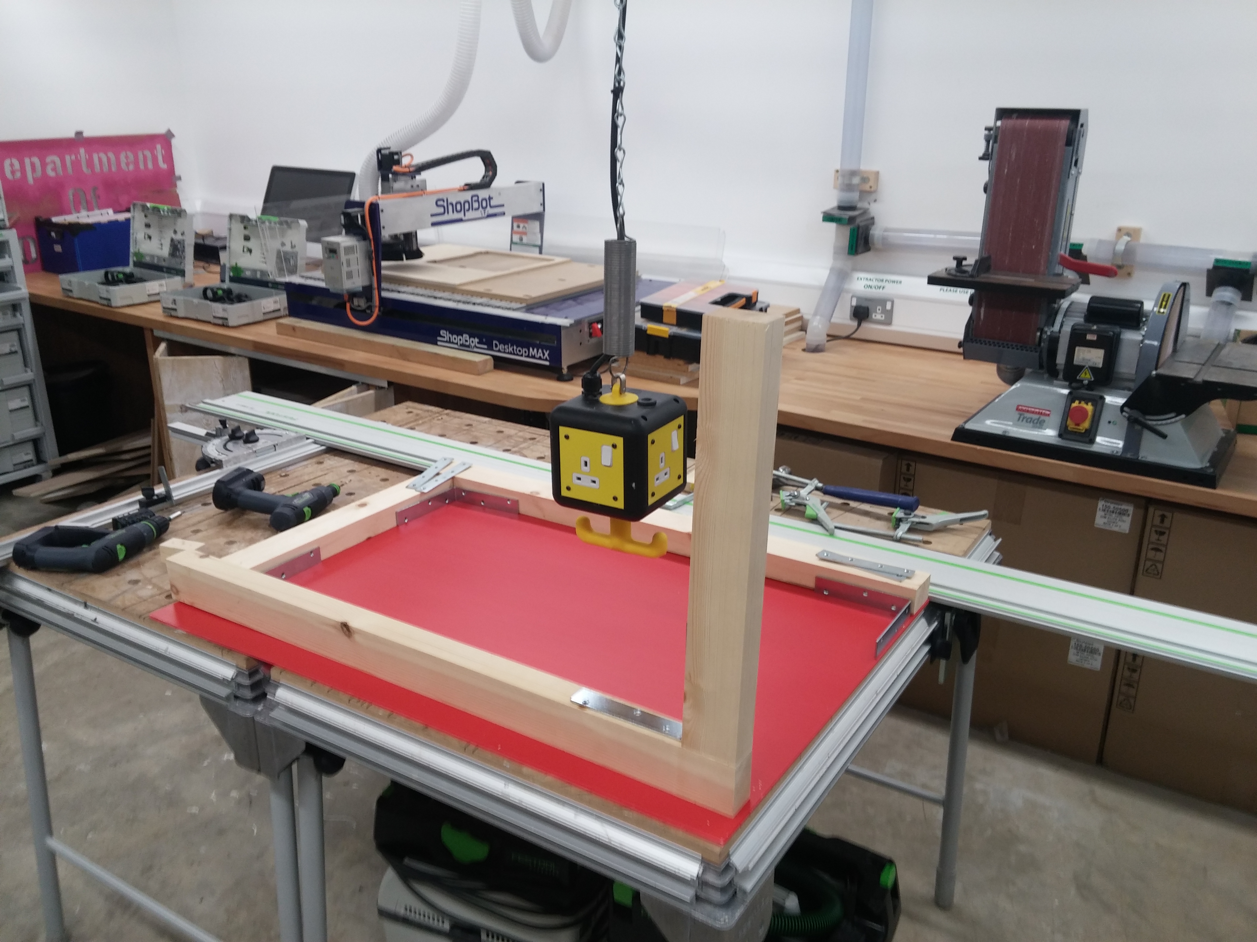
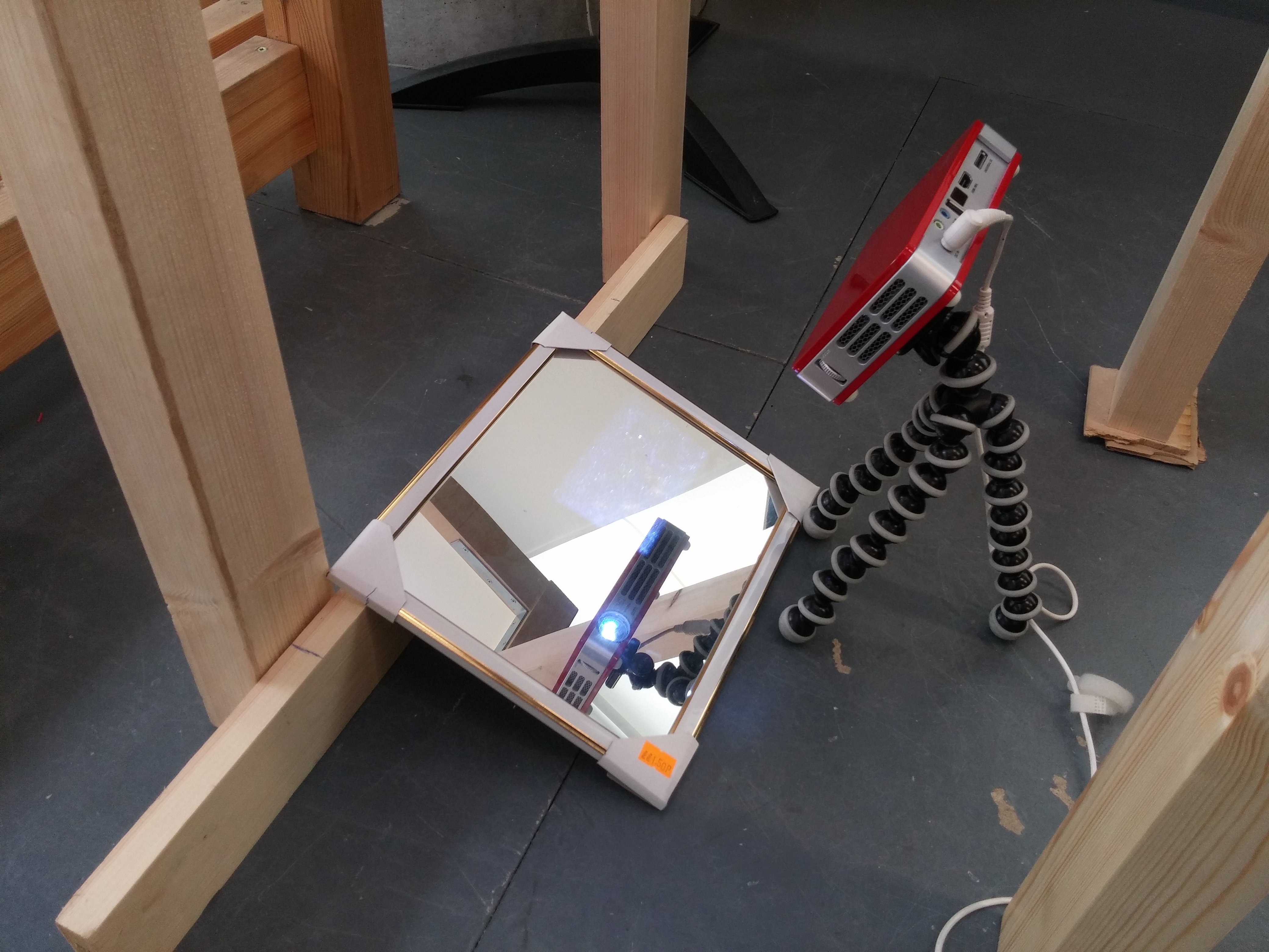
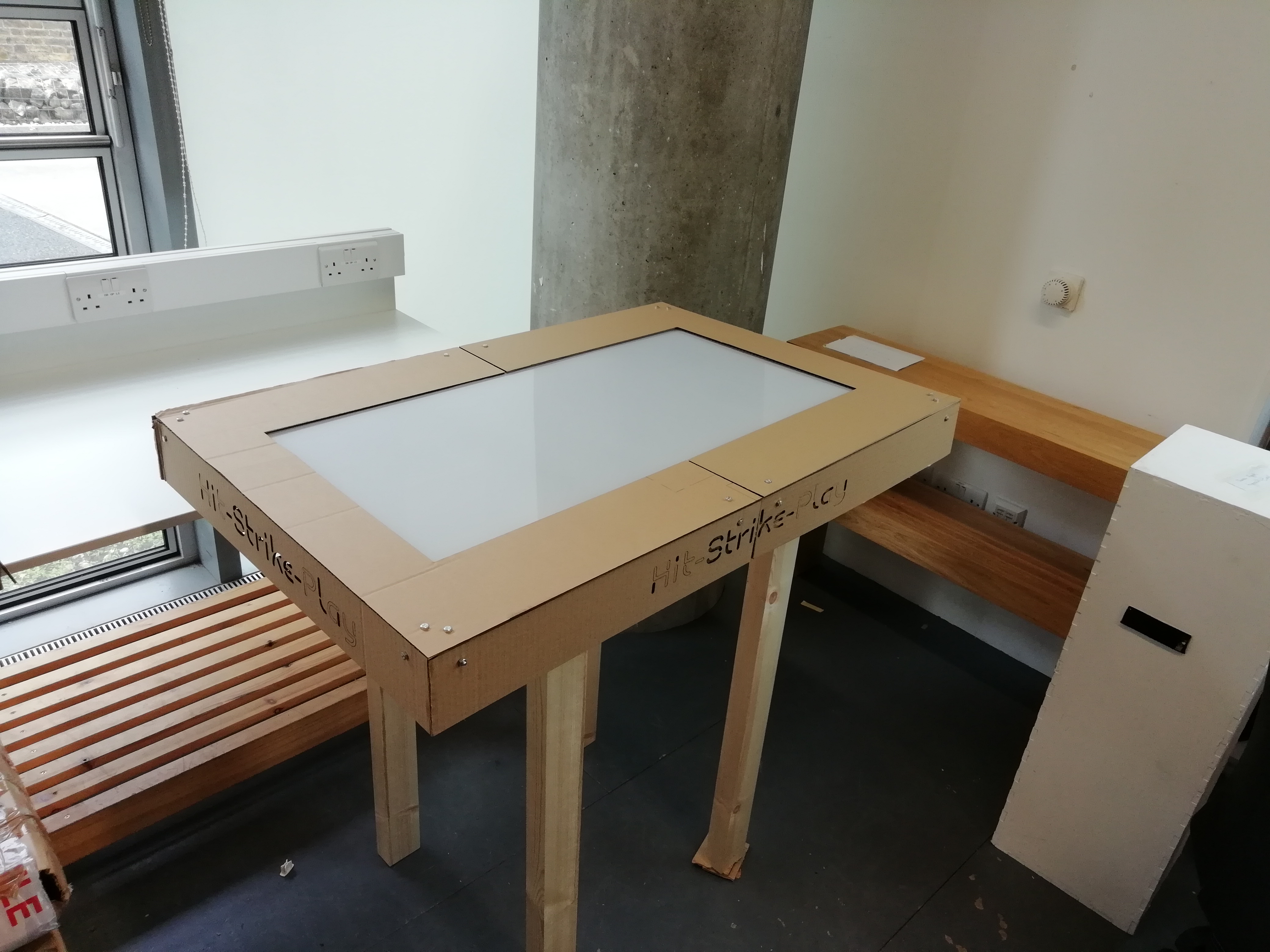
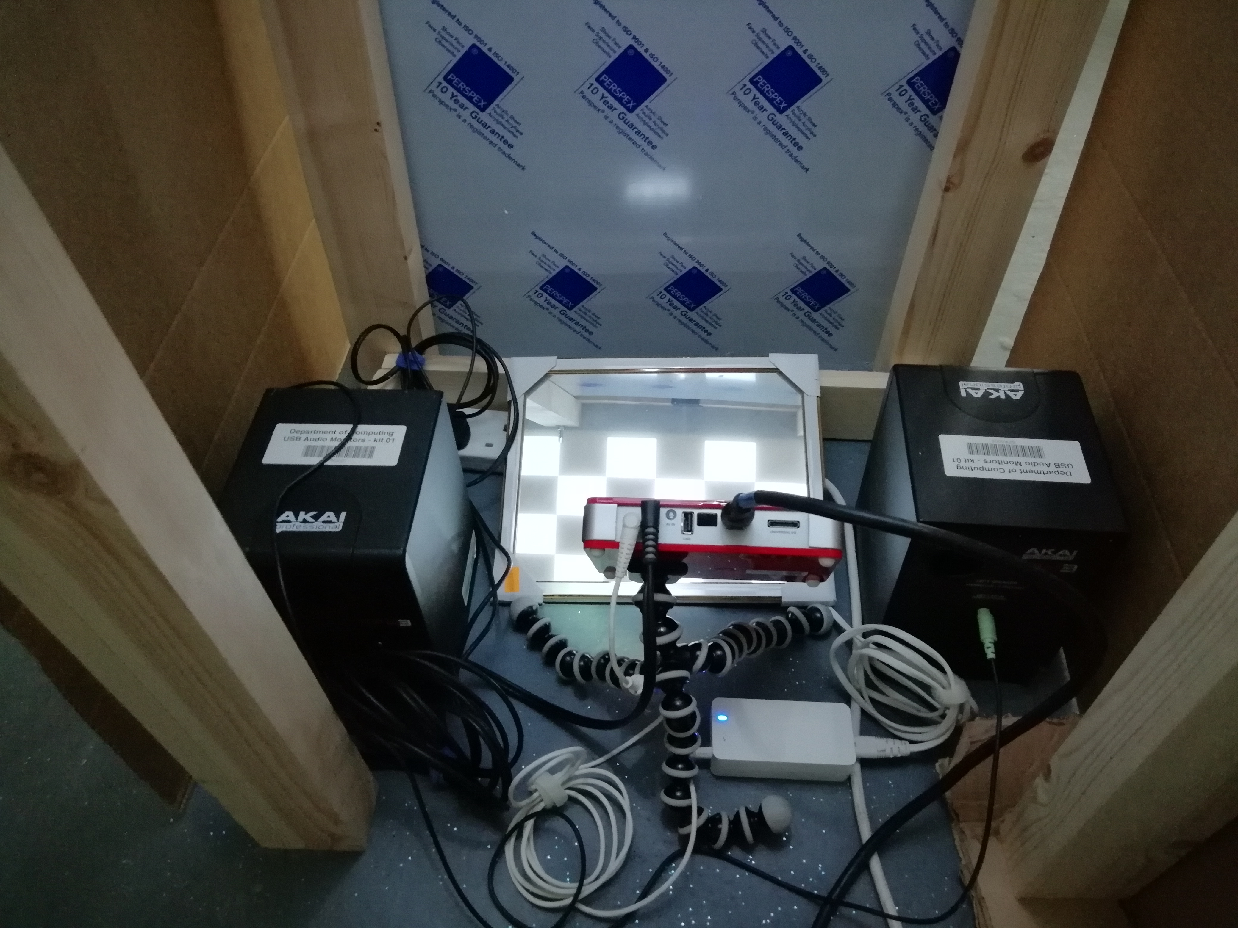
Hit-Strike-Play, for this exhibition, was designed to be a table that display different layouts and play sounds. I took into consideration the fact that I had to build it on my own, which required creating a piece that is transferable and simple to construct. For my table I decided to create a wooden frame with four legs that holds a screen (an acrylic sheet) and to use a small projector to project underneath the surface. My projector’s image was too small, so in order to extend its throw and have a bigger image, I used a mirror and projected on the mirror. I also placed a pair of speakers inside the lower part of the table, this helped simulating an actual instrument with a resonating box. This approach allowed me to easily transfer and install my piece on my own, and will enable me to reassemble it the future. The lower box of the table is made of acrylic panels that placed on top of screws, attached to each leg of the table. The software that is projected on the screen is controlled by IR markers and has GUI that allow users to change layouts and sounds directly from the interface. On the top frame of the table there are LEDs connected to an Arduino to enhance the overall look. Designing the table and the actual construction were challenging, I never worked with wood and acrylic to this extant and scale, however, I enjoyed assembling everything together and see how my vision took shape.
Technical
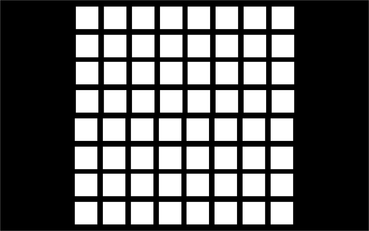
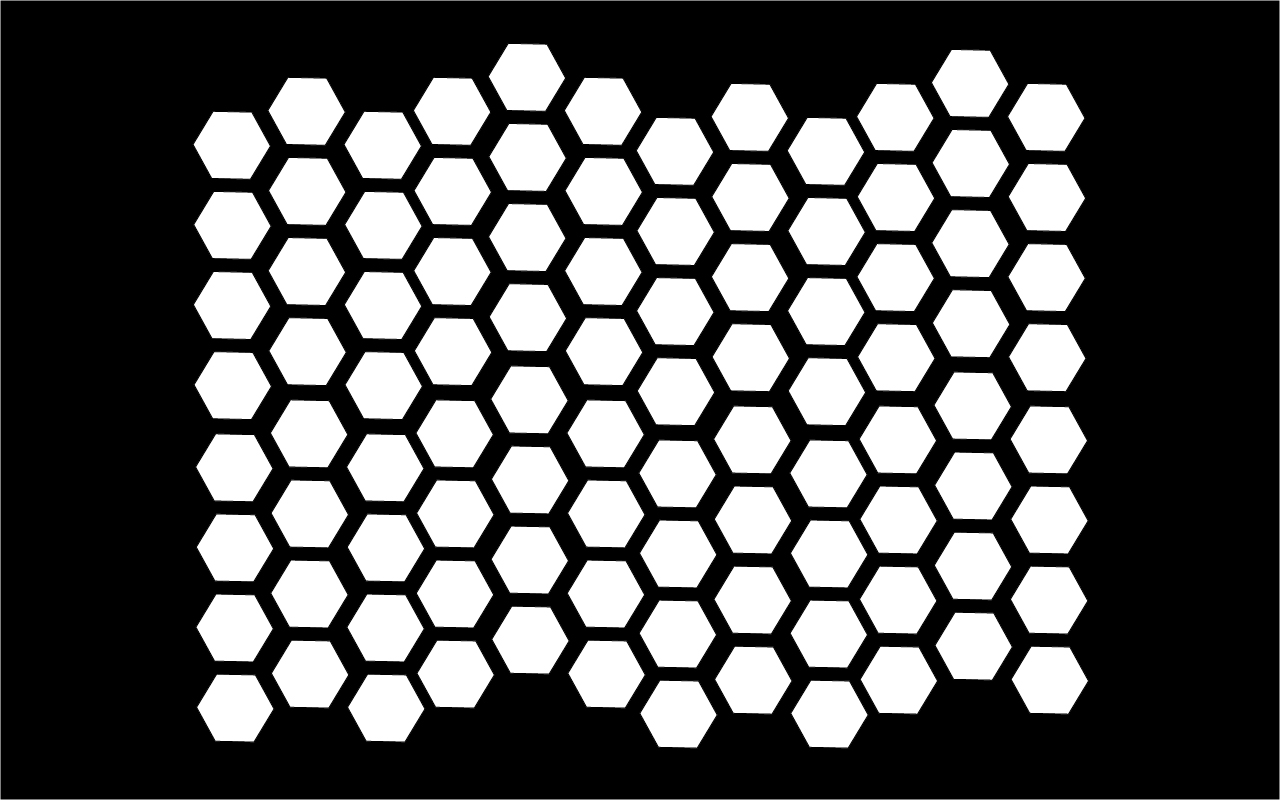
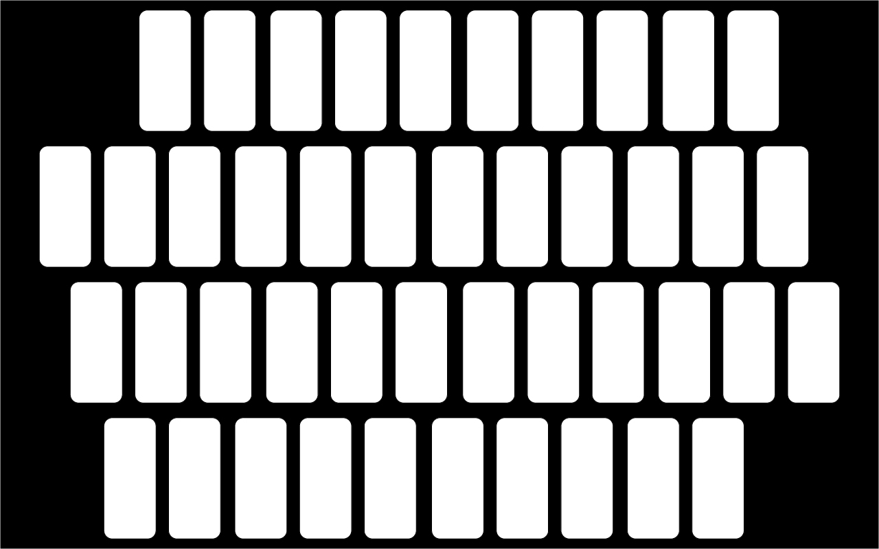
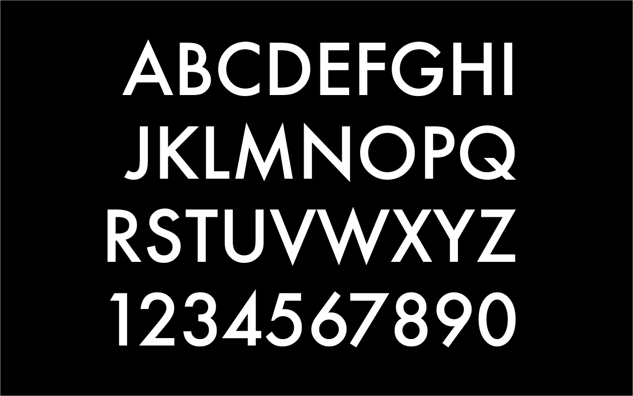
My project was designed from two main features that supported one another. The first was to come up with a system for designing layouts efficiently. I wanted to expand my set of layouts regardless of other features and have unlimited access for new layouts. I used computer vision to look at an image directory and by calibrating a background differencing algorithm, I drew the contours of objects in the images as layouts. As opposed of instructing the computer in each layout what to draw, computer vision allowed an automated process for designing the layouts. Using this method I knew the exact location of each shape in a layout, which was the information I needed for the interactive process. Once I wrote this layout maker class I could design different layouts in any photo editor, put them in the right directory and have new layouts. I implemented familiar layouts of acoustic instruments such as Piano, Kalimba and Pandrum and classical controllers like Bucla’s Thunder, MPC, Push and other isomorphic layouts. I also experimented with text based layouts like fonts, artists logos and random shapes. Each shape in the layout was given a different color. I created movement in the colors in order to highlight the direction of the notes, low to hight and how the relationship is represented in each layout. In several layouts I highlighted specific notes to strengthen the musical context like sharp or flat notes.
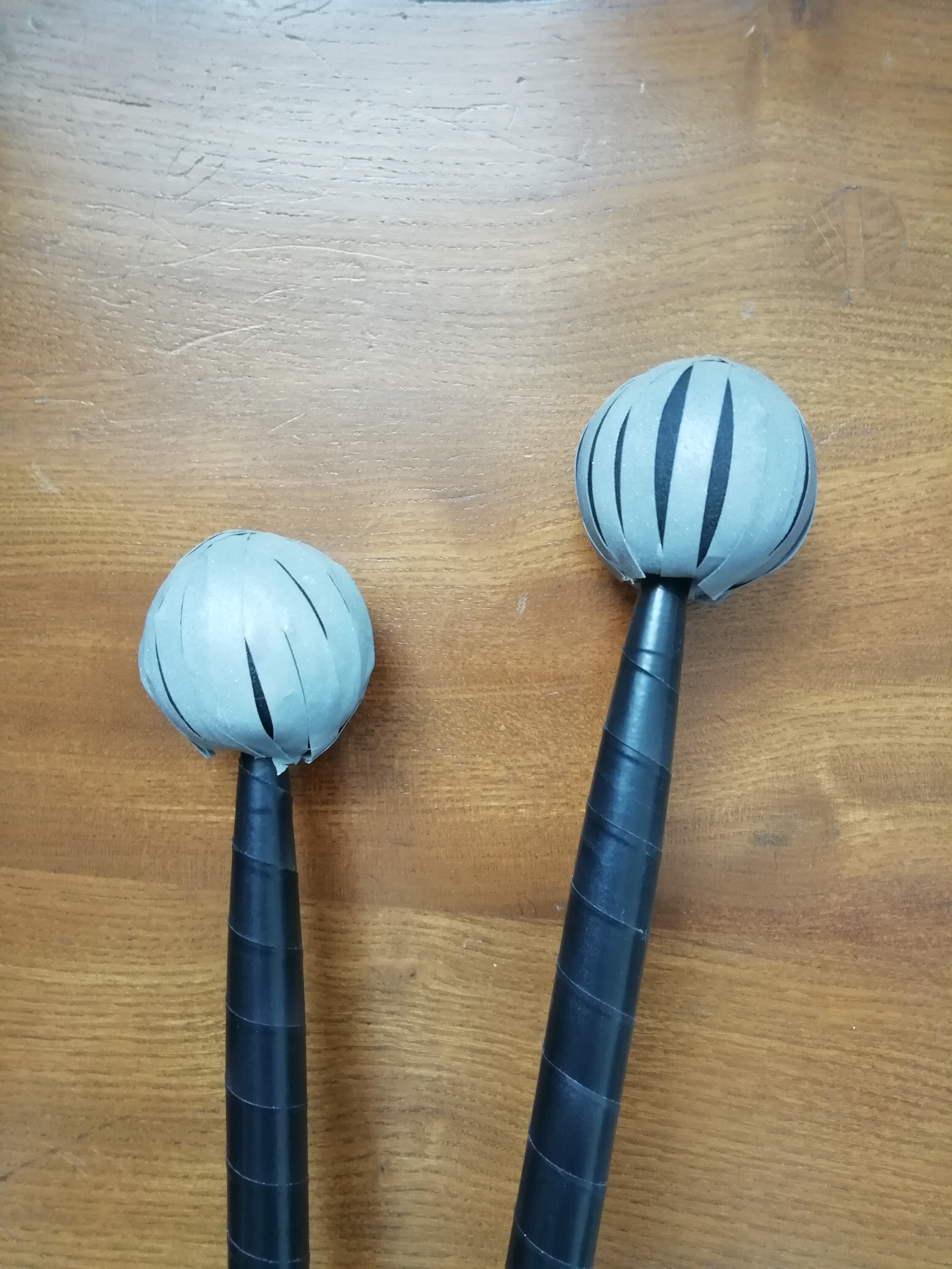
For tracking the mallets with the IR markers on a tabletop I used an infrared camera. IR camera was able to ignore the projected surface in front of it and only track the dedicated markers. I placed the camera on top of the table. At first I tried using the PS3 eye camera, by removing its IR filter and replacing it with a visible light filter. Unfortunately removing the filter created a distortion in the image and while I was able to track a direct IR light, the camera could not detect a reflective material. I tried adding IR lighting but it did not improve the results. I then tried using the Kinect camera, and after several attempts with different lighting settings, the Kinect proved to work well using its own IR lighting. I was extracting the location of each marker and its size. By checking the location I was able to match it with a layout and also detect the object velocity. In addition, by at looking its size I knew the marker’s distance from the camera and proximity to the tabletop.
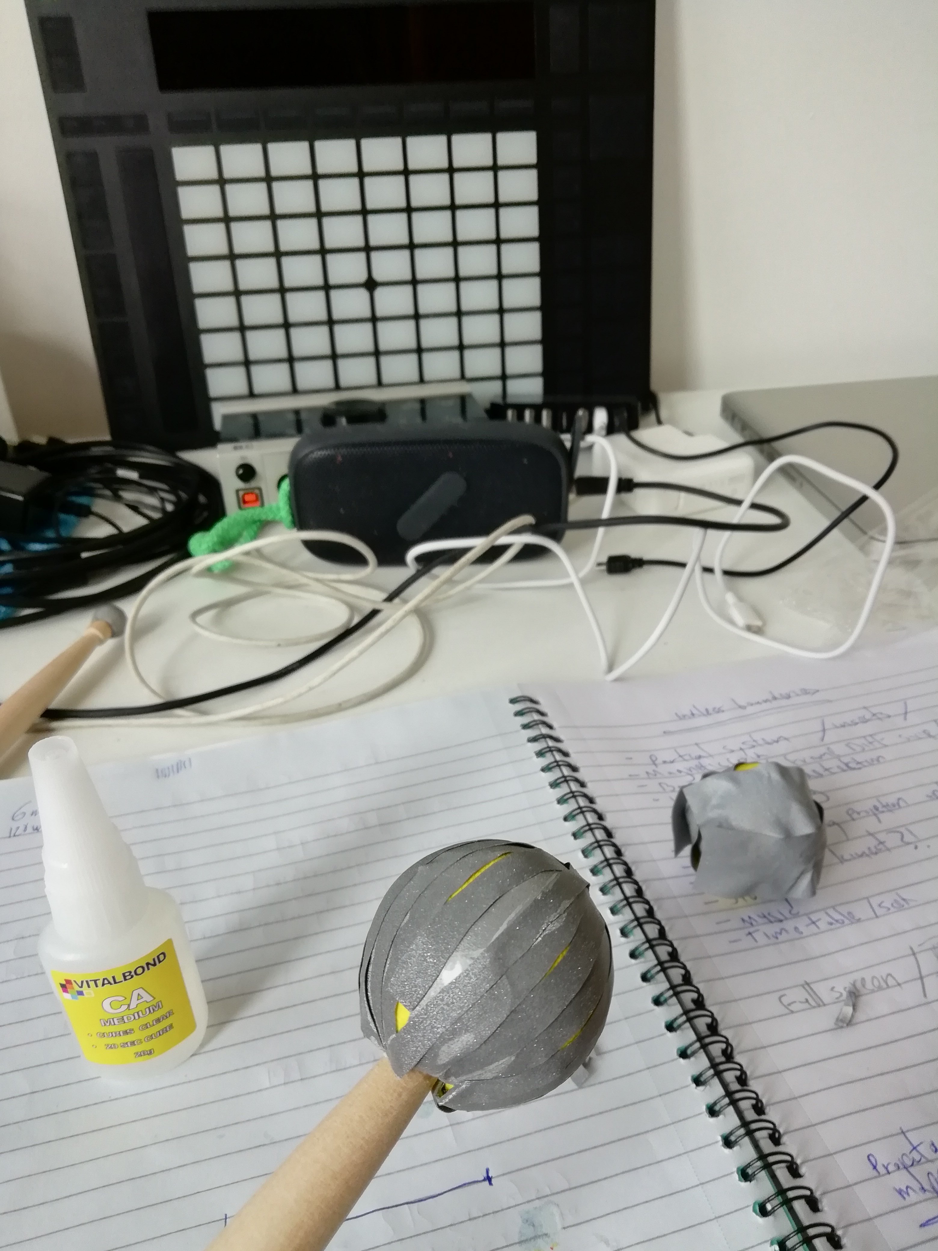
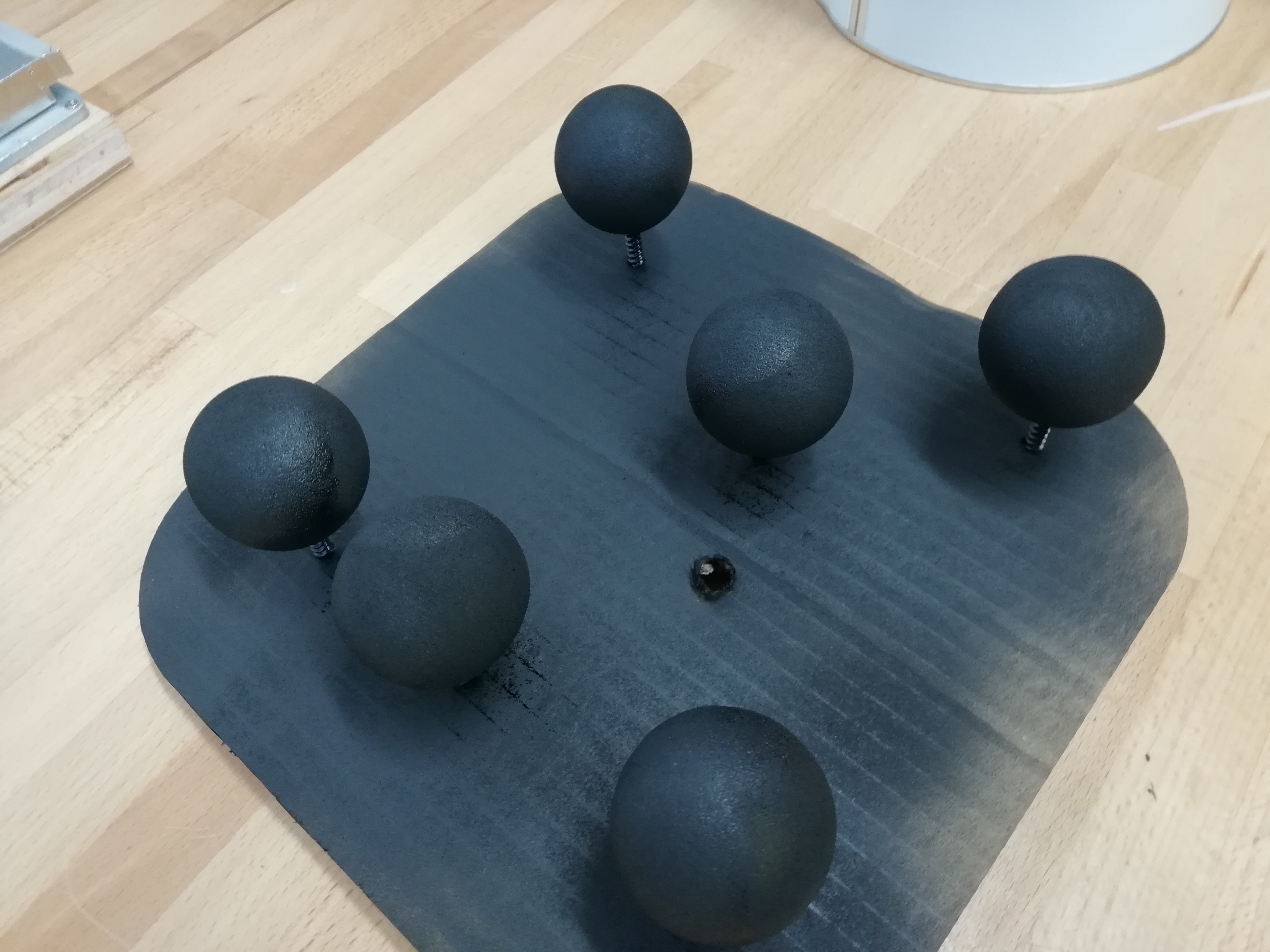
One of the biggest challenges in the project was fabricating the IR markers, choosing the right size, glue and materials was a tedious process that involved many iterations until I was able to produce a reliable marker. Another challenge was utilising polyphony and interact with more than one marker at a time. I explored the use of threading, but ended up using them only in a simple Midi class that sends the notes outside the software.
The interaction between my two main features was straightforward, for each object being tracked (my IR markers) check its position on top of the layouts and if the size of the marker is small enough to consider a hit, send a MIDI message to a music software. To improve the tracking I used a homography [7] class I wrote for a project in term 2 [8]. This allowed me to track a very specific area, where the layouts are being displayed. I tracked the markers size, and since the camera was placed above the table, the further the marker was, the size was smaller. By calibrating what is considered a hit I was able to have an interactive system.
The software had two hidden menus that were not accessible during the exhibition. The first was a settings menu for camera and tracking calibration and the second was a menu to edit and change notes in a layout. For the purpose of this exhibition all layouts were hardcoded with their relevant notations and all MIDI was sent to Ableton live as the sound engine.
Future development
I have several ideas for the next iteration of Hit-Strike-Play. From a technical perspective, I think working with better equipment like a modern IR/depth camera (intel RealSense for example) will open new possibilities. By having better resolution and higher frame rate the overall performance will improve significantly. Also, finding the right kind of tactile sensors to add to the screen could improve playability. On the software side, I would try to implement MPE (Midi Polyphony Expression) a new standard that will allow each note to be more expressive. Combining MPE with computer vision and layout design could open new possibilities that I did not have the chance to explore. Also, I would improve the layout editor, making it a tool that everyone could explore, even in an exhibition setting. As for natural progression, I could transform Hit-Strike-Play to an installation that allows users to design their own layouts or take picture of their face and use it as an a layout they could interact with. I would also examine different tuning systems and how they interact with the different layouts, adding another layer of complexity to Hit-Strike-Play.
Self evaluation
I think I successfully allowed visitors in an exhibition setting to explore and appreciate different layouts and their relation to digital musical instruments. In the opening of the grad show I watched how people interact with my table and noticed that most people tried using “swipe” gestures more often then “strike”. Due to technical difficulties I had to produce polyphony, it was impossible to play using a “swipe” gesture. During the process I decided that I prefer my table would interact with more users (polyphony) then have a swipe gesture. After the opening I decided to update my code ,coming with a solution to have both. This did not solve the problem completely, but improve the interaction. I think this significantly improved how people reacted to my work, allowing them to use the swipe as they expected. Also, as a musician myself I feel that the technologies I choose to work with during the project (camera and computer vision) introduced latency to the interaction, which made it hard to play in a professional setting. Overall, I am very excited about the future possibilities of Hit-Strike-Play and the exploration it will lead in the computer music field.
References
OpenFrameworks addons:
ofxCv - by Kyle McDonald
ofxMidi - by Dan Wilcox , Class with threads by Hiroshi Matoba
Academic references:
1. Bjørn, K., Metlay, M. and Nagle, P. (2017). Push turn move. Bjooks Media.
2. Cook, P., 2001, April. Principles for designing computer music controllers. In Proceedings of the 2001 conference on New interfaces for musical expression (pp. 1-4). National University of Singapore.
3. Cook, P.R., 2009. Re-Designing Principles for Computer Music Controllers: a Case Study of SqueezeVox Maggie. In NIME (Vol. 9, pp. 218-221).
4. Maupin, S., Gerhard, D. and Park, B., 2011. Isomorphic tessellations for musical keyboards. In Proceedings of Sound and Music Computing Conference (pp. 471-478).
5. Aerodrums. (2018). Home - Aerodrums. [online] Available at: https://aerodrums.com/home/ [Accessed 12 Sep. 2018].
6. Kaptein, P. (2009). Building a Pressure Sensitive Touch Surface. [online] Beyond the keyboard. Available at: https://beyondthekeeboard.wordpress.com/2009/08/27/building-a-pressure-sensitive-touch-surface/ [Accessed 12 Sep. 2018]. 7. Sukthankar, R., Stockton, R.G. and Mullin, M.D., 2001. Smarter presentations: Exploiting homography in camera-projector systems. In Computer Vision, 2001. ICCV 2001. Proceedings. Eighth IEEE International Conference on (Vol. 1, pp. 247-253). IEEE.
8. Term 2 project: https://compartsblog.doc.gold.ac.uk/index.php/work/endless-boundaries/
9. O'modhrain, S., 2011. A framework for the evaluation of digital musical instruments. Computer Music Journal, 35(1), pp.28-42.
10. Jordà, S., 2003, August. Interactive music systems for everyone: exploring visual feedback as a way for creating more intuitive, efficient and learnable instruments. In En Proceedings of the Stockholm Music Acoustics Conference, August (pp. 6-9).
11. Paradiso, J.A. and O’modhrain, S., 2003. Current trends in electronic music interfaces. Guest editors’ introduction. Journal of New Music Research, 32(4), pp.345-349.
Artistic references :
Home
http://www.ece.uvic.ca/~elec499/2001a/group07/index.html
https://shiverware.com/musixpro/
http://www.altkeyboards.com/instruments/isomorphic-keyboards
http://terpstrakeyboard.com/


