Fogtown
An audiovisual performance piece about existential uncertainty and identity impermanence. Features computational illustrations and animations made entirely in Touchdesigner.
produced by: Williams Fincannon
Introduction
Fogtown is the culmination of interconnecting concepts and techniques which have been in development over the last few years. It is the output of an exploration into new methods of creation and presentation, as well as an expression of the existential uncertainties that were present throughout the project’s conception and development. Put simply, Fogtown is an audiovisual performance piece created with computer generated illustrations and animations.
Concept and background research
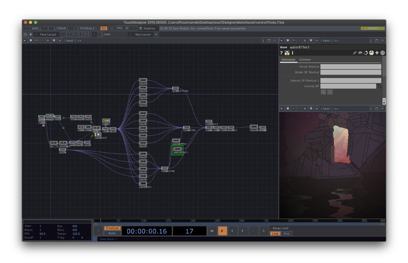
Perhaps the biggest challenge with creating visual works for live performance is the time that it takes to create time-based media. I’ve aimed to tackle this problem by developing systems for generating illustrated content within the node based programming language, TouchDesigner, by Toronto based company, Derivative.
These systems are developed through analyzing the work and processes of many established illustrators--especially the works of Jean Giraud (Moebius), Kilian Eng, and Victo Ngai. Each of these artists have provided insights into their processes through videos and articles. Using this research as a jumping off point, I began to design networks which output comparable results to each stage of their processes.
Technical
Approaching illustration through designing systems enables the immediate realization of new scenes and consistent inspiration for new concepts. Through moving sliders and pressing buttons, you are presented with countless compositions on which to base new narratives. The challenge here becomes how to continue refining the system in order to produce increasingly consistent, complex, and useful illustrations, which can be carried on further to containing animations.
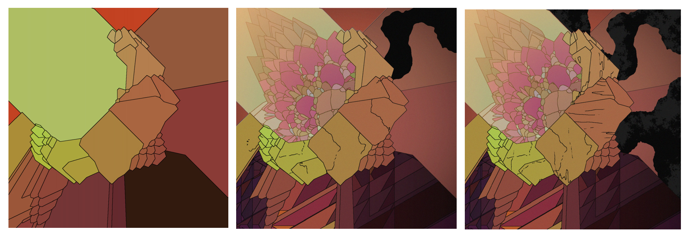
The first step in building the system was finding ways to generate interesting contours resembling those created by hand. This was first done with experimenting with noises but I achieved more successful results by generating outlines from randomly placed, intersecting, 3D geometry. The first layer of lines form the base of each composition. From there, I decide which shapes to add detail to and duplicate the process within that shape. The process is repeated on a third layer, but at this stage, managing all the sections of detail becomes an issue.
Once I managed to create one successful composition, I set out to fine tune the system so that applying random values to certain parameters would produce results that were just as complex and compelling, and required minimal adjustments to produce a finished scene. Finding the right balance between complexity and simplicity is key, as a system that is too complex takes a great deal of time to manage, as well as becomes too taxing on the computer’s hardware. Currently, most of the systems consist of dividing the illustration into three parts, which are each divided again into three sections of detail. These systems continue to grow as new techniques and methods of optimization are found that allow for additional layers of detail.
Abstract compositions came naturally through the process of manipulating noises and randomizing geometry. The bigger challenge has been finding ways to generate shapes and lines that suggest representational forms. I began by experimenting with methods of creating human silhouettes. I’ve found some success by manipulating 3D primitives with fine tuned noises. Once an interesting and believable silhouette is found, the previously mentioned process of adding detail is applied to reinforce the illusion of a representational object.
Looking to build on this concept further, I began experimenting with other ways to generate 3D geometry which were less random, and could offer additional detail such as lighting information, and produce more gestural, expressive forms. For this, I turned to working in VR--primarily with the applications, Gravity Sketch and Tiltbrush. This approach would make the illustrations less procedural, but succeeded at the original goal of aiding in producing work quickly. Perhaps even more-so than previous methods, as this allowed me to create scenes that could produce different yet relevant line work when rendered from different angles.
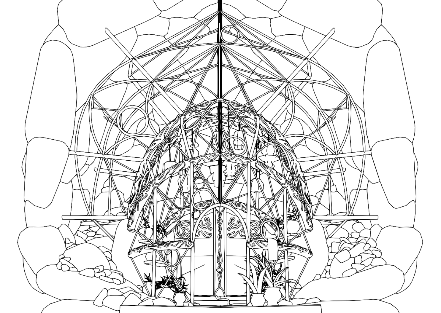
To achieve line art based around geometry made in Gravity Sketch and Tiltbrush, I used an experimental build of 3D modeling software, Blender, which included a tool for generating line art in real time. I’ve found much quicker and more satisfying results with this method as apposed to others, such as blender’s freestyle render pipeline, and cinema 4D’s line art tools. Generating line art in this way saves time and allows for the testing of different compositions before committing to hours of adding hand drawn details.
Challenges arise in this approach as well. When basing 2D content off of 3D geometry, the underlying framework can become too apparent if not carefully considered. The work might end up feeling like 3D geometry only trying to imitate 2D illustration. This, in my view, results in a composition that is less aesthetically pleasing and detracts from the world being built. In my experience, modeling in VR is ideal for creating geometry for this purpose since it allows for more gestural and less precise input from the user.
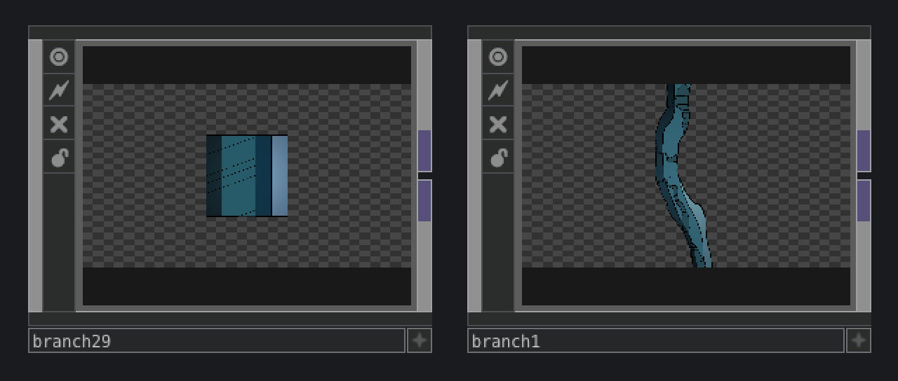
One of the biggest breakthroughs I had while experimenting with different approaches was when I returned to working with simple 2D noise functions. By using multiple layers as I had done before, I began creating individual components with custom parameters which allowed me to quickly duplicate and manipulate complex elements in order to build a scene. While the previous methods provided a top down approach to creating compositions, this approach required me to build from the ground up. This process is more akin to a traditional illustration workflow, but it retains the benefits of creating lines and forms computationally.
Like the illustrations, most of the animation was achieved in Touchdesigner. I’ve experimented with ways to emulate the movement of hand drawn animations through lowering framerates, applying stepping behavior to the LFOs, stacking LFOs, using perlin and similar noise algorithms, and applying displacements to the animated content. I have experimented with adding hand drawn animation loops as well, but only when I felt it was a more practical solution that using the tools and methods mentioned above.
In order to animate in a way that requires more control of representational forms, I turned to working in VR, primarily with 3D modeling and animation application, Quill. Quill offers several unique animation features which have inspired new ways of approaching a scene. Similar to working in 3D for illustrations, it’s easy to make geometry look too perfect, breaking the illusion that the geometry belongs in the scene. Because of this, special attention was paid to how content was rendered. I found that tricks such as increasing the focal length of the rendering camera, and working loosely when building geometry can help flatten out the results, making the content more fitting within 2D environments.
I made a point to avoid using a timeline or keyframes to animate. By doing so, the content offers endless variation and becomes a much more expressive tool. Approaching animation in this way was inspired by my studies in generative music composition and modular synthesis which I will discuss in the next section.
Future development
The process feels more like “painting with noises” than I had originally anticipated. I believe this can be improved on further, when I am able to spend time creating illustration and animation tools outside of Touchdesigner. Since the software I’m using isn’t entirely geared for creating these sorts of artworks, I can see a lot of potential in developing software for my specific purposes. Creating these tools will be my next steps in developing this practice as I believe that what I have achieved so far is only scratching the surface of what is possible with this approach to content creation and presentation.
Self evaluation
The techniques I have been developing have already proven themselves in speeding up my own workflow and producing work that is reusable in future scenes and projects. They have also contributed to my artistic style in ways that I was not expecting. Creating forms with noises produces unexpected results that I would not have ever created by hand. The same is true with animation. Experimenting with certain parameters inspires movement that would not have come naturally using a traditional approach.
I went into this project intending to create systems that generated completed illustrations at the push of a button. I’ve succeeded on some level, but even when compositions are assisted by procedural tools, they still require a fair bit of attention before they can be considered finished scenes.
References
Baumann, Hasko, director. Moebius Redux: A Life in Pictures. BBC Four, 2007.
Eng, Kilian. “DW Design on Facebook Watch.” Facebook Watch, DW Design, 27 Apr. 2016, www.facebook.com/124409704274214/videos/982606721787837/.
Apple Inc. “A Master Class in Illustration : App Store Story.” App Store, Apple Inc, 21 May 2020, apps.apple.com/us/story/id1470268360.
Boothe, Dan, director. Fantasia: The Making of a Masterpiece. Robert Heath Inc., 1991.
Sunada, Mami, director. The Kingdom of Dreams and Madness. Toho, 2013.


