Digital Labyrinth
produced by: Max Jala in collaboration with James King (Sound Design)
Introduction
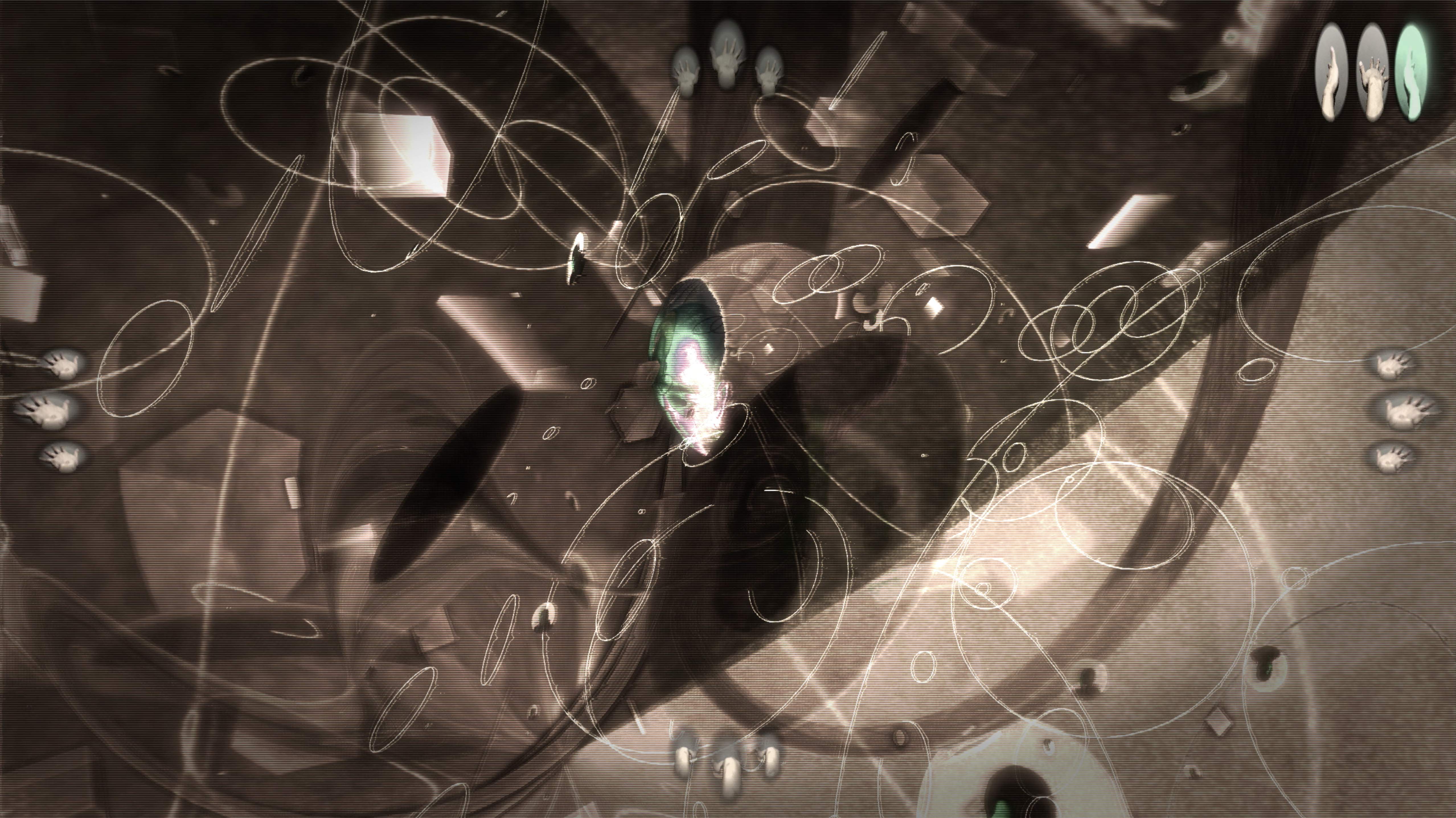
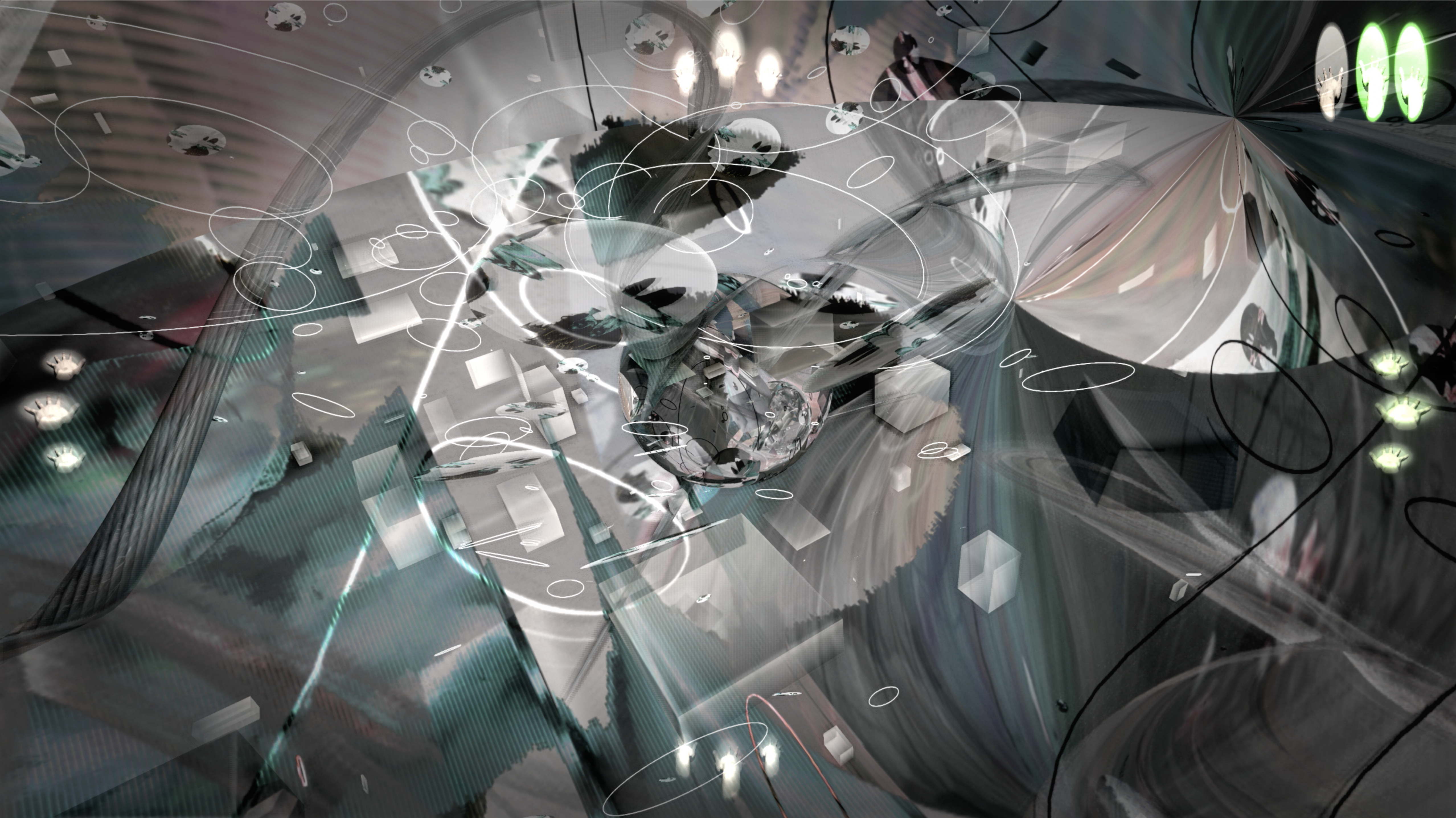
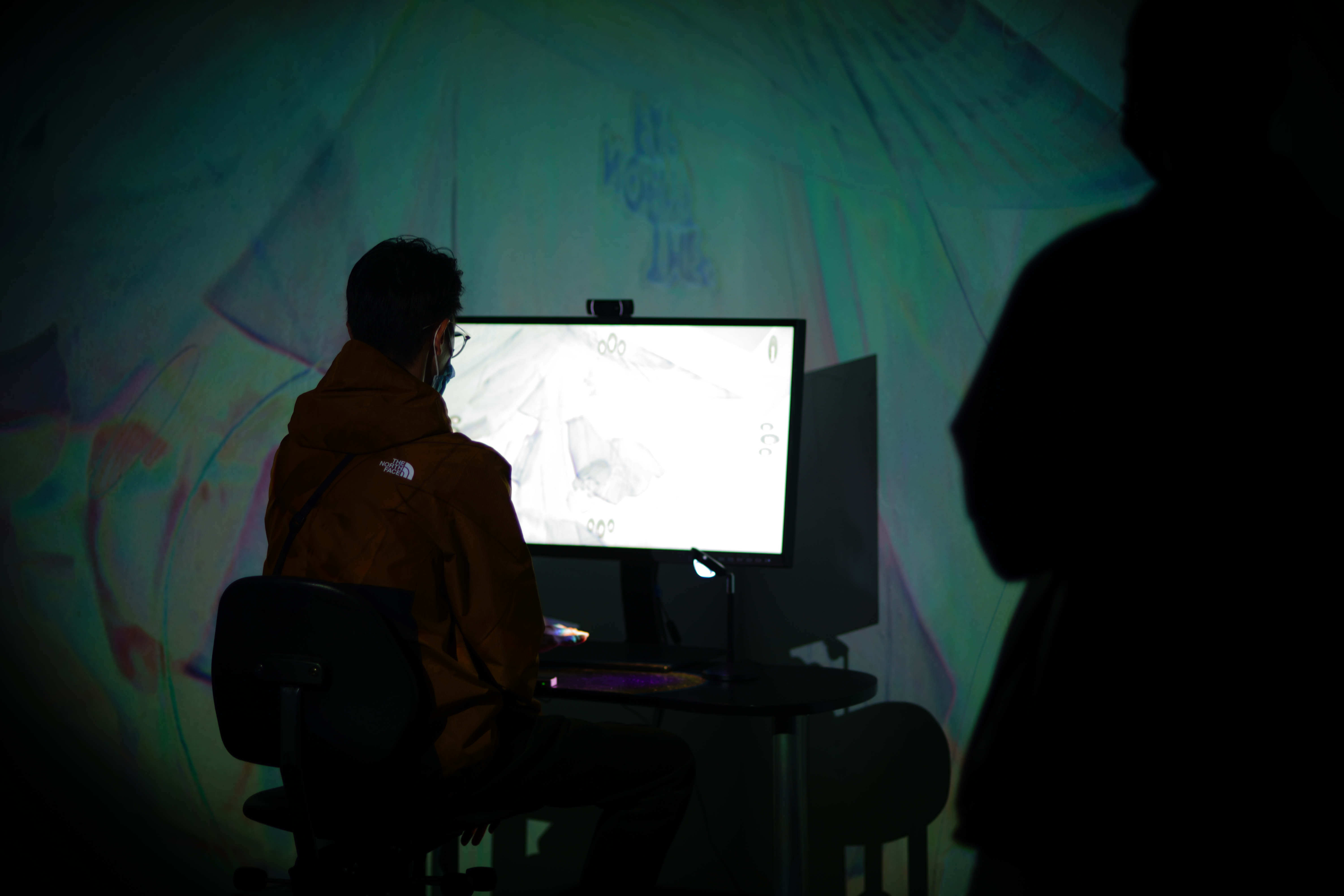
Digital Labyrinth is an interactive audiovisual piece that presents a recursive loop of generative worlds. The piece invites a sole explorer to traverse and get lost in its endless labyrinth as they float through digital debris in search of new worlds and new sounds.
The piece uses hand-tracking via Leap Motion Controller to allow users to navigate and steer through these worlds through hand movements and gestures. By placing your hand over the sensor a user can interact with the piece in the following ways:
- An open hand will prompt forward acceleration.
- A clenched gesture will halts and brakes forward movements
- Direction controls are dictated by the rotation and tilting of your hand.
Within each world lies another world you can travel towards and enter, alternatively you can explore and observe your current surroundings.
At a wider level, Digital Labyrinth hopes to investigate new modes of engaging with sound and visuals - blurring lines between game and art. The piece also intends to immerse and hold users captive in an endless loop of sound and visual exploration, creating a virtual vacuum that is both more spacious and claustrophobic than physical reality.
Concept and background research
Digital Labyrinth hopes to explore new modes of engaging with sound and visuals - blurring the lines between game and art. While the experience is playable through the explorative nature of the piece there are no real objectives set in place, thus breaking the mould of objective-driven games.
My motivation for creating this piece stems from my previous work and affinity for vj / audiovisual work. Typically for such performative works the artist (vj / musician) dictate the tempo of the piece - deciding when visuals and sounds should transition and in what manner. I wanted to grant the audience greater autonomy and a sense of discovery as they explore the different sounds and visual environments of the piece at their own pace.
The piece is intended to be personalised for its current user, this informs the freeform style of exploration with no menus or onboarding tutorials. As well as the discovering the different worlds presented in the piece I also wanted users to discover how they want to interact with the piece with only subtle cues such as the hand icons that light up when a user triggers the corresponding gestural control.
Freeform exploration is also present on another level in the piece’s floating navigation. With Digital Labyrinth I wanted to create a real sense of floating, hence why its navigational controls were not bound to any xyz axis. The use of the Leap Motion Controller helped in making the experience one that was embodied through the feedback between corresponding hand manipulation and navigational responses.
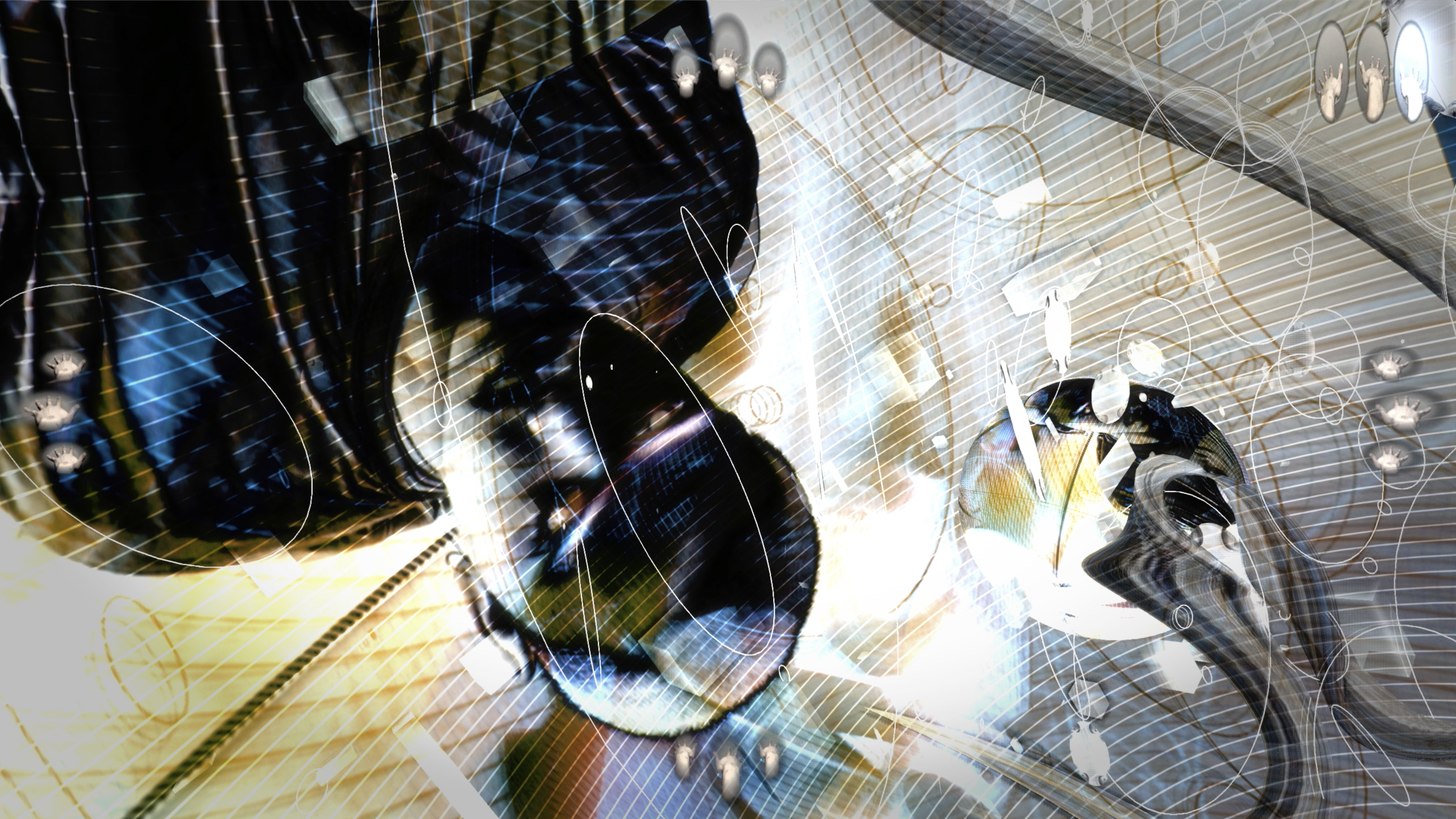
Aesthetically, Digital Labyrinth draws heavily on hyper-gamified aesthetic, especially because is not necessarily a game. This informs the generally maximalist visuals and the often glitchy textures that adorn many of the worlds. For this piece there was a clear intent to embrace the ‘digital-ness’ of digital art instead of trying to disguise it as something more analog or natural.
The decision to embrace the hyper-digital aesthetic both sonically and visually were inspired very much by the hyper-pop music scene and prominent labels such as PC Music and visual direction.
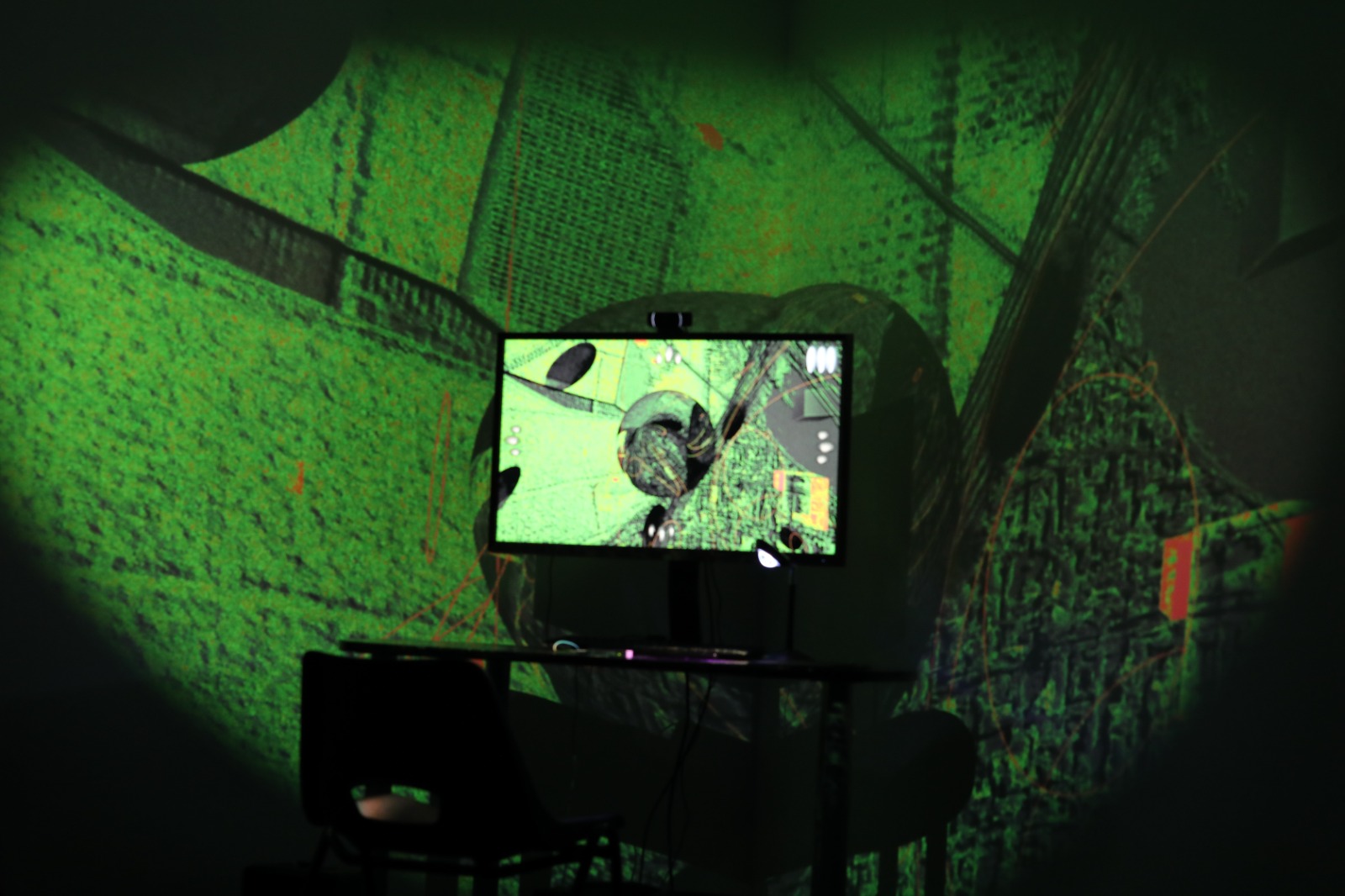
At a physical level, I wanted the installation to appear almost like a souped-up gamer’s setup with complementary immersive projections that tread a fine line between garish and beautiful.
Technical
The key technology driving the piece is a Leap Motion Controller. Harnessing its hand recognition capabilities the various navigational controls are based on the orientation and gesture of a user’s hand.
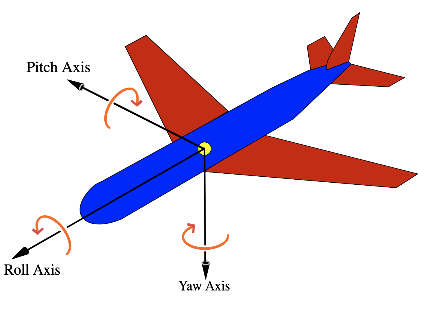
Directional controls follow aircraft principle axes, namely: pitch, yaw and roll.
This gives the user the sensation of floating that I desired with this piece. To further enhance this sensation, values from the leap controller have smoothing applied so there is a certain amount of drifting due to residual momentum.
The process of designing and programming the directional control was one that required constant testing and feedback from my peers. Initially there were more planes of movement with a user’s hand xyz position relative to the sensor controlling dollying (accerlerating, decelerating and reversing), panning (left and right movement) and trucking (up and down movement). While some users found this intuitive, different users would interact with the sensor at different positions which lead to a breaking of their intentions and the resultant directional response. Overall, there were too many different planes of movement that it was potentially too challenging for some users. These observations informed the reduced controls that strikes a balance between freeform and rewarding, and user-friendly. The addition of hand gesture icons that light up according to specific user actions also aided in creating some visual feedback and cues for learning how to interact with the piece.
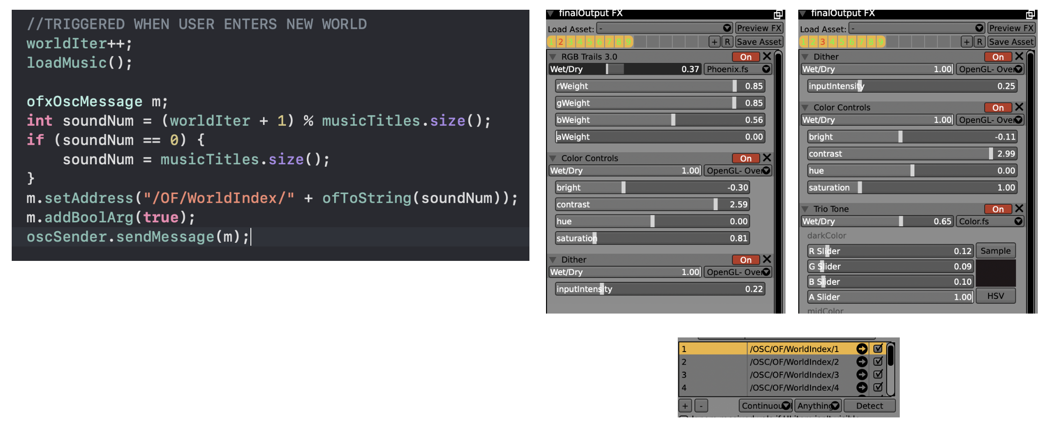
The pipeline for visual generation involved two softwares: openFrameworks and VDMX (vj tool). In the past I have used the pair in tandem with openFrameworks sending out visuals (via Syphon) which is received by VDMX where live post-fx are applied and conducted for final presentation. This is a pipeline I have had much success with in live performances as it allows me to intuitively apply shaders and incorporate other media (such as videos and images) on the fly. But crucially this workflow relies heavily on myself as the artist to trigger effects and transitions according to the music - this was not possible in this installation. While I still wanted to have this sense of transition and visual richness afforded by this pipeline, I had to make alterations to automate it and allow the user to control these performance aspects. Key to the triggering of the different visual effects applied to the many worlds was the use of OSC communication between the two technologies.
Another feature of the visual pipeline is the use of feedback. The feed from an ofEasycam is sent to VDMX (via Syphon) where effects are applied and sent back to openFrameworks, this altered image is then sent back and texture mapped to the bounds of the current world and other objects within it - creating a feedback loop of sort (the more you see -> the more you see). Additionally, the resultant canvas image (ofEasycam feed) would be sent back to VDMX for additional effects to be applied for the final rendering. This theme of feedback and mirroring also informed the use of the webcam, which incorporated live video of the user which were often distorted and used as textures on the geometries of the 3D environments. This made for surprising moments when users noticed their likeness distorted within the piece and also varied visual outputs.
Lastly another technical challenge for the project was implementing an idle autopilot mode when people were not interacting with the piece - this was triggered if there was no hand detected for 2 seconds. This served two purposes: reorient the camera towards the next world if the user was lost, and provide an idle animation for when nobody was interacting with the piece. When tackling this feature I encountered a problem that was completely novel to me - gimbal lock. This refers to the loss of one degree of freedom in conventional three-dimension Euler axes systems. Gimbal lock led to a bizarre warping of view and navigation. After some investigation, I was pointed towards quaternions and spatial rotation which I eventually wrapped my head around and implemented for my reorientation and autopilot feature.
Future Development
To further develop the piece I would like to incorporate further generative elements to the world compositions. As mentioned earlier, in its current state 9 overall visual presets are applied to each newly generated world, but an OSC messaging system whereby individual effects are triggered and modulated in a varied generative fashion could produce worlds of greater variety for a greater sense of discovery.
Additionally, I would like to develop the sound interaction of the piece. Currently, the only interaction with sound in the piece occurs when a user approaches a new world and the current world’s sound fades out as the approaching world’s sound fades in. This is largely due to the pre-recorded nature of the different sound pieces. With access to individual sound elements of the different pieces it would be possible to modulate and alter the sonic qualities of each piece according to a user’s interaction and movement within the virtual 3D space.
Self evaluation
All in all, I believe the piece was a success in achieving what I had imagined. There was a genuine sense of exploration and discovery as users floated and travelled through the different worlds. Most importantly I believe it was a fun and enjoyable experience for most people. Admittedly, the learning curve was occasionally steep for some who had not read the project instructions, especially given the omission of a new user tutorial experience. While the inclusion of responsive hand icons certainly helped create clues and cues for user interaction, it may be worthwhile providing additional guidance so all users can engage with the piece fully and enjoyably. Regardless, I derived a lot of pleasure watching people have fun and intently engage with the piece in their own ways; gradually gaining more control and fluency in navigating and exploring the different worlds.
References
Eliminate Gimbal Lock with Quaternion Rotations [Video Tutorial]. [online] Cineversity.com. Available at:


