Dicing
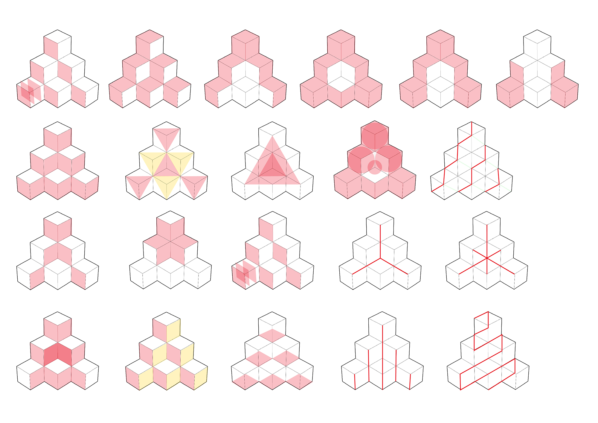
Dicing a pyramid into six dices. Roll the dices, you’d see same circles but different aspects.
produced by: Bingxin Feng
Introduction
Projection-mapped on a three-layer structured cubes pyramid, Dicing is a generative art piece that showing a dynamic world of dices, which explores the possible variations of just the simple circle shapes. The scene starts with the appearance of a pile of dices, then following an order of one to six, it shows minimalist black and white animations generated from the number of dots on a dice.
Concept and background research
At the very beginning stage of this project, my initial idea was to create a ‘nature story’ of a narrative from water flow (ocean) to plants (life) appearance - because I’m quite obsessive with the idea of the nature of codes. I did some experiments, but since the limit of my coding experience, the outcomes were not very satisfying. Without the knowledge of complexity, complicated, and object-oriented programming, it’s unlikely to draw very very organic nature scenes. Also in term of the form, considering the cubes pyramid shape wasn’t very reasonable for the idea of natural flow, I decided to change my idea.
According to the previous experiments, I found that circle was my most used shape, so with an inspiration of ‘circles + cube’, I came up with the final concept of ‘Dice’. Dice was a very nice concept, visually and metaphorically. Visually, there’s only one main element, circle, but in 6 different compositions, which was simple but also flexible for variations. Metaphorically, dice had been always related to life, destiny, and chance. Like the footballer Alexis Sanchez said ‘Life is like the dice that, falling, still show a different face. So life, though it remains the same, is always presenting different aspects.’ So even the animations were generated from only the shape of (black and white) circles, still, there could be loads of variety and surprise.
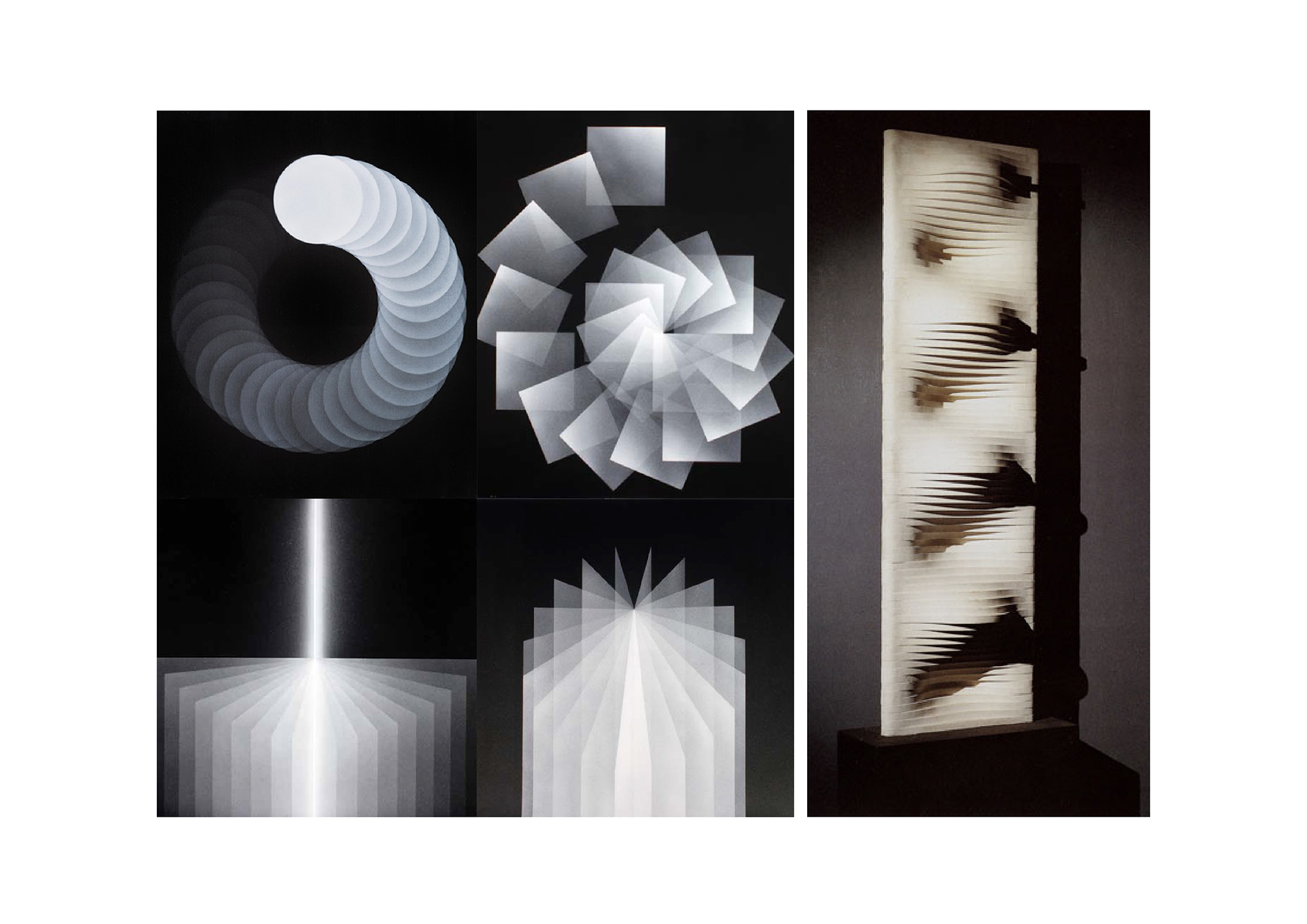
In terms of the aesthetic, Julio Le Parc and Horacio Garcia Rossi were my main reference. Their works inspired me to use greyscale to create a sense of lights in the dark, and to use small circles as particles to generate bigger shapes.
Technical
I used for loops, sin, noise, if-statements, vectors, functions in my codes. Since one of the main goal was to practice and improve my ability to use less/simple elements to develop various visuals by exploring the forms/ the generative rules, so the challenge was to think of how to apply the codes into many different combinations to create many different visuals. Also, at the beginning, I didn’t understand sin/cos very well, but after several experiments, I’m more practised with it now.
Future development
For further development, I’d like to add some colors to this piece. Not like crazy colors, but some subtle colors. Because I think minimalist works don’t have to be black and white, some subtle colors could make it a bit more dynamic and a bit more layers. And the current piece was fairly focused on the shape of the circle, but for the concept of ‘dice’, I think the relation between circle and square, or even sphere and cube, definitely could be developed further. And because the dice itself is a cube, so having a transition between 2D and 3D of the animation would be a reasonable development.
Self evaluation
Although it’s a second idea, I’m actually like the concept of dice a lot. Because both visually and metaphorically, it’s simple, but also flexible to vary, it’s playful, but also with a possibility to link to deeper thought. And for aesthetic and expression, I made the movements organically, and the control of brightness created a fairly elegance scene - these were one of my main goals in this project. However, it was a pity that I didn’t realize my first idea - the nature of flows: water, wind, plants. In the experiment stage, I had tried my best to code those ideas, but the visuals were really far away from the images in my mind. I think it was because of my lack of coding experience - I didn’t see enough, and learn enough codes, to be aware of what kind of coded images could present ‘nature’ and how to code them.
Also, comparing with the other object shapes like the picture frames, or the circle canvas, I think the cubes-pyramid is a bit too chunky - if I want to develop it further as an art piece displayed in the gallery. The cubes-pyramid was easier to start with, but it’s more likely to become a public installation in a park, or in a mall. After seeing the other works in the pop-up show, I think the cubes-pyramid shape has less potential to be developed as an art piece. Next time I would like to consider the object shape more carefully.
Last but not least, considering my background and my ‘final goals’ in this course, I really want to use codes to make films more experimentally. But I didn’t really experiment videos/ webcam in this piece, which it’s a bit regrettable. (But the reason I chose to experiment more on geometric shapes rather than videos in this piece was that I thought geometric shapes was the most basic level, videos was a higher level, I wanted to make sure that I can handle the basic nicely, then go to challenge the higher level in the next stage.)
References
Term 1 lab assignment - Noisy sun, Pulsating rings
Twins Circle by Dan Anderson - it helped me to understand how to apply sin in a location movement, to draw a circle or spiral
Sine Wave Small by Vroni - it helped me to understand how I can apply sin in drawLine to create a wave-like image, and I modified this code in my Dice_03 source
Processing, A Programming Handbook for Visual Designers and Artists, Casey Reas and Ben Fry
The Nature of Code, Daniel Shiffman


