Codex
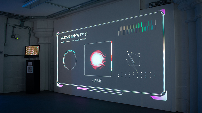
Codex is a collaborative installation that explores conventions regarding how we categorize and process information. Audience members use their phones to determine the evolution of alien creatures according to a genetic algorithm, with its data being sent over a server using web sockets. The life forms are then scanned, processed, and presented alongside an alien language via a projection.
produced by: Harry Wakeling
Introduction
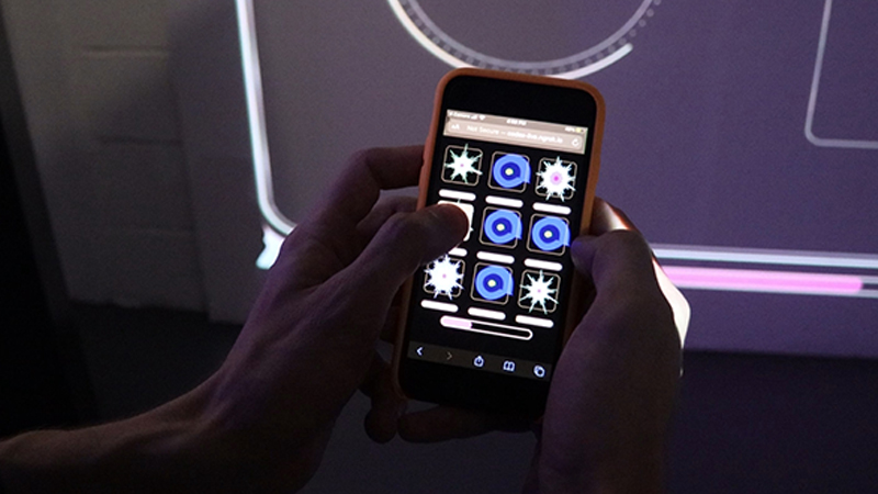
The piece is inspired by various conventions within graphic design, making use of indecipherable shapes and text to provide a visual system. The user interacts with a phone app to assign a fitness rating to creatures of their choosing. The higher the fitness, the more likely its genes will pass over to the next generation. Their selection then manifests on a projection, presented within the format of an alien display. If there are multiple interactions at the same time, the creature inherits a mixture of genes from every user. Every selection is then logged and recorded in an accompanying website, displaying how the creature has gradually evolved over time.
Concept and background research
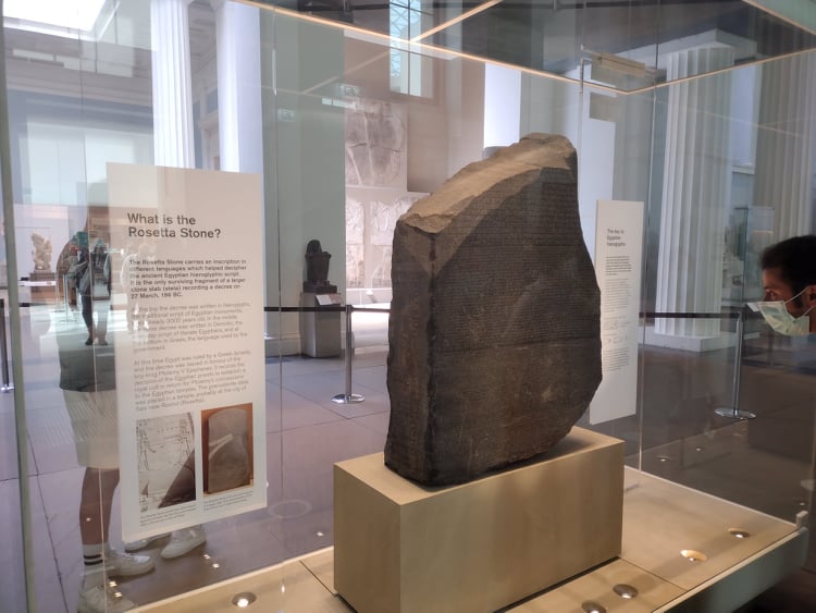
My background is in graphic design, and I have always been particularly interested in the history of typography and visual communication. At the beginning of this project, I conducted research into the history of the written word. To gain inspiration I visited the British Museum, specifically to see the Rosetta Stone. This is arguably one of the most important archaeological finds in history, as it was the key to deciphering ancient Egyptian hieroglyphs. I took careful consideration into how it was presented within the context of the rest of the museum; I was also interested in how the stone itself has become an idiom for deciphering encrypted information.
Figure 1: A photograph I took of the Rosetta Stone
Looking at historical examples such as the Rosetta Stone led me to study examples of work that explore fictional worlds and languages. One of the first pieces I came across was the Voynich Manuscript, a book from the 15th Century that contains icons and drawings annotated with a fictional writing system. It has been studied by professional historians and cryptographers for hundreds of years, however its meaning has never been demonstrably deciphered.
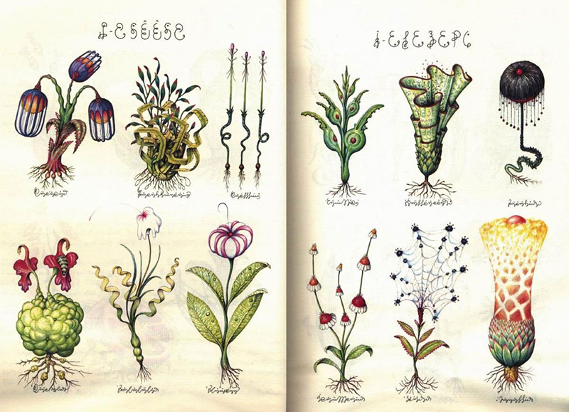
A piece that ended up being one of the main inspirations for the final project was the Codex Seraphiniuas, a book created by the Italian Artist Luigi Seraphini in the 1980s. Like the Voynich Manuscript, it features a series of surreal drawings alongside a fictional language. The piece is presented within the format of an encyclopedia, taking inspiration from how we categorize and present information in the West, however its content is completely imaginary and surreal. Seraphini has described the piece as a sort of speculative fiction that offers a depiction as to how we will communicate in the future:
"I was trying to reach out to my fellow people, just like bloggers do. There is a connection between Codex Seraphinianus and digital culture. I was somehow anticipating the net by sharing my work with as many people as possible." (Seraphini, 2013)
Figure 2: Codex Seraphinianus, Luigi Serafini (1981)
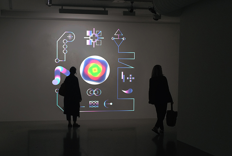
I became interested in developing a project inspired by the Codex Seraphiniaus that explored a fictional world of my own making, however I was unsure about what format to present it in. After some consideration, I felt that it would be appropriate for it to exist online using web technologies, as the book itself is speculating on the future of communication and internet culture. My initial idea was to create a series of interactive animations in P5.js that audience members could interact with using their phones, presented within the context of an ancient hieroglyph.
Figure 3: An early mockup of my idea
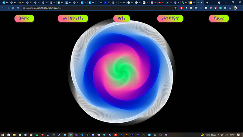
I also considered making a website inspired by my research, creating an interactive online database of an alien world. I knew I wanted to present my own fictional language, so I arranged a collaboration with my coursemate Noa Geras who drew up a series of alien letters using her skills in calligraphy. I took her drawings and turned them into a web font, which allowed me to host them online. You can view a website draft I created here, using the React framework.
Figure 4: Still from a website I built during the early phase of this project
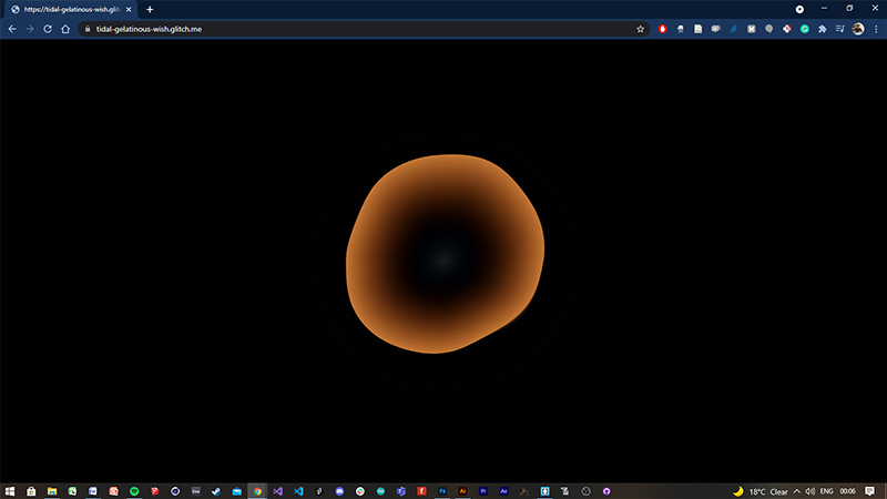
I also became interested in experimenting with server-side programming using Node.js. I created an experiment where I produced an alien-looking animation that morphs and changes depending on how many clients are looking at it on a server. You can view it here.
Figure 5: Initial experimentation with server-side programming
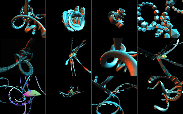
Following feedback from various tutors, I became interested in presenting a series of alien creatures alongside my fictional writing in an archive format. I felt that the experiments I produced thus far lacked variety and did not have enough meaningful interaction. After viewing the summer sessions lecture given by William Latham, I felt that it could be interesting to incorporate genetic algorithms into my idea. I looked at examples of pieces that simulate natural selection, such as Galápagos, an interactive installation created by the artist Karl Sims. Something that I found exciting about this piece, as well as genetic algorithms in general, is that it offers the possibility to create a unique experience for every user, due to the response constantly evolving and changing. I felt if I could incorporate the elements from my previous experiments together alongside this technical framework, I could have the foundation of an interesting piece.
Figure 6: Galápagos, Karl Sims (1997)
Technical
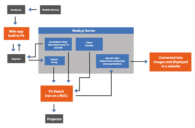
The piece consists of two main elements: A genetic algorithm that provides the framework for the audience interaction, and three websites (built using P5.js) that communicate with each other over a Node server.
Figure 7: Diagram showing how I passed data through my server
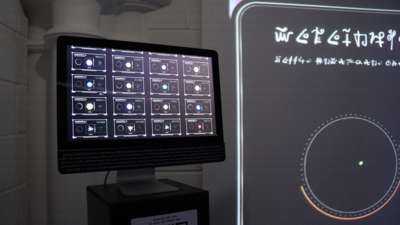
When the audience makes a selection on their phone, an array of data is sent to the server, which is then retrieved and converted into a creature in the website displayed on a projector. The website resets every 13 seconds, signaling a new generation; when this happens, a screenshot is taken of the display, converted into base 64 data, and sent to a third website. This website then converts the data back into an image and displays it in a grid using CSS styling.
Genetic Algorithm
The piece uses a genetic algorithm to determine the evolution of each creature. I took a lot of inspiration from Daniel Shiffman’s Nature of Code series, for example the framework of the phone app is based on his Interactive Selection sketch. In this example, the fitness function is assigned by user interaction, producing an array of data that is passed down every time there is a new generation. The data is then converted into the properties of each creature; if multiple options are selected, the two creatures with the highest fitness rating are merged to create a ‘child’ of both arrays. The creatures are created using the Superformula, a calculation used to create complex shapes commonly found in nature. The various parameters of the formula are modified based on the data being received from the genes array, along with the creature’s size, colour, rotation speed, and noise values.
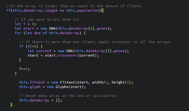
I had to modify the code significantly to adapt it for my piece. The main difference was how I isolated the fittest creature from every generation and displayed it on a separate website. To do this, I had to return the fitness array and broadcast it to the server every generation. To make it easier for me to understand, I created two folders of identical code; one for the phone app, and the other for the projection sketch. Once I was able to retrieve the array on the projector side, I fed it into its population class. This allowed me to create a new creature with the same genes from the user's selection on the phone, albeit with significantly more detail. One of the main challenges was figuring out what to do if multiple clients interacted with the piece at the same time. I encountered a lot of bugs when more than one person joined the server, for example the sketch would miss generations or multiple shapes would appear on the screen. To solve this, I fed all of the arrays into an additional array, and wrote an if statement that specified that shapes should only be drawn when the array's length was greater than or equal to the number of clients on the server. I then wrote the following code to merge all of the arrays together:
Figure 8: Code demonstrating how I merged all of the arrays together, using the examples built-in crossover function
User Interaction and styling
Once I had sorted the bugs, I focused on the styling of each sketch. In regards to the projection, I liked the idea of presenting the creatures within the context of a cryptic, alien display. The gene array is presented to the right of the creature as a series of letters, along with a moving shape created using Perlin noise. I also added a line that scans over each creature and leaves a trail based on its colour values, moving up and down randomly. Based on feedback in the summer sessions, I knew I had to make it very obvious when someone joined a server. To do this, I added a display to the left of the creature that generated a bouncing ball every time the client count increased, along with a corresponding sound effect. I also added a sound to signify a new generation, as well as atmospheric background music that played on a loop.
I conducted a lot of user testing to make sure that the app worked responsively across different displays, as well as being intuitive to use. To test the app, I used Ngrok to make my local domain accessible to other phones, a process that I ended up using during the exhibition. I learned a lot from these tests, specifically that certain browsers contain built-in functions for zooming/swiping that I needed to deactivate in my code. I also put a lot of work into how I presented the archive website; it was displayed on a Macintosh computer, however I felt that the logo being visible would ruin the immersion. To solve this, I concealed the base with an acrylic plaque that contained my alien writing. I also made sure to download software that would prevent it from automatically powering off during the course of the exhibition.
Figure 9: Images of my app, website and projection
Future development
There are many ways I would like to develop this piece further. For one, I am interested in how it could be presented outside of an exhibition format. How could this piece work outside? What if the creatures were projected across a building? I also believe that the framework I have constructed could lend itself well to other installations. The idea that anyone can interact with a piece using their phones without needing to download an app is an exciting prospect to me.
In terms of improvements, I would like to develop the use of sound in the piece. I originally wanted to create unique sounds live in the sketch that would react to each creature, perhaps being affected by its genetic information. I intended to collaborate with a coursemate that specializes in sound design, however due to various reasons this was unable to go ahead. I resorted to using royalty-free music and sound effects that I found online. This worked to an extent, however it became slightly repetitive over the course of the exhibition. I would also like to develop the creatures further by adding in more variation. The superformula produced some interesting results, however I feel it could be improved by using this in conjunction with other processes for simulating organic form. I believe it would also be interesting to have the creatures move in 3-D, similar to the aforementioned work by Karl Sims and William Latham.
As the piece makes heavy use of web technologies, I believe the next phase of this project would be getting it to work online and have it responsive across any display. I imagine that this would be similar to the piece Electric Sheep, created by the artist Scott Draves. Like Codex, it uses a genetic algorithm, where audience members get to decide how creatures survive and evolve. Something that I particularly like about this piece is that you can view the lineage of each creature and how it evolved in an online archive. This is something that I included in my piece to an extent, however the end result was not as detailed as I would have liked due to time constraints. This is the main area of my project that I feel requires development.
Self-evaluation
During the course of the exhibition, I noticed some issues with the piece that will need to be improved upon in the future. One issue was that some people got confused with the interaction; they thought that they had to tap on each creature, rather than holding their finger on it. This is something that I will need to resolve if I am to develop this piece further, as it led to some people thinking that it didn't work properly. I also encountered a slight bug when multiple people joined the server, which was if one of the clients didn't make a selection, sometimes nothing changed. This was an issue to do with the number of arrays not always equaling the client count. If people inadvertently left the app open, it occasionally led to the piece not entirely working. I tried to fix this issue several times before the exhibition, however a solution eluded me. This is something I will have to study in more detail in order to get the piece working smoothly with multiple users. I also feel that I should have included an option for an iPad in case there was no internet, in order to make the interaction obvious for people that are not tech-savvy and don't know how to access a website via a QR code.
Despite these drawbacks, overall I am very happy with how the project turned out. The piece ran smoothly over the course of the exhibition due to the lengths I took to set it up. I am also happy with the presentation of the piece, in terms of the graphic design of the projection, the way I decorated the computer, and the layout of the phone app. Despite the small issue I mentioned before, overall most people were able to use that app smoothly, and I ultimately achieved the interaction I envisioned at the start of this project. I also felt that the interaction was an effective workaround regarding the issues surrounding the COVID-19 pandemic. By having the app on people's phones, it meant that I was able to significantly reduce any health and safety risks that could have occurred. I am also particularly happy that I was able to achieve a polished result with technology I had never dabbled in before. This was the first time I have ever created a project using genetic algorithms or WebSockets, and I believe I set myself a challenge that (for the most part) I was able to complete to a high standard. In summary, I feel I successfully executed a project that was a natural progression of the themes I was interested in at the start of the term.
References
Robinson, A., 2003. The story of writing. New York, NY: Thames and Hudson.
Bourke, P, 2021. Supershapes / SuperFormula. [online] Paulbourke.net. Available at: http://paulbourke.net/geometry/supershape/
Shiffman, D, 2012. The nature of the code. [S.l.]: D. Shiffman.
Shiffman, D, 2017. [online] Youtube.com. Available at: https://www.youtube.com/watch?v=bjULmG8fqc8&ab_channel=TheCodingTrain
Serafini, L., 2013. Look Inside the Extremely Rare Codex Seraphinianus, the Weirdest Encyclopedia Ever. [online] Wired. Available at: https://www.wired.com/2013/10/codex-seraphinianus-interview/
Serafini, L., 1981. Codex Seraphinianus. [S.l.]: Rizzoli.
Draves, S, 1999. Electric Sheep Crowdsourced Evolving Art. [online] Electricsheep.org. Available at: https://electricsheep.org/#/about
Sims, K., 1997. Galapagos interactive exhibit by Karl Sims, 1997. [online] Karlsims.com. Available at: http://www.karlsims.com/galapagos/
Latham, W, 2017. William Latham History. [online] Latham-mutator.com. Available at: https://mutatorvr.co.uk/


