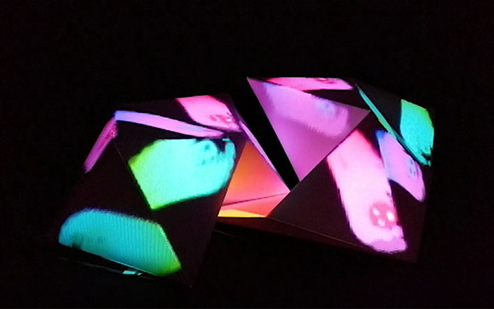
Anxious Shapes
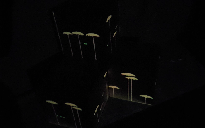
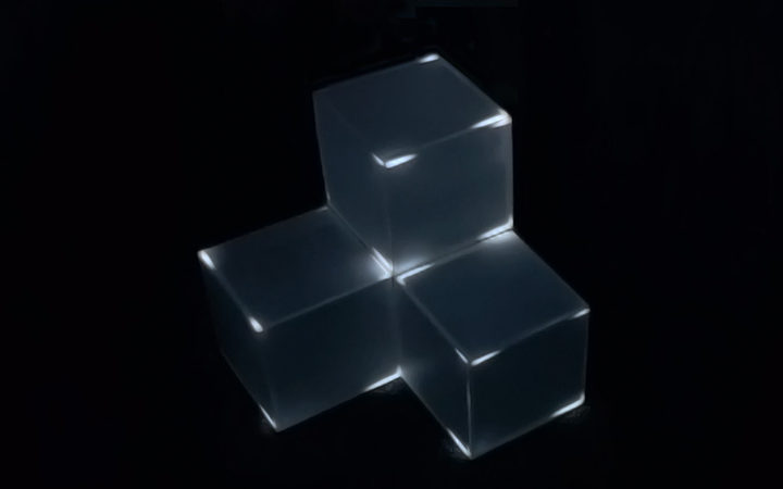
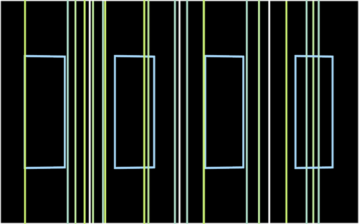
A projection mapping project exploring the use of 2D Primitive shapes in creating complex visual patterns that ultimately play with the viewer's sense of perception.
Produced by: Teodora Fartan
CONCEPT
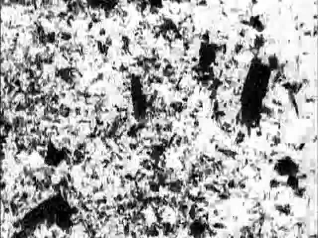
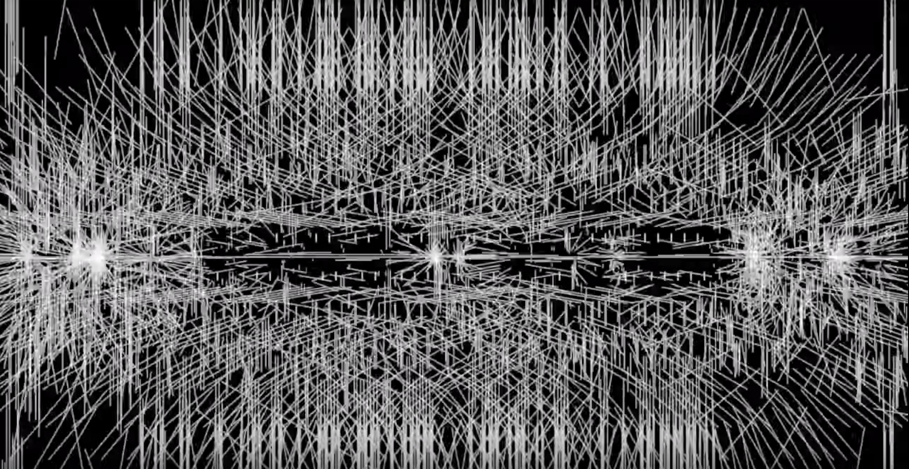
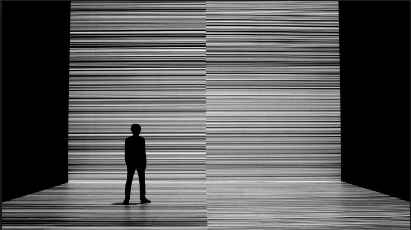
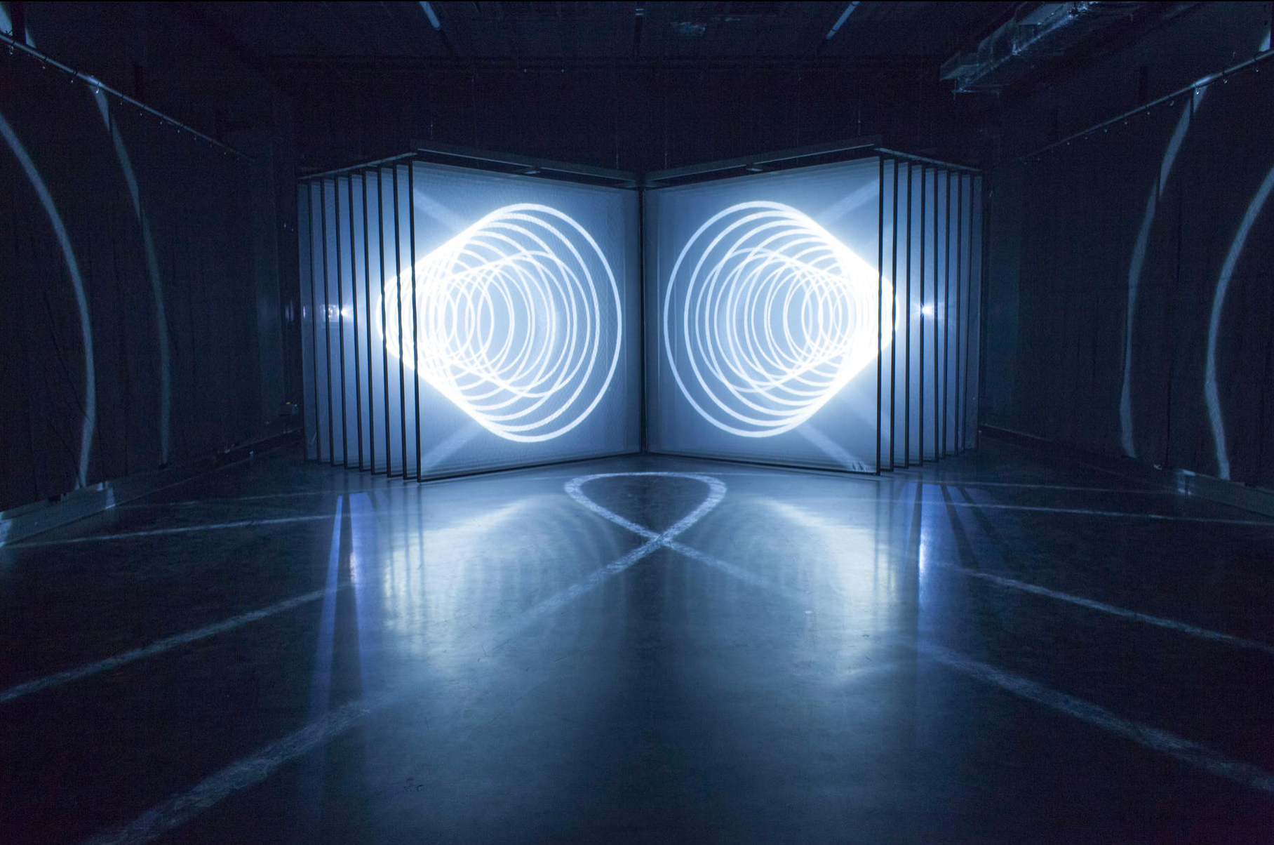
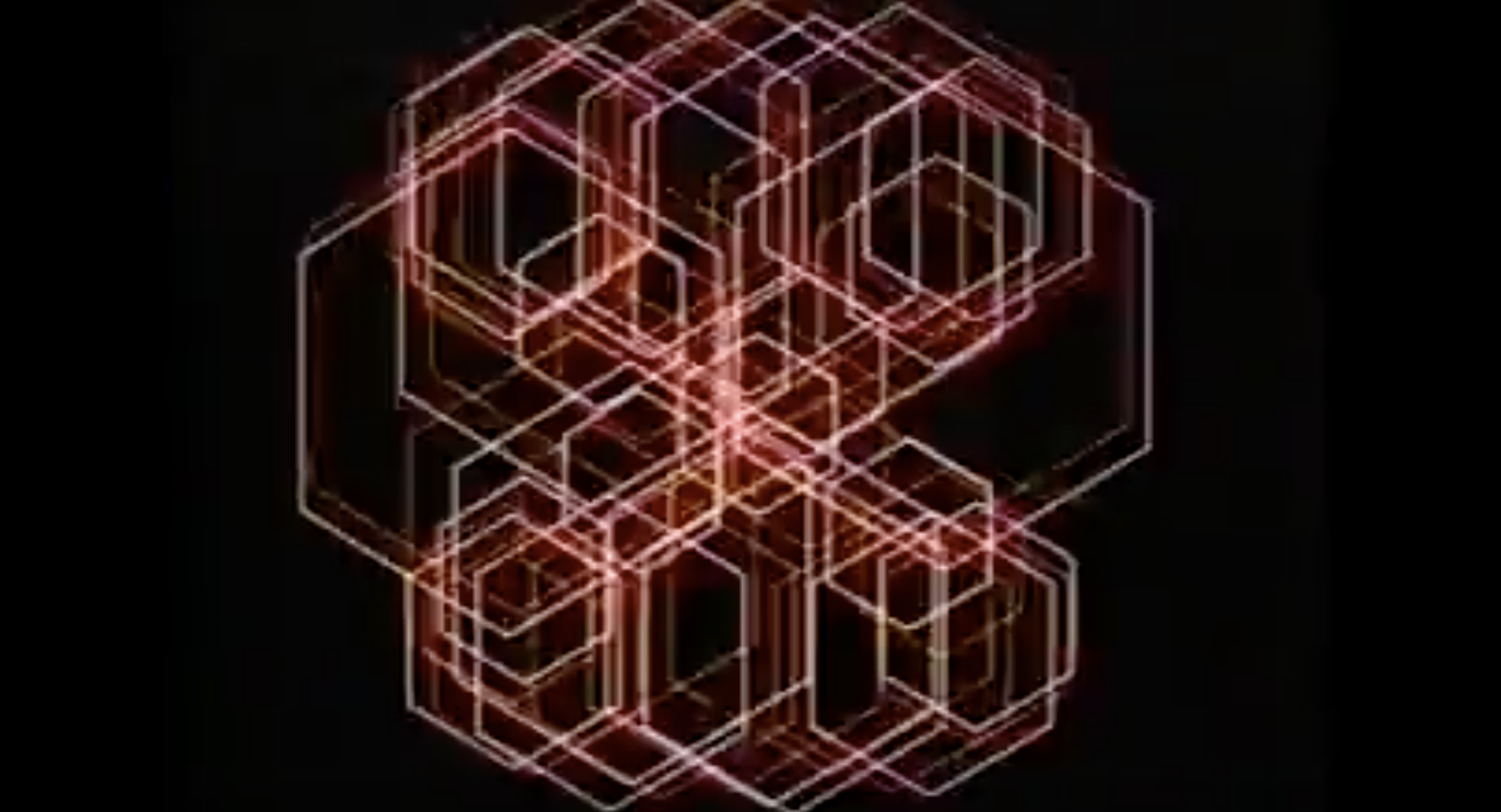
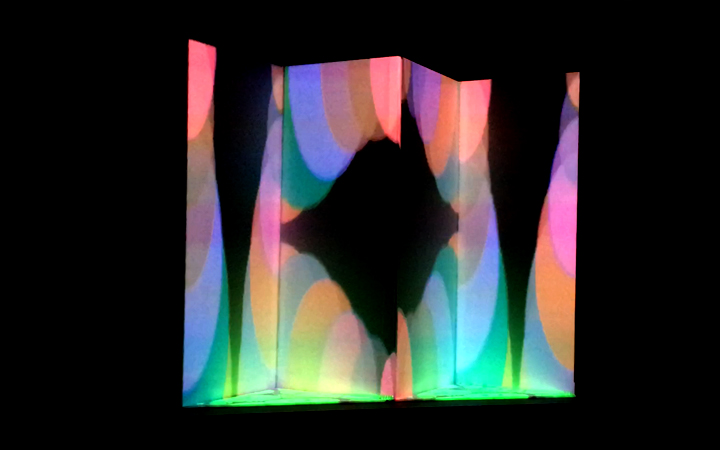
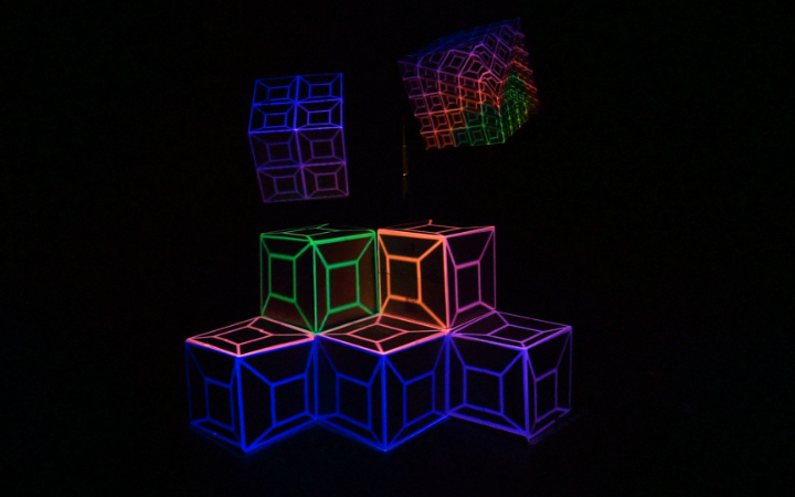
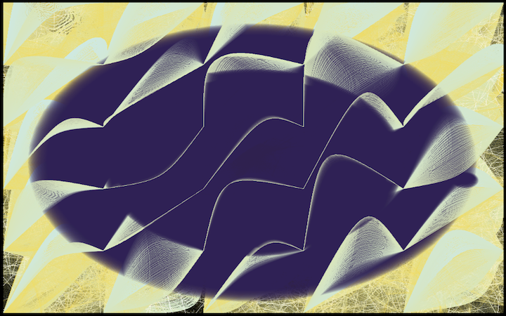
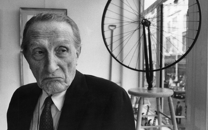
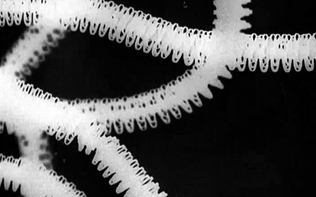
This projection-mapping project draws its inspiration from a wide range of sources, from the patterns exhibited in Man Ray’s ‘Le Retour a la Raison’ (1923) and John Whitney’s experimentation with shapes in ‘Matrix III’ (1972) to the more contemporary works of Ryoji Ikeda and the visual complexity generated through his ‘Test Pattern’ series, or the works of Nonotak Studio and their use of simple shapes and repetition to assemble perception-altering experiences.
Fascinated by how artists have employed simplistic 2D primitive shapes in order to create intricate visual pieces, I decided to experiment with ways in which I could generate sophisticated patterns that played with the viewer’s sense of perception by using only triangles, circles and squares. The aim of this project is to explore the possibilities of generating complex visual pieces that draw the viewer in and disrupt normal ways of seeing at times through their erratic existence. The geometrical shapes are anxious, volatile, mercurial even, all of them reacting to the dictations of the underlying code with the ultimate aim of creating a complex web of interactions.
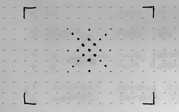
Inspiration gallery (Man Ray, John Whitney, Ryoji Ikeda, Nonotak Studio) :
PROCESS
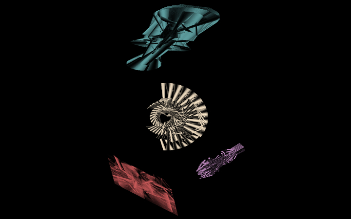
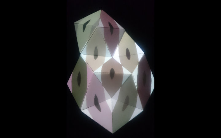
Due to the many assemblage possibilities offered by the Olga kit and the thought that our initial shape might have to change when setting up in the exhibition space, I set out to devise three generative animations that would be flexible enough to adapt to the possible modifications. By making use of the techniques taught to us across the length of the term as well as further advice from the ofBook’s section on Graphics, I set out to create three scenes for my projection that would progress from triangles to circular shapes and further onto rectangular forms in order to create intricate visuals:
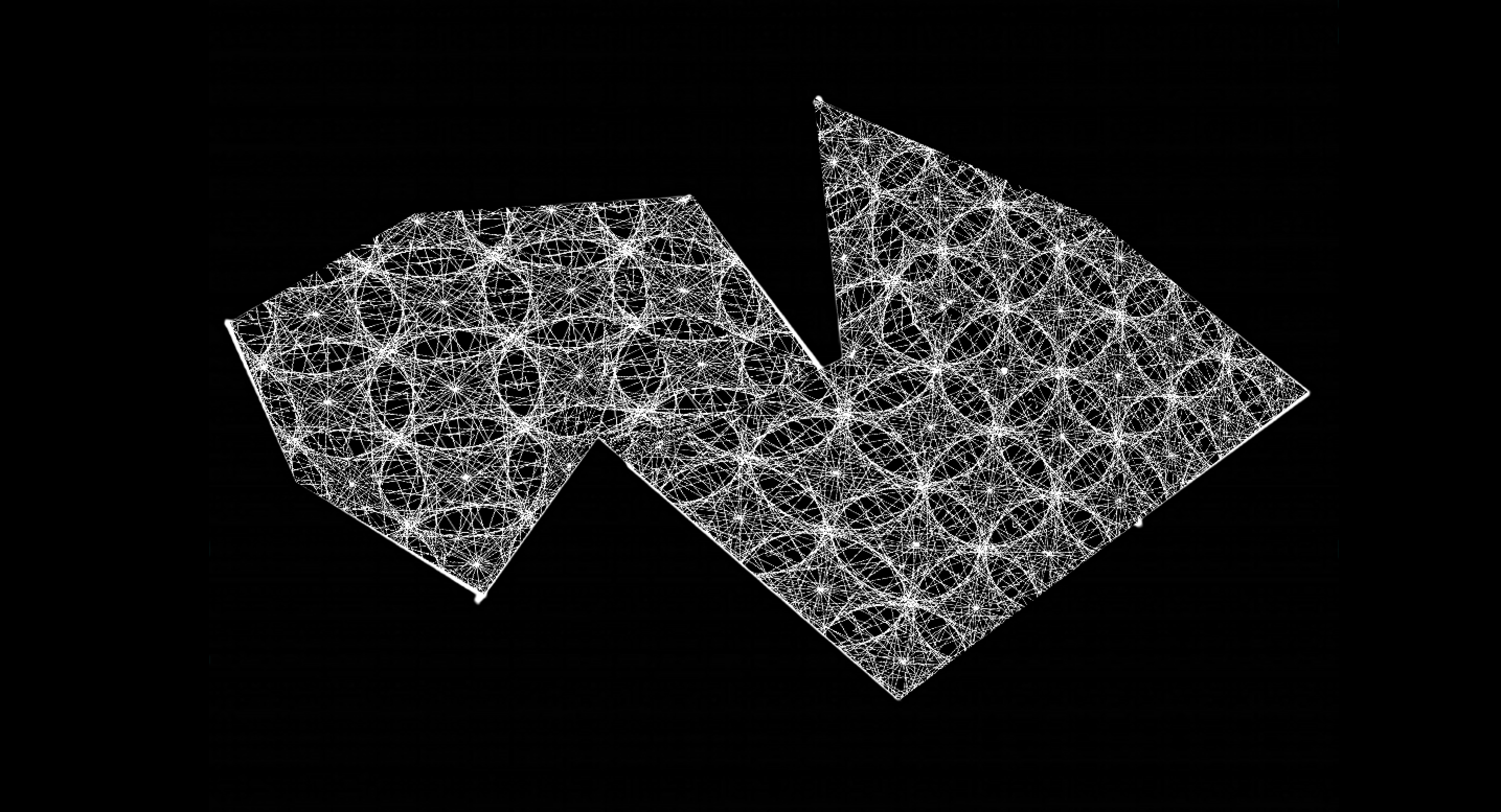
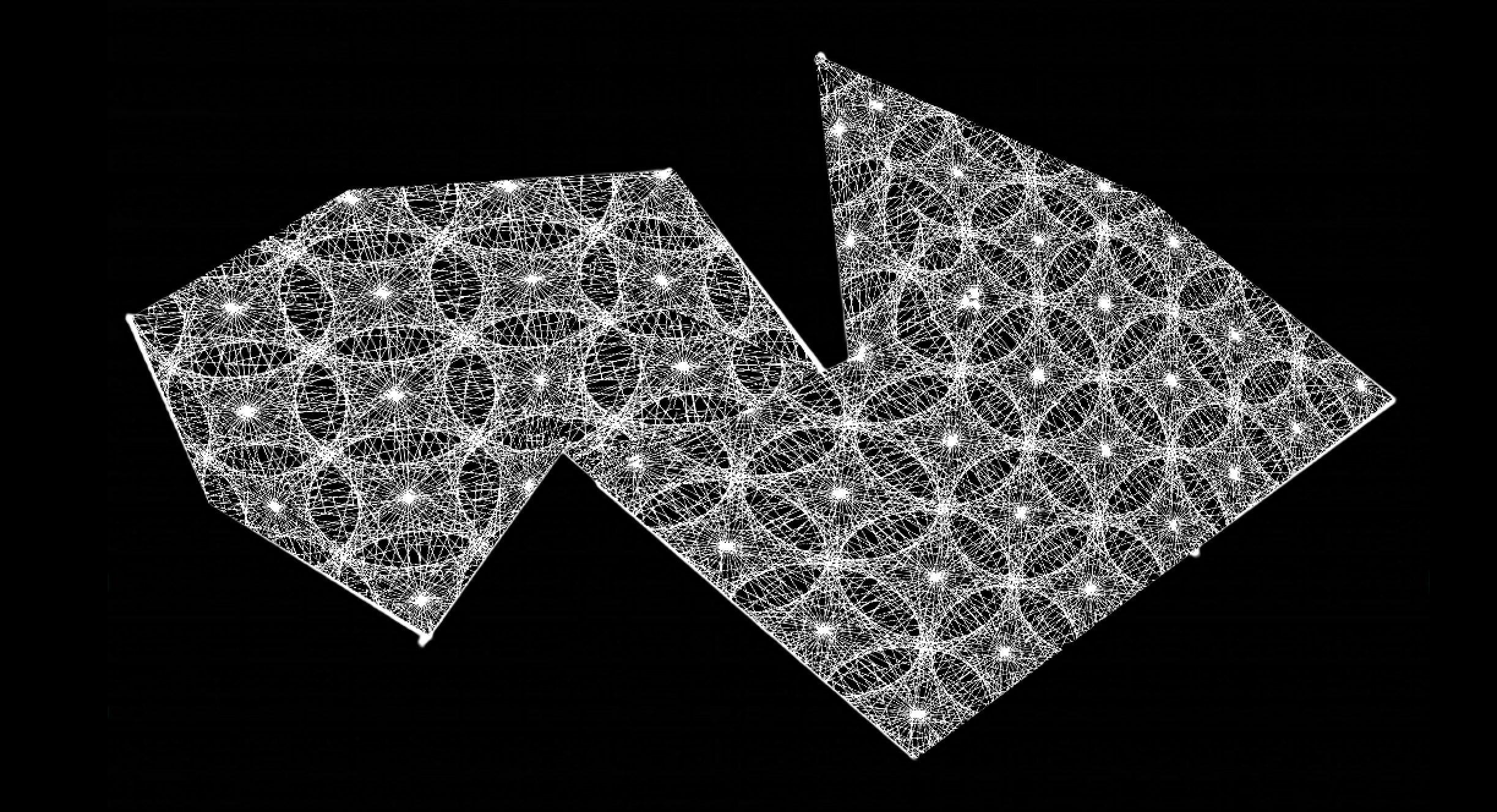
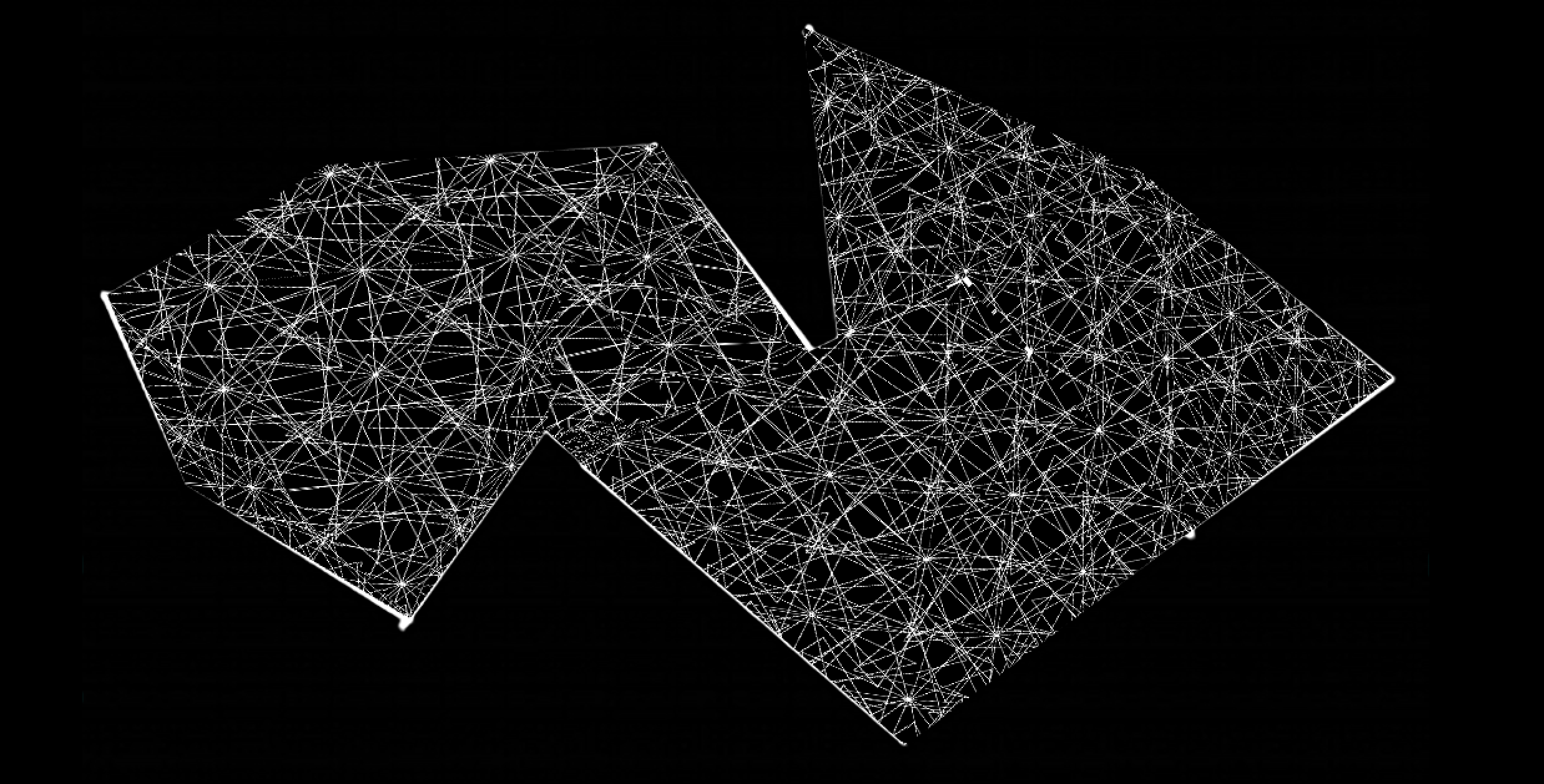
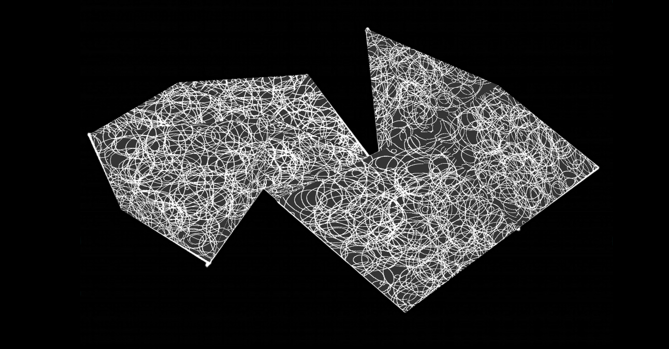
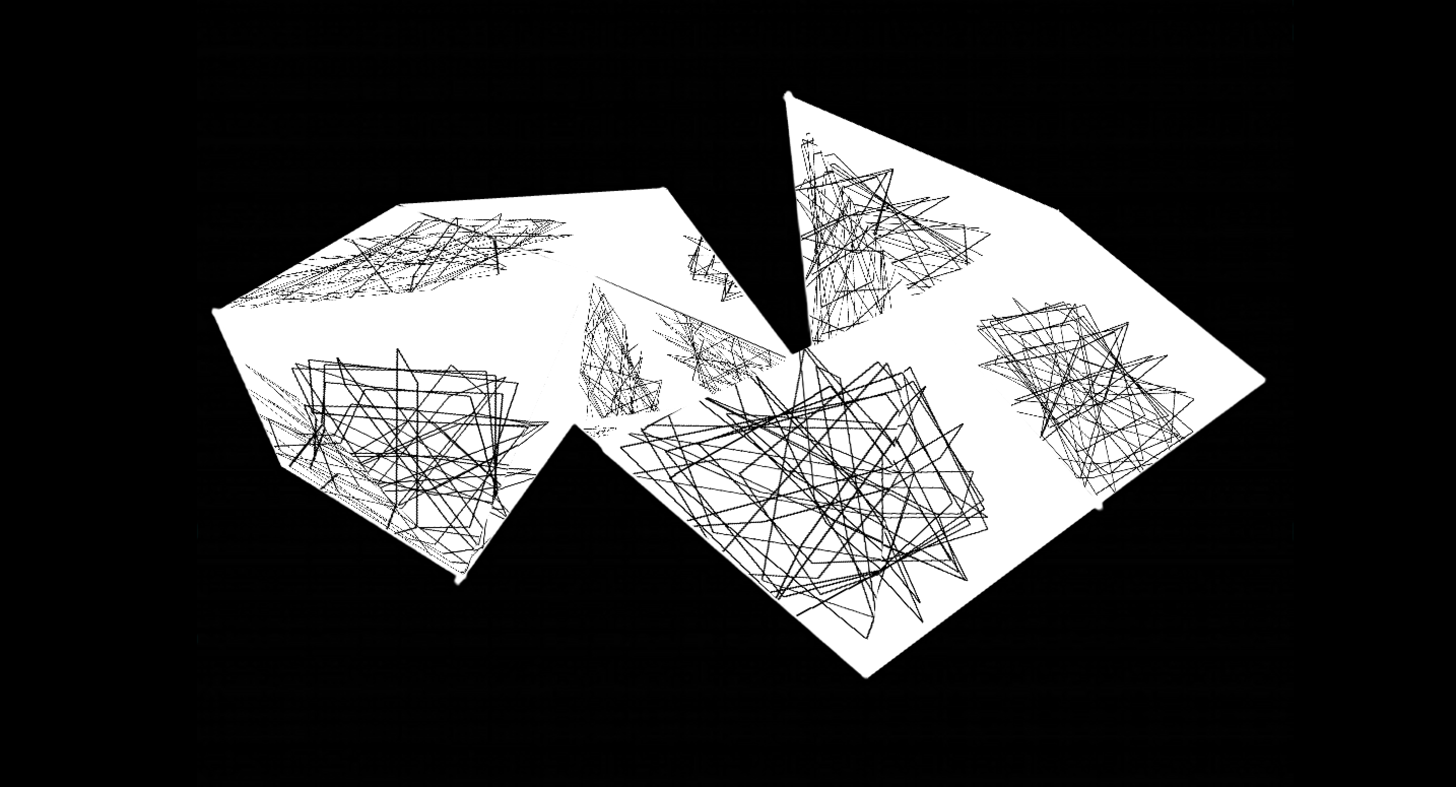
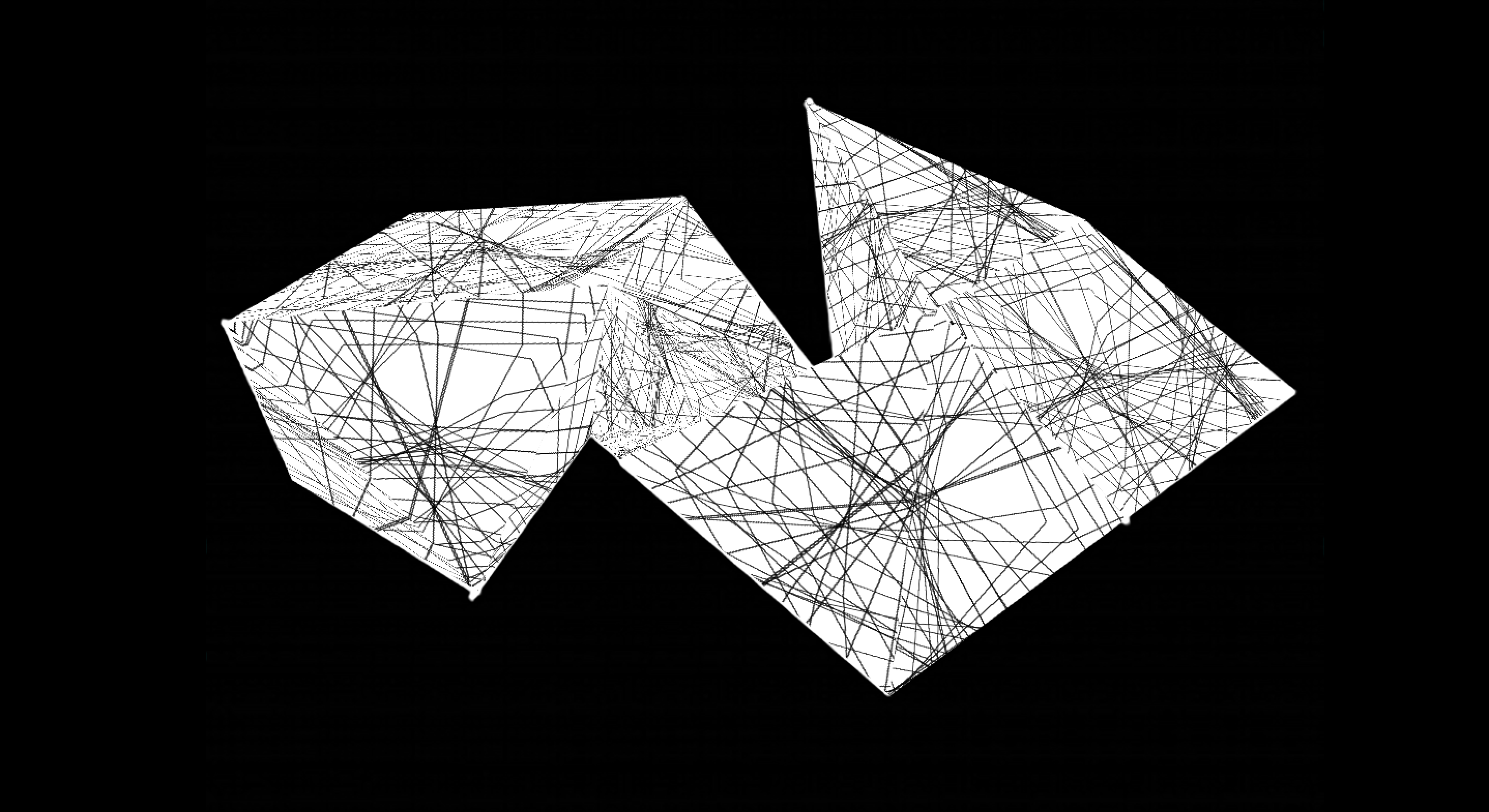
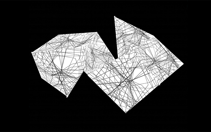
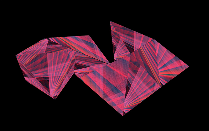
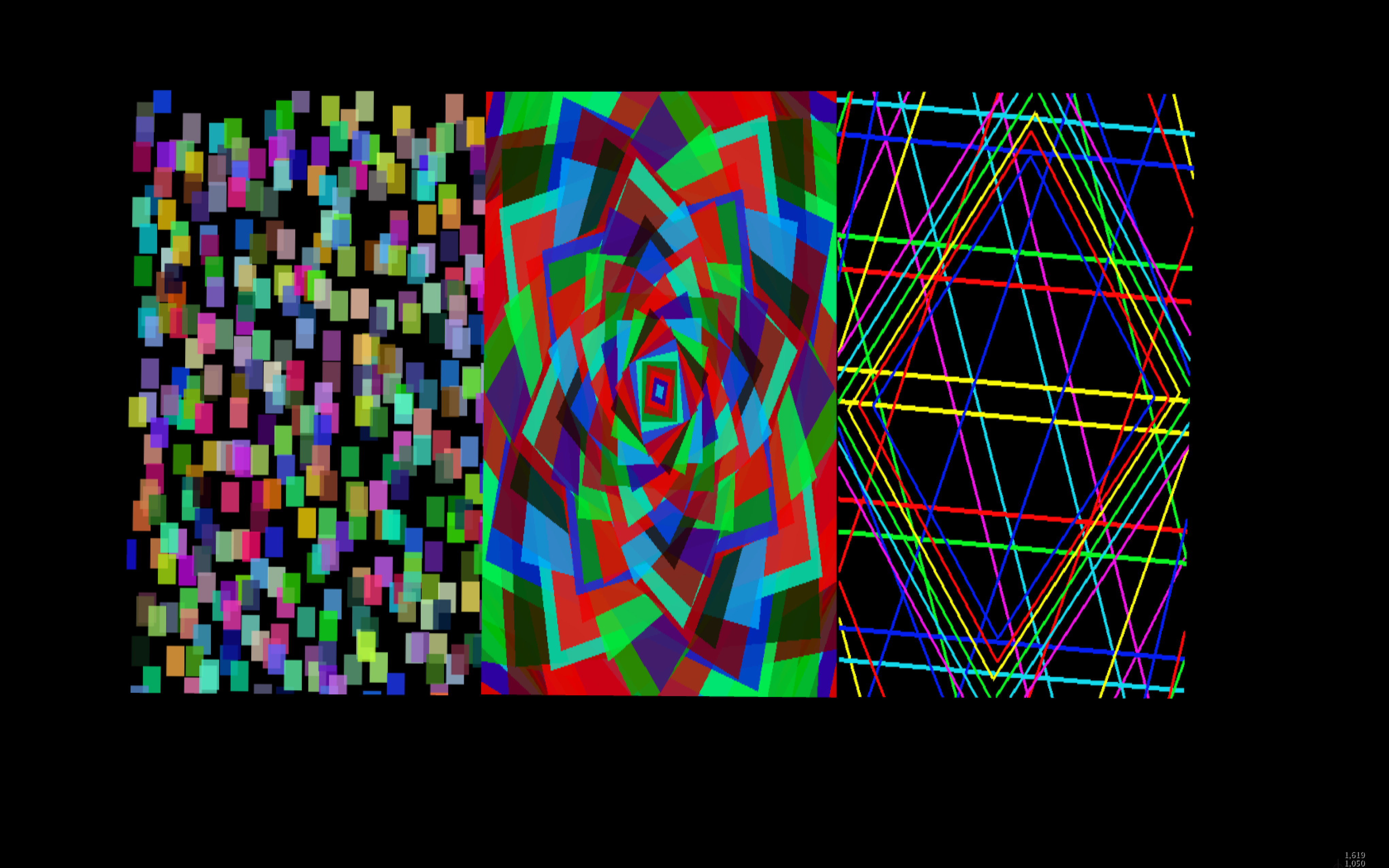
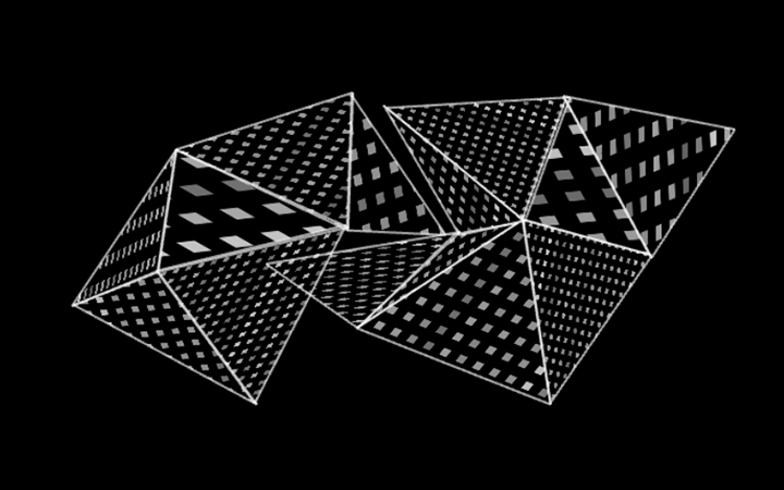
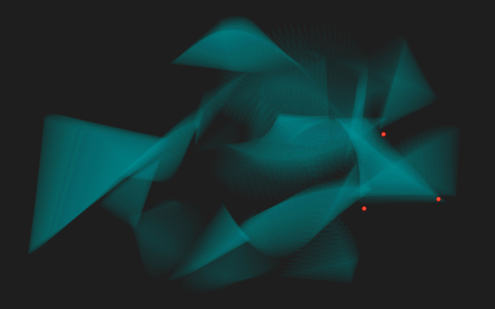
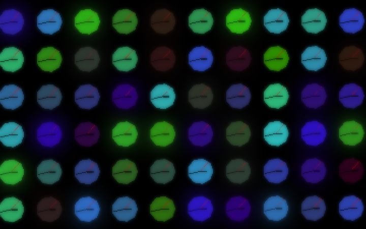
The first one employs the use of a grid, each element represented by triangles spinning around a point. A timer was set up in order to increase the number of triangles and speed over the course of one minute, thus creating a pattern that evolves from simple lines to a complex, intricate matrix, that reveals ‘hidden’ circular shapes generated through the motion of the spinning triangles. Although the shapes are triangular, the eye starts perceiving circular shapes – in this sense I feel that the first scene has perhaps best achieved the objective of altering perception.
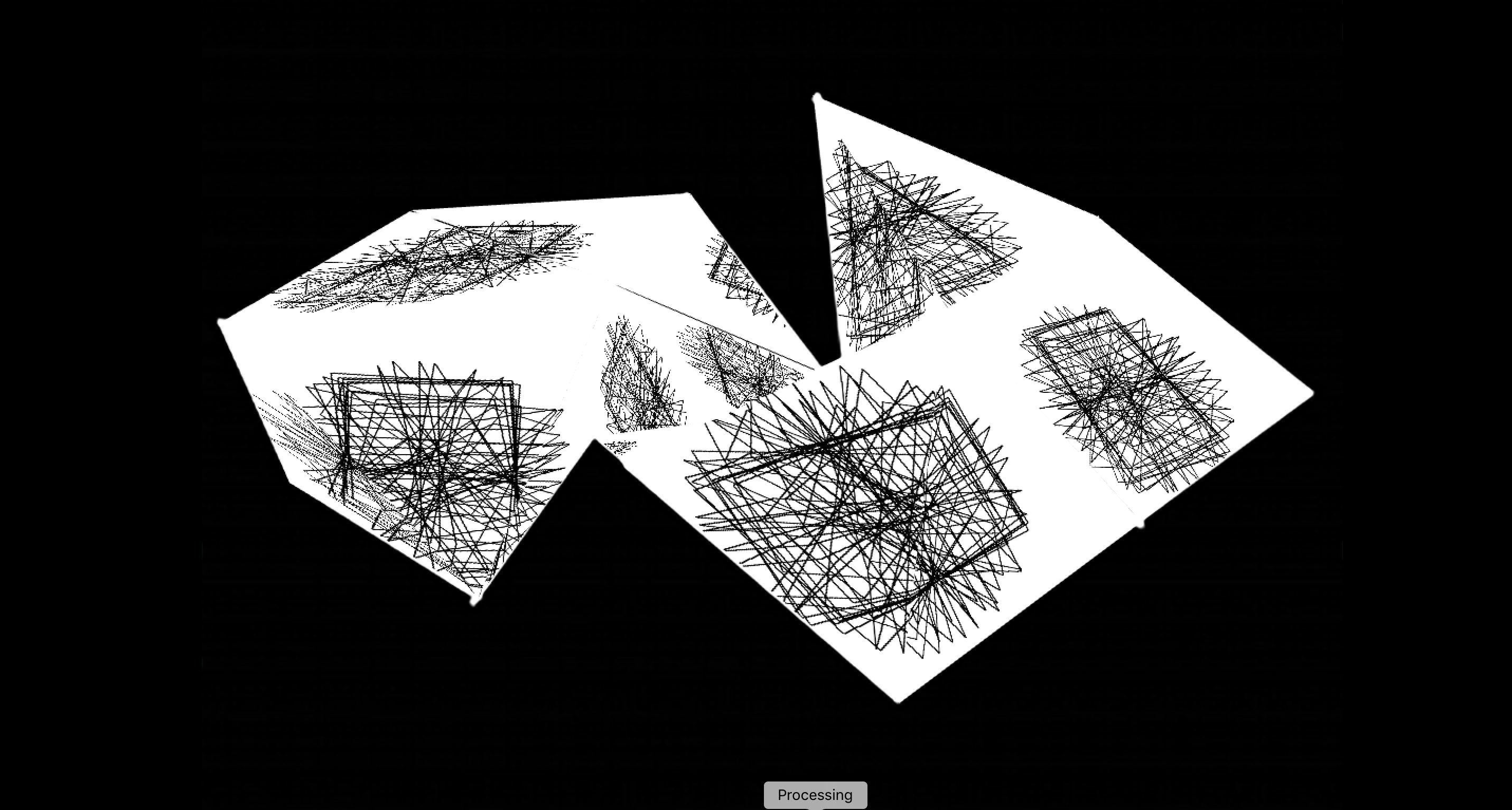
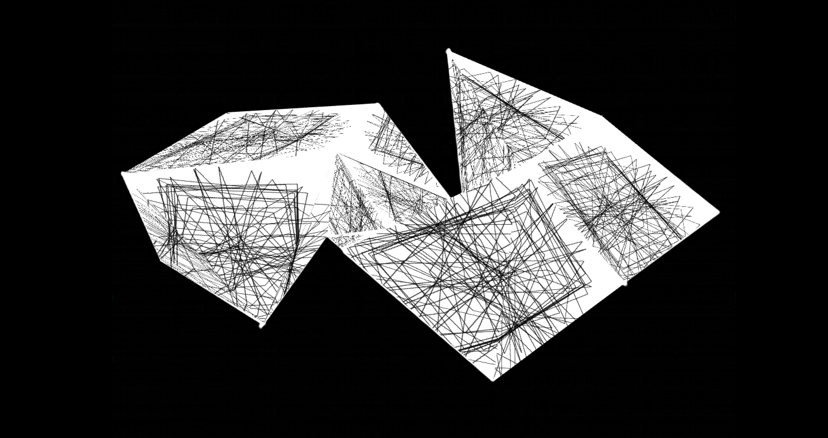
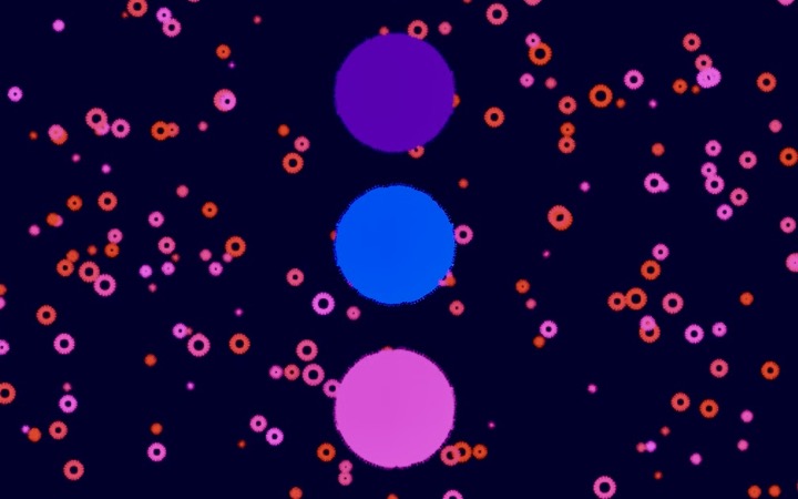
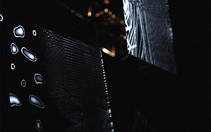
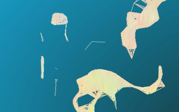
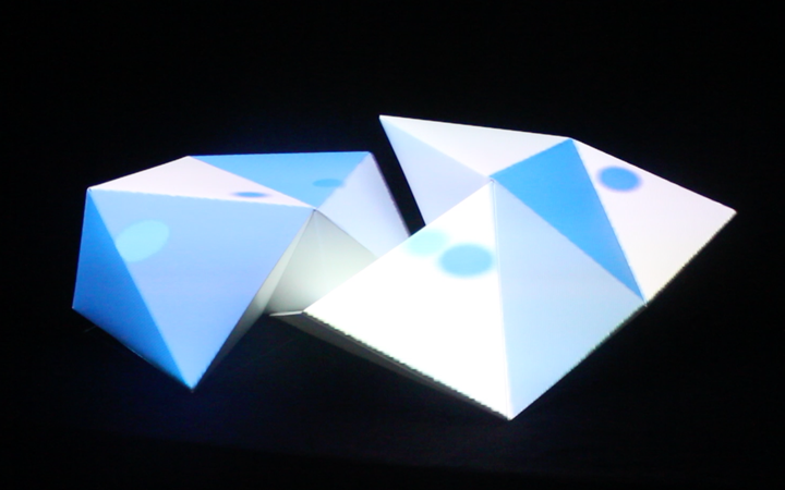
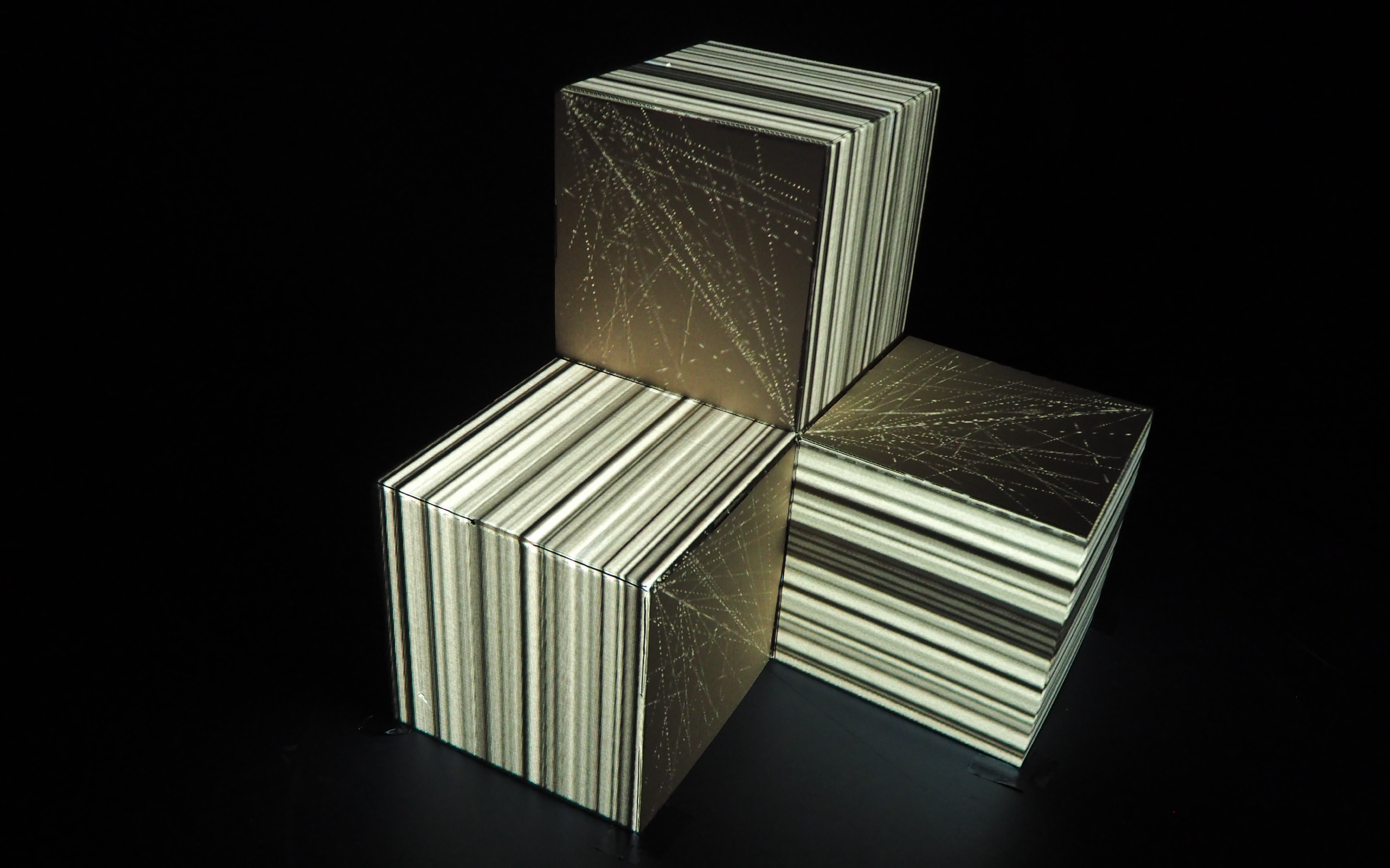
The second scene experiments with the use of noise in order to generate intricate visuals; the moving circles are inspired by raindrop patterns in water; they are soon overlapped by the much harsher, angular shapes of squares – an interesting transitional effect is achieved through the use of a pulsating background and different line colour for the shapes (when the background flashes black, the white shapes can be seen and vice versa when it flashes white). This background technique is used both as another way to play with perception and as a transitional effect from a predominantly-dark piece to a white environment.
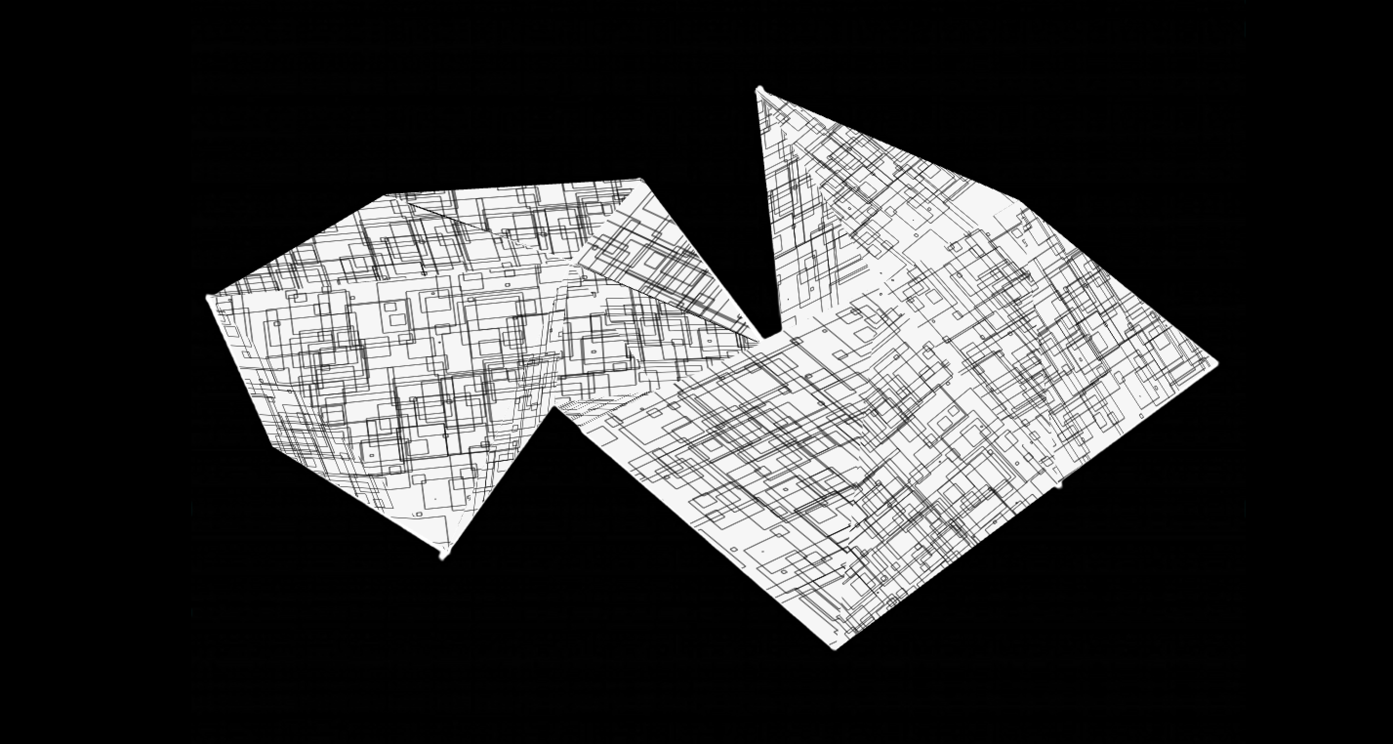
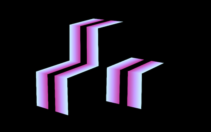
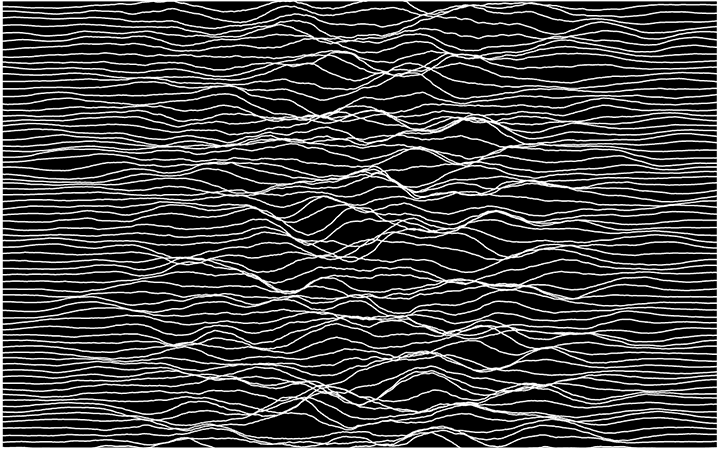
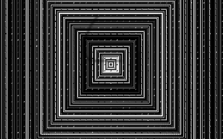
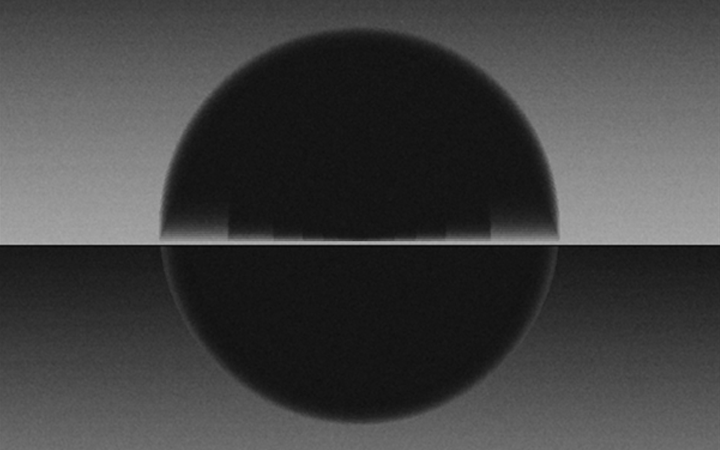
The third and last scene experiments with a complex shape made out of rectangles that zooms in and out, effectively creating a line pattern when viewed at full height and then diminishing to a self-contained structure. The scaling and rotation alterations enable the piece to be ever-changing and paired with the in-out movement, maintain the attention of the audience.
The choice to limit colour to the grayscale range was made in the belief that a limited chromatic palette will better focus the eye of the observer on the movement and changes at play in the pieces.
TECHNICAL ASPECT
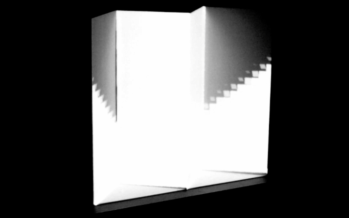
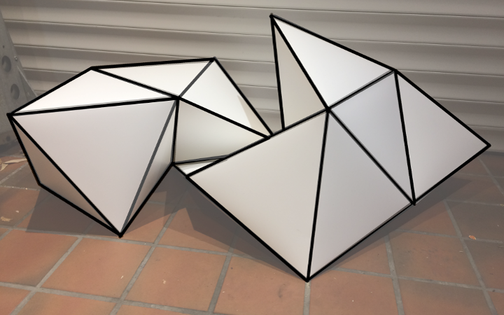
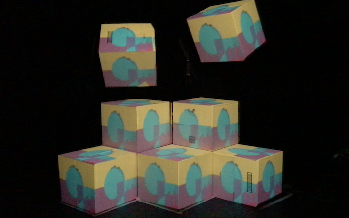
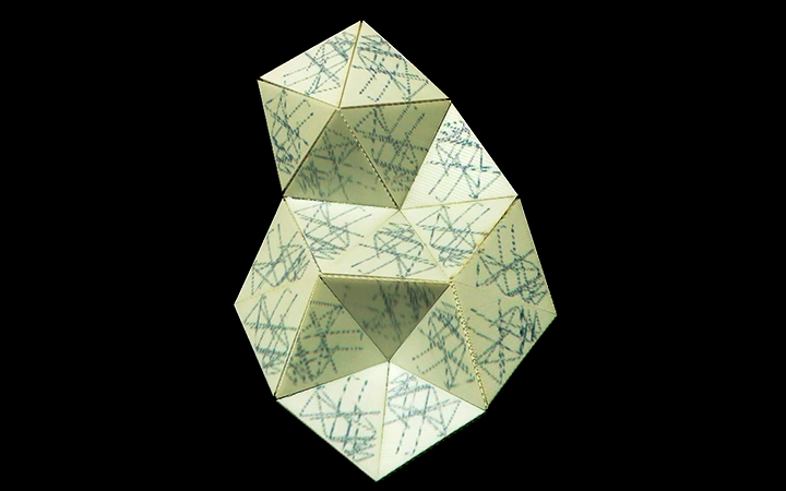
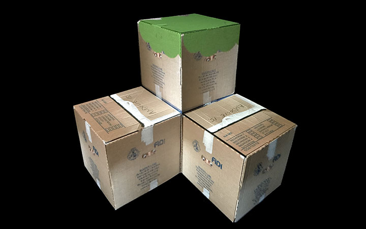
Perhaps the most challenging aspect of this projection mapping endeavour was setting up for the exhibition. The different circumstances from our original plan in terms of positioning, relative distance from projector and its location prompted us to change our dummy object radically and re-work our scenes. Time constraints were a challenge as well, as we had to selectively make decisions in order for the team to be all exhibiting in a proper manner at the time of the opening.
The resolution of the projector and its distance from the piece did have a big impact on my projection scenes, as the intricate patterns require a high-quality output to be properly observed – unfortunately, changing the projector was not an option due to time constrains but this is something that could have been avoided with better preparation and earlier tests and it is definitely a process I will take into account more seriously when experimenting further.
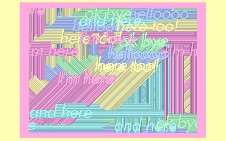
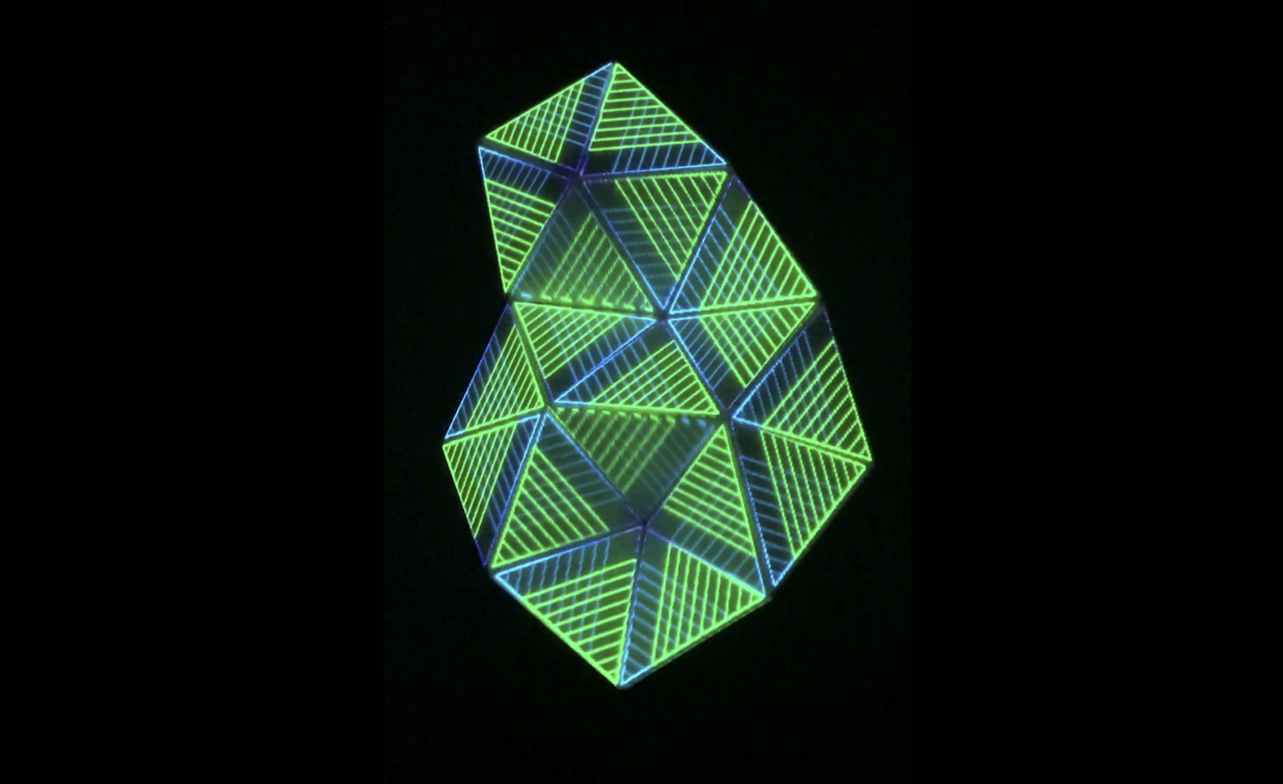
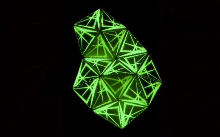
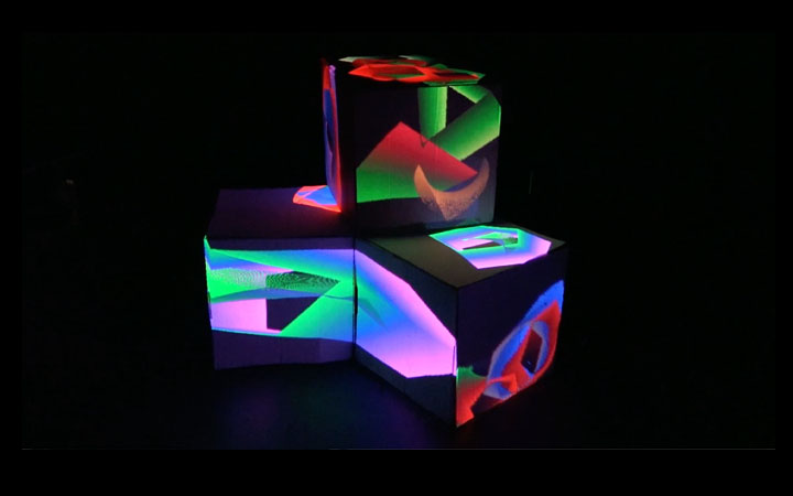
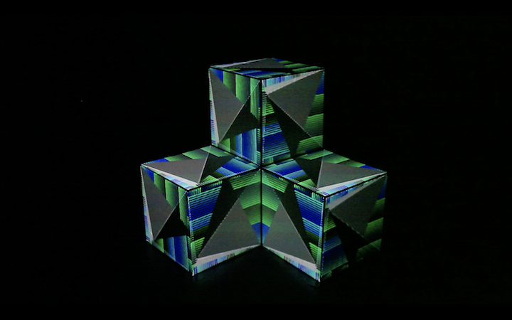
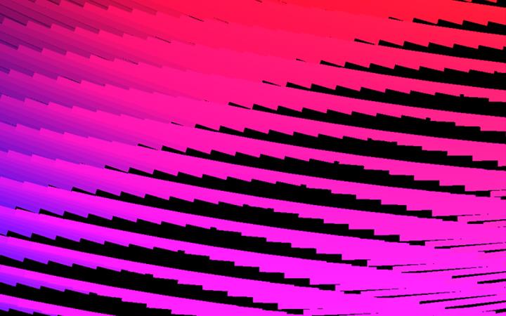
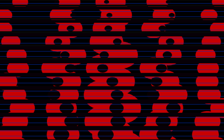
Stills from the aforementioned scenes:

FURTHER DEVELOPMENT
In terms of further development, I would like to keep experimenting with ways of creating complex patterns and perhaps introducing a greater element of movement and change into the scenes. This has definitely been a good exercise in employing noise, scale, rotation and for loops so far and I feel like there is quite a lot of possibility to build on these animation.
REFERENCES
Hadley, M. (n.d.). ofBook – Graphics. [online] Openframeworks.cc. Available at: http://openframeworks.cc/ofBook/chapters/intro_to_graphics.html [Accessed 13 Jan. 2018]
Ikeda, R. (2008). Test Pattern #1101.
Nonotak Studio. (2003). Daydream V.02.
Purform. (2010). White Box.
Ray, M. (1923). Le Retour a la Raison (The Return to Reason).
Whitney, J. (1972). Matrix III.


