Projection Mapping a Noisy Grid
An animation that moves from ordered to disordered lines.
produced by: Isaac Clarke
Introduction
When we started this project I was struggling with how to approach it. My interests in computing and contemporary art felt distant from projection mapping animations and I was unsure of how I could awaken it for myself. To begin the process I started working from a couple of processing sketches I had developed earlier in the year.
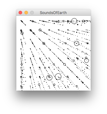
The first one SoundsOfEarth (https://github.com/isaac-art/SoundsOfEarth) is a animation that reacts to a short audio file, in which circles in a grid change in size. Although very simple I enjoyed the effect this gave as though a camera was moving above a surface, or items were falling down paths. I also thought it would be useful to begin with the restricted greyscale pallet before adding colour to the scene.
The other processing sketch ScottishWitches (https://github.com/isaac-art/ScottishWitches) used a dataset as a source to draw shapes into pages of a pdf.
I think these both had different feels to them visually, the SoundsOfEarth being lighter and faster and the ScottishWitches having a weight to it and a sharper line.
Concept and background research
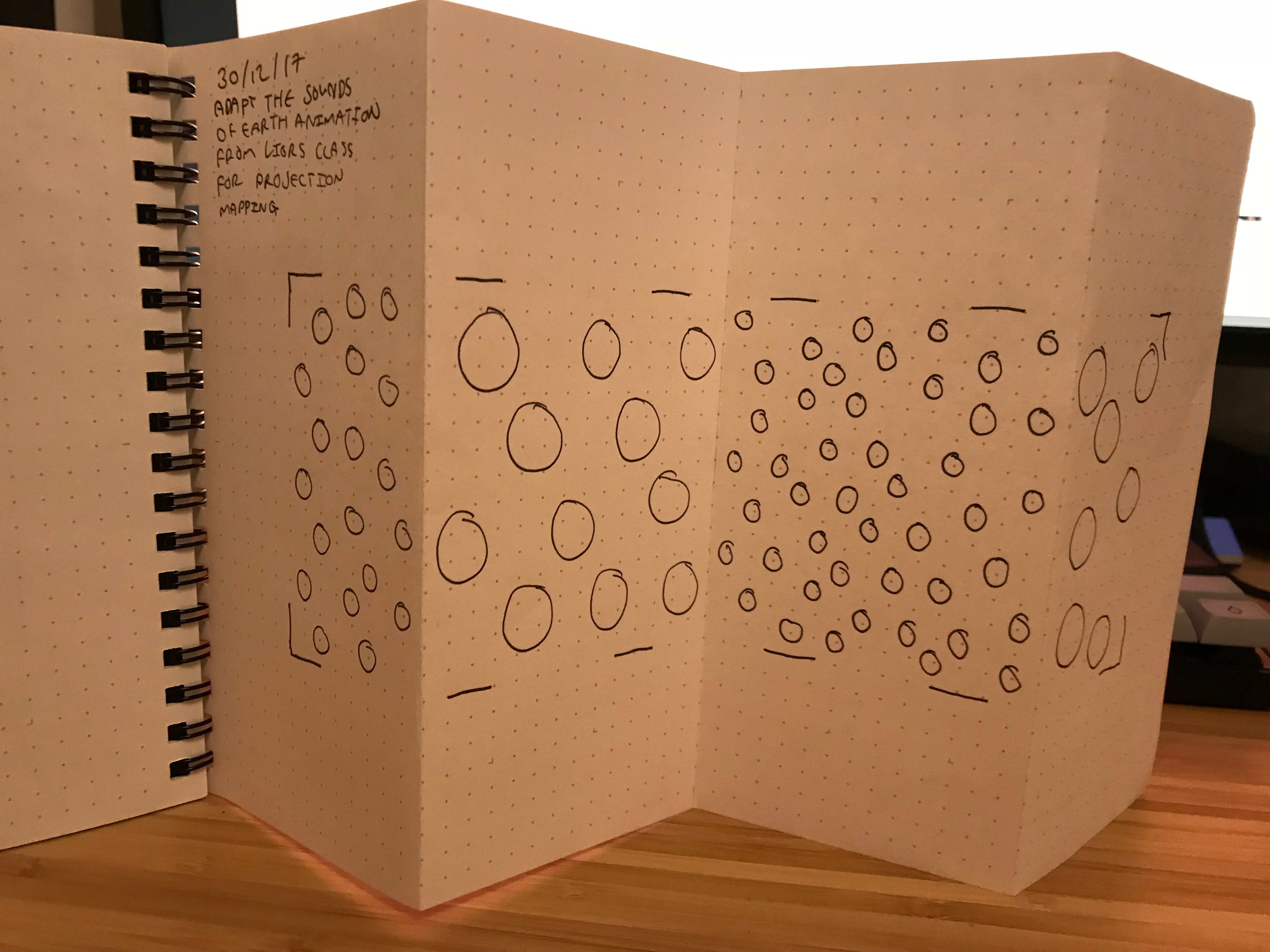
The surface our group was projecting onto was a concertina, accordion like shape. I wanted to play around with the multiple angles of this shape and how depending on the viewers position they can see different images. The material we used was also slightly transparent which allowed the viewer to walk around the object and have the object always be covered by the light from the projector.
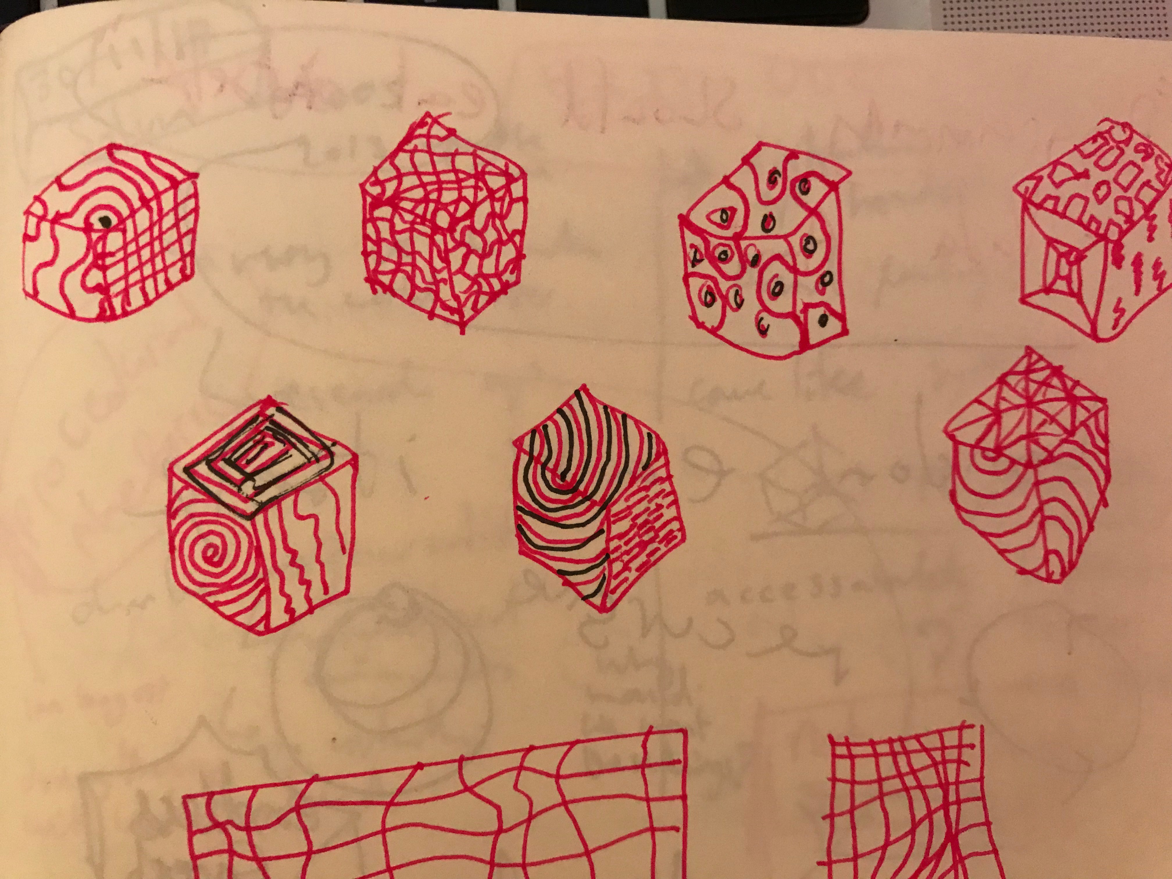
I had also been thinking about the work of Hundertwasser and his comments on walking in lines, never straight but never random. A noisiness to them, just as they should be, breaking the straight. I had been thinking of programming and its material origins, and wanted to use the structures of grid and mechanical movements, but break them up a bit, and give them life. Allow new forms to emerge from the imperfection.
My work in other modules had been looking at the Quipu, a 17th century database system using knots in string, so I was reading the book “Mathematics of the Incas: Code of the Quipu” by Marcia and Robert Ascher. Alongside that I have also been reading Alan Moore’s Jerusalem and I’m sure the visions of angels and angles found their way into this work too.
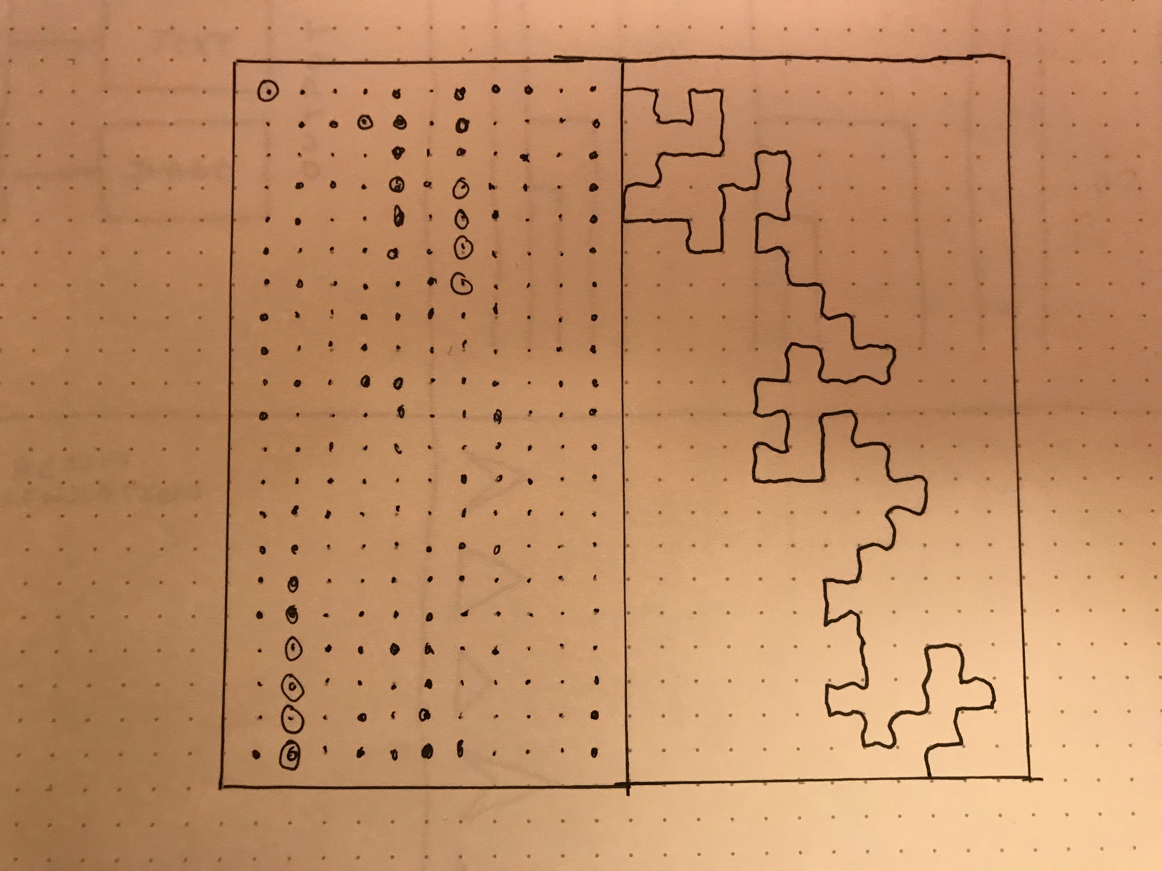
So taking the previous scripts, these influences, and the shape idea I was able to begin sketching out designs in my notebook of possible forms and arrangements that I found interesting.
Technical
From these I began developing the code to represent them. First of all I began by translating my soundsOfEarth visuals from Processing Java to OpenFramworks C++. In place of an audio file as a data source I instead created a vector of noise-led values for the script to pull from. As you would expect this had a very different visual feel to what I enjoyed in the soundsOfEarth script.
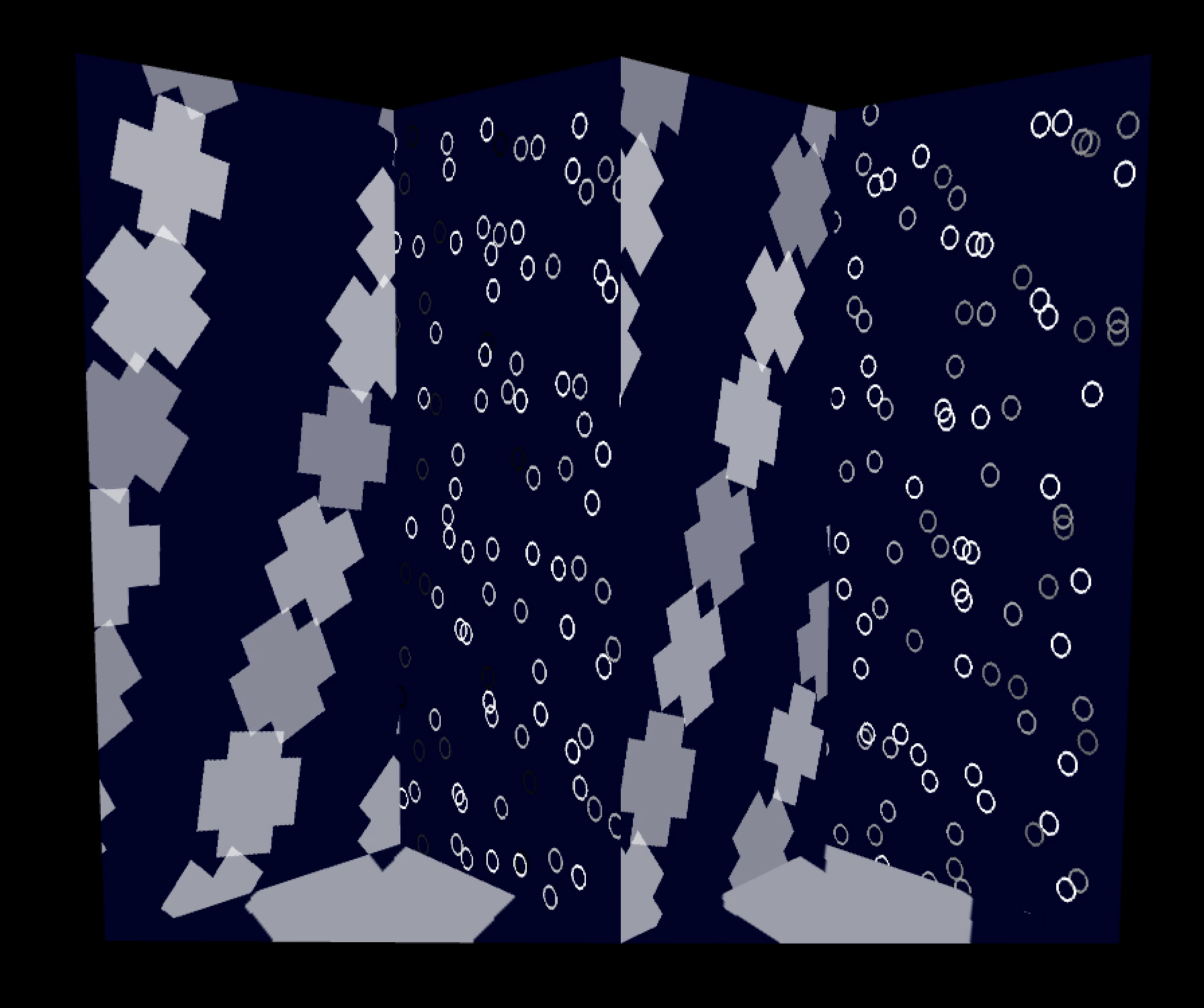
With the grid of circles I had I wanted to create some movement, like the viewer is tracking over a plane. So I began by moving the points of every even horizontal line in the grid using module in an if statement, this gave me a bit of that movement I was looking for. I accentuated this by moving the odd lines in the opposite direction. Then I decided to have the points of the grid wrap around the borders of the shape by checking if they were in the bounds of the width and height of the fbo. Adding some conditional timers I was able animate between combinations of movements in different directions. This gave the grid a lot of movement but still in a very ordered way. So I decided to have the animation toggle between order and slight disorder by adding noise to the movements of each individual grid point after a set time had elapsed. This achieved the effect I was looking for as the grid begins moving and slowly descends into bubbly movement.
The next animation was based of an animation I had seen by Saskia Freeke (https://www.openprocessing.org/sketch/416046) in which shapes alternate between square and cross. I developed an overly complex way to achieve this by plotting out each of the corners in the cross shape and then have the script change a value which would move these points accordingly to become a square shape. After completing this I realised I could have just used two rectangles onto of each other to achieve the same effect. I kept the original version in the code thought as I like the detail. These crosses followed a similar idea to the grid. Using noise they slowly deviate from the straight lines and take on different organic structures. I also added in a very slight rotation that gave a kind of rhythm to the deviation, slowly creating a corkscrew of the grid. This animation was the most successful in using the split panel of the accordion shape as the crosses could be seen aligning across the panels very visibly.
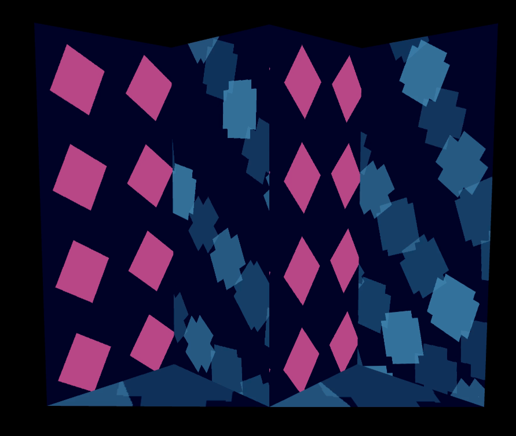
The last animation was a simple addition of coloured rectangles rotating across the panel. What I liked in this animation was using the value of the sin wave that controlled the scale and rotation of the rectangles as a condition in changing the colour. Ties with a random value on red this allowed the colours to change at the top and bottom of the wave, when the shaped were aligned and at their peak sizes. This gave them a pop that kept them interesting despite not making as much use of timing as the other animations.
Future development
For me the most interesting way of pushing this work for future development would be in the object that is being mapped. The concertina worked well for the pop-up exhibition but is only a short term attraction. It would be good to spend longer thinking about the relation between the projections and the object and what they do to each other as I feel like I hadn’t really questioned what the purpose of the projection mapping was. I feel like an augmented reality that allows an object to also deviate from its constraints, to cause dissent in its own structure, is an important consideration for future variations of this work. I also think working on a much smaller scale could allow a delicate use of light rather than the assault in the dark room. I’d like to projection map a feather.
Self evaluation
Overall I am pleased with the animation, I think I could have got a smoother projection by using filled shapes rather than lines, as I think the crosses and coloured squares had much more visual impact with the projection mapping than the circles animation, despite that being the part I spent most time on. I think with more time I could have smoothed over some of the transitions between the different animations too which would have tied the animations together into one piece rather than feeling separate.
References
Ascher, M. Ascher, R. (1981) Mathematics of the Incas: Code of the Quipu. Dover Publications.
Moore, A (2016) Jerusalem. Knockabout.
Saskia Freeke. Geometric Animations 170325. - https://www.openprocessing.org/sketch/416046
Video Documentation - https://vimeo.com/250781628
SoundsOfEarth - https://github.com/isaac-art/SoundsOfEarth
ScottishWitches - https://github.com/isaac-art/ScottishWitches


